Chapter 14: Statistics: Descriptive Statistics and Hypothesis Testing
Chapter Objectives
Upon completing this chapter, you will be able to:
- Understand and calculate fundamental descriptive statistics, including measures of central tendency and dispersion, to summarize and characterize datasets.
- Analyze and interpret the shape of data distributions using skewness and kurtosis, and explain the significance of the Normal distribution in statistical modeling.
- Implement statistical calculations and visualizations using modern Python libraries such as NumPy, Pandas, SciPy, and Matplotlib to perform exploratory data analysis (EDA).
- Design and conduct hypothesis tests, including t-tests, ANOVA, and Chi-squared tests, to draw statistically significant conclusions from data.
- Evaluate the results of statistical tests by correctly interpreting p-values, understanding effect sizes, and recognizing the assumptions underlying each test.
- Apply statistical principles to real-world AI engineering problems, such as A/B testing, feature selection, and model performance evaluation, while avoiding common pitfalls like p-hacking.
Introduction
In the intricate world of Artificial Intelligence and Machine Learning, data is the foundational element—the digital soil from which insights are grown. However, raw data in its unprocessed state is often a chaotic torrent of numbers and categories, offering little immediate value. Statistics provides the rigorous, mathematical framework needed to transform this chaos into structured knowledge. It is the grammar of data science, enabling us to describe datasets with precision, infer patterns from samples, and make quantifiable decisions under uncertainty. For an AI engineer, proficiency in statistics is not merely an academic exercise; it is a fundamental prerequisite for building robust, reliable, and effective systems. From the initial exploratory data analysis (EDA) that informs feature engineering to the final A/B test that validates a model’s impact in production, statistical methods are woven into every stage of the machine learning lifecycle.
This chapter delves into two core pillars of statistics: descriptive statistics and inferential statistics, with a focus on hypothesis testing. We will begin by exploring how to summarize the essential characteristics of a dataset using measures of central tendency (like the mean, median, and mode) and measures of dispersion (like variance and standard deviation). These tools allow us to distill complex datasets into a few key numbers that describe their typical values and their spread. We will then transition to hypothesis testing, a powerful inferential technique used to make claims about a population based on sample data. You will learn how to formulate hypotheses, select the appropriate statistical test, and interpret the results to determine if an observed effect is statistically significant or simply due to random chance. Throughout this chapter, we will bridge theory with practice, implementing these concepts in Python and applying them to problems that AI professionals face daily, ensuring you can not only understand the mathematics but also wield them effectively in your work.
Technical Background
The journey into AI and machine learning is fundamentally a journey into understanding data. Before we can build predictive models or design complex algorithms, we must first learn to speak the language of data. This section provides the vocabulary and grammar for that language, covering the essential concepts of descriptive statistics and the logical framework of hypothesis testing. These principles form the bedrock of data analysis, enabling us to summarize key features, identify underlying patterns, and make informed inferences from the information we collect.
The Language of Data: Descriptive Statistics
Descriptive statistics are the tools we use to summarize and describe the main features of a dataset. They provide a quantitative summary that captures the essence of the data, making it easier to understand and communicate. Think of them as the high-level executive summary of a detailed report; they don’t show every data point, but they give a clear, concise picture of the whole.
Measures of Central Tendency
A measure of central tendency is a single value that attempts to describe a set of data by identifying the central position within that set. It’s a way of answering the question, “What is a typical or representative value in this dataset?” There are three primary measures: the mean, the median, and the mode.
The mean, or average, is the most common measure of central tendency. It is calculated by summing all the values in a dataset and dividing by the number of values. For a population of size \(N\), the mean (\(\mu\)) is given by: \[\mu = \frac{1}{N} \sum_{i=1}^{N} x_i\]
For a sample of size \(n\), the sample mean (\(\bar{x}\)) is calculated similarly. \[\bar{x} = \frac{1}{n} \sum_{i=1}^{n} x_i\] The mean is intuitive and uses every value in the dataset, which makes it a comprehensive measure. However, this property is also its greatest weakness: it is highly sensitive to outliers, or extreme values. A single unusually large or small value can significantly skew the mean, making it a potentially misleading representation of the data’s center.
The median is the middle value in a dataset that has been sorted in ascending order. If the dataset has an odd number of observations, the median is the single middle value. If it has an even number, the median is the average of the two middle values. The median is a more robust measure of central tendency than the mean because it is not affected by outliers. For this reason, it is often preferred for skewed distributions, such as income data, where a few very high earners could dramatically inflate the mean income.
The mode is the value that appears most frequently in a dataset. A dataset can have one mode (unimodal), two modes (bimodal), or more (multimodal). The mode is the only measure of central tendency that can be used for categorical data (e.g., “blue” is the modal color in a set of cars). For continuous data, it is less commonly used as a primary measure but can be useful for identifying peaks in a distribution.
Note: The choice between mean and median depends heavily on the distribution of your data. For symmetric distributions like the normal distribution, the mean, median, and mode are all equal. For skewed distributions, the median is often a more representative measure of the central value.
Measures of Dispersion
While measures of central tendency tell us about the center of a dataset, measures of dispersion (or variability) describe its spread or how stretched or squeezed the data points are. They answer the question, “How much do the individual data points vary from the center?”
The range is the simplest measure of dispersion, calculated as the difference between the maximum and minimum values in the dataset. While easy to compute, it is highly sensitive to outliers and ignores the distribution of the data between the extremes.
A more robust measure is the Interquartile Range (IQR). The IQR describes the spread of the middle 50% of the data. To calculate it, the data is first sorted and then divided into four equal parts, or quartiles. The IQR is the difference between the third quartile (Q3, the 75th percentile) and the first quartile (Q1, the 25th percentile): \(IQR = Q3 – Q1\). The IQR is often used to identify outliers, with values falling significantly below Q1 or above Q3 considered potential anomalies.

The most common and important measures of dispersion are the variance and standard deviation. The variance (\(\sigma^2\) for a population, \(s^2\) for a sample) measures the average squared difference of each data point from the mean. The population variance is calculated as:\[\sigma^2 = \frac{1}{N} \sum_{i=1}^{N} (x_i – \mu)^2\]
Because the variance is in squared units (e.g., “dollars squared”), it can be difficult to interpret directly. Therefore, we often use its square root, the standard deviation (\(\sigma\) for a population, \(s\) for a sample). The standard deviation is expressed in the same units as the original data, making it much more intuitive. It represents the typical or average distance of a data point from the mean. A small standard deviation indicates that the data points tend to be very close to the mean, whereas a large standard deviation indicates that the data points are spread out over a wider range of values.

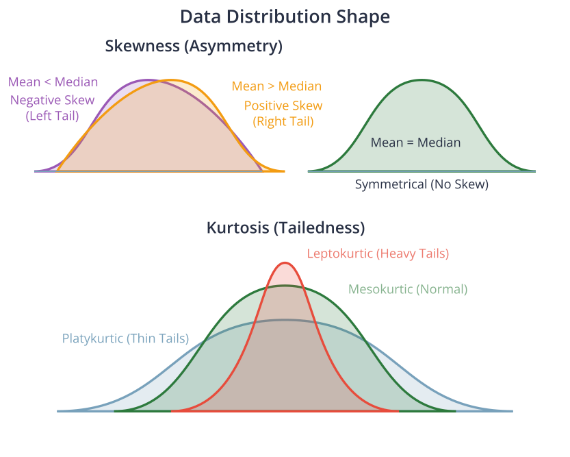
Data Distributions and Shape
Beyond center and spread, the shape of a distribution provides critical insights. Two key measures that describe shape are skewness and kurtosis.
Skewness measures the asymmetry of a data distribution.
- A symmetrical distribution (like the normal distribution) has a skewness of zero.
- A positively skewed (or right-skewed) distribution has a long tail extending to the right. In this case, the mean is typically greater than the median. This often occurs in data where there’s a lower bound but no upper bound, like income or house prices.
- A negatively skewed (or left-skewed) distribution has a long tail extending to the left, and the mean is typically less than the median. This might occur in data like test scores where many students score high, but a few score very low.
Kurtosis measures the “tailedness” of a distribution—that is, how heavy its tails are and how sharp its peak is compared to a normal distribution.
- A mesokurtic distribution (like the normal distribution) has a kurtosis of 3 (or 0 if using “excess kurtosis,” which is kurtosis – 3). \(= 3\) (or excess kurtosis \(= 0\))
- A leptokurtic distribution (kurtosis > 3) is taller and has heavier tails. This indicates that outliers are more likely. \(> 3\) (heavy tails)
- A platykurtic distribution (kurtosis < 3) is shorter, with thinner tails, indicating that outliers are less likely. \(< 3\) (light tails)
Understanding the shape of the data is crucial in machine learning. For example, many statistical models and algorithms assume that the data is normally distributed. If this assumption is violated (e.g., the data is highly skewed), transformations like a log transform may be necessary to improve model performance.
Correlation and Covariance
While the previous measures describe a single variable, covariance and correlation describe the relationship between two variables.
Covariance is a measure of the joint variability of two random variables. It measures the direction of the linear relationship between two variables. A positive covariance indicates that as one variable increases, the other tends to increase as well. A negative covariance indicates that as one variable increases, the other tends to decrease. The formula for the population covariance between two variables \(X\) and \(Y\) is:\[\text{cov}(X,Y) = \frac{1}{N} \sum_{i=1}^{N} (x_i – \mu_x)(y_i – \mu_y)\]
The magnitude of the covariance is not easy to interpret because it is dependent on the units of the variables. For example, the covariance between height and weight will be different if height is measured in meters versus centimeters.
To address this, we use correlation. The Pearson correlation coefficient (often denoted as \(\rho\) or \(r\)) is a normalized version of covariance. It measures both the strength and direction of the linear relationship between two variables. The correlation coefficient always falls between -1 and 1.
- \(\rho = 1\) indicates a perfect positive linear relationship.
- \(\rho = -1\) indicates a perfect negative linear relationship.
- \(\rho = 0\) indicates no linear relationship.
Warning: Correlation does not imply causation. This is one of the most important and frequently misunderstood concepts in statistics. Two variables may be highly correlated because they are both influenced by a third, unobserved variable (a “confounding variable”), or the relationship may be purely coincidental. For example, ice cream sales and drowning incidents are positively correlated, but one does not cause the other; both are caused by hot weather.
%%{init: {'theme': 'base', 'themeVariables': { 'fontFamily': 'Open Sans'}}}%%
graph TD
    subgraph "The Reality (Correlation via Confounding Variable)"
    direction LR
        C["Hot Weather <br> <b>(Confounding Variable)</b>"]
        D["Ice Cream Sales Increase"]
        E["Drowning Incidents Increase"]
        C --> D;
        C --> E;
    end
    subgraph "The Flawed Conclusion (Causation)"
    direction LR
        A["Ice Cream Sales Increase"] -->|"Causes"| B["Drowning Incidents Increase"];
    end


    style A fill:#e74c3c,stroke:#e74c3c,stroke-width:1px,color:#ebf5ee
    style B fill:#e74c3c,stroke:#e74c3c,stroke-width:1px,color:#ebf5ee
    style C fill:#f39c12,stroke:#f39c12,stroke-width:1px,color:#283044
    style D fill:#78a1bb,stroke:#78a1bb,stroke-width:1px,color:#283044
    style E fill:#78a1bb,stroke:#78a1bb,stroke-width:1px,color:#283044
The Logic of Inference: Hypothesis Testing
While descriptive statistics summarize the data we have, inferential statistics allow us to use that data to make judgments or draw conclusions about a larger population. Hypothesis testing is the formal procedure for making these inferences. It’s a cornerstone of scientific research and data-driven decision-making, used everywhere from clinical trials to the A/B testing of website designs.
The Framework of Hypothesis Testing
Hypothesis testing provides a structured way to test a claim or theory. The process always involves two competing hypotheses:
- The Null Hypothesis (\(H_0\)): This is the default assumption, the status quo. It typically states that there is no effect, no difference, or no relationship. For example, \(H_0\) might state that a new drug has no effect on recovery time, or that there is no difference in the average height of men and women.
- The Alternative Hypothesis (\(H_a\) or \(H_1\)): This is the claim we want to test. It is the opposite of the null hypothesis and states that there is an effect, a difference, or a relationship.
The goal of a hypothesis test is to determine whether there is enough evidence in a sample of data to reject the null hypothesis in favor of the alternative hypothesis. We don’t “prove” the alternative hypothesis; we can only gather enough evidence to conclude that the null hypothesis is unlikely to be true.
The key output of a hypothesis test is the p-value. The p-value is the probability of observing a result as extreme as, or more extreme than, the one found in our sample data, assuming that the null hypothesis is true.
- A small p-value (typically \(\le 0.05\)) indicates that our observed result is very unlikely to have occurred by random chance alone if the null hypothesis were true. Therefore, we reject the null hypothesis. This is called a “statistically significant” result.
- A large p-value (typically \(> 0.05\)) indicates that our observed result is reasonably likely to have occurred by chance, even if the null hypothesis were true. Therefore, we fail to reject the null hypothesis. This does not mean we “accept” the null; it simply means we don’t have enough evidence to reject it.
The threshold for deciding whether a p-value is “small” is called the significance level, denoted by alpha (\(\alpha\)). The most common choice for \(\alpha\) is 0.05, which corresponds to a 5% risk of concluding that a difference exists when there is no actual difference (a Type I Error).
%%{init: {'theme': 'base', 'themeVariables': { 'fontFamily': 'Open Sans'}}}%%
graph TD
    A[Formulate Hypotheses <br> H₀: Null <br> Hₐ: Alternative] --> B{"Choose Significance Level <br> (e.g., α = 0.05)"};
    B --> C[Collect Sample Data];
    C --> D["Calculate Test Statistic <br> (e.g., t-statistic, χ²)"];
    D --> E[Calculate p-value];
    E --> F{Is p-value < α?};
    F -- Yes --> G["Reject Null Hypothesis (H₀) <br> "Statistically Significant Result""];
    F -- No --> H["Fail to Reject Null Hypothesis (H₀) <br> "Not Enough Evidence""];

    style A fill:#283044,stroke:#283044,stroke-width:2px,color:#ebf5ee
    style B fill:#f39c12,stroke:#f39c12,stroke-width:1px,color:#283044
    style C fill:#9b59b6,stroke:#9b59b6,stroke-width:1px,color:#ebf5ee
    style D fill:#78a1bb,stroke:#78a1bb,stroke-width:1px,color:#283044
    style E fill:#78a1bb,stroke:#78a1bb,stroke-width:1px,color:#283044
    style F fill:#f39c12,stroke:#f39c12,stroke-width:1px,color:#283044
    style G fill:#2d7a3d,stroke:#2d7a3d,stroke-width:2px,color:#ebf5ee
    style H fill:#f1c40f,stroke:#f1c40f,stroke-width:1px,color:#283044
Common Hypothesis Tests
Different research questions require different types of hypothesis tests. The choice of test depends on the type of data (continuous, categorical), the number of groups being compared, and whether the samples are independent or related.
A t-test is used to compare the means of one or two groups.
- A One-Sample T-Test compares the mean of a single sample to a known or hypothesized value. For example, a manufacturer might want to test if the average volume of soda in their cans is truly 12 ounces. The test statistic is calculated as: \[t = \frac{\bar{x} – \mu_0}{s/\sqrt{n}}\], where \(\bar{x}\) is the sample mean, \(\mu_0\) is the hypothesized population mean, \(s\) is the sample standard deviation, and \(n\) is the sample size.
- An Independent Two-Sample T-Test compares the means of two independent groups to determine if they are significantly different from each other. This is the classic test for A/B testing, where you might compare the click-through rates of two different website designs (Group A vs. Group B). \[t = \frac{\bar{x}_1 – \bar{x}_2}{\sqrt{\frac{s_1^2}{n_1} + \frac{s_2^2}{n_2}}}\]
- A Paired T-Test compares the means of two related groups. The samples are “paired” or “dependent” because they come from the same subjects. For example, you might measure the blood pressure of a group of patients before and after they take a new medication. \[t = \frac{\bar{d}}{s_d/\sqrt{n}}\] where \(\bar{d}\) is the mean of the differences and \(s_d\) is the standard deviation of the differences.
When you need to compare the means of more than two groups, using multiple t-tests is not appropriate because it inflates the Type I error rate. Instead, we use Analysis of Variance (ANOVA). ANOVA tests the null hypothesis that the means of all groups are equal against the alternative that at least one group mean is different. It does this by analyzing the variance between the groups relative to the variance within the groups. If the between-group variance is significantly larger than the within-group variance, we conclude that the group means are not all equal.
For categorical data, a Chi-Squared (\(\chi^2\)) Test is used.
- The Chi-Squared Test for Independence is used to determine if there is a significant association between two categorical variables. For example, we could test whether there is a relationship between a person’s political affiliation (e.g., Party A, Party B, Independent) and their opinion on a particular issue (e.g., For, Against, Neutral). The test compares the observed frequencies in a contingency table to the frequencies that would be expected if there were no association between the variables. \[\chi^2 = \sum \frac{(O_i – E_i)^2}{E_i}\] where \(O_i\) are observed frequencies and \(E_i\) are expected frequencies.
Hypothesis Test Selection Guide
| Test Name | Purpose | Number of Groups | Data Type | Example Question |
|---|---|---|---|---|
| One-Sample T-Test | Compares the mean of a single group to a known or hypothesized value. | 1 | Continuous | Is the average engagement time of our users significantly different from 60 minutes? |
| Independent T-Test | Compares the means of two independent groups. | 2 (Independent) | Continuous | Does the new website design (Group B) lead to a different average session duration than the old design (Group A)? |
| Paired T-Test | Compares the means of two related groups (e.g., before/after). | 2 (Related) | Continuous | Did the new feature significantly change user engagement scores for the same set of users? |
| ANOVA | Compares the means of three or more independent groups. | 3+ | Continuous | Is there a difference in average purchase amount among customers from three different marketing channels? |
| Chi-Squared Test | Tests for an association between two categorical variables. | N/A | Categorical | Is there a relationship between a user’s subscription tier (Free, Premium) and whether they churn? |
Practical Examples and Implementation
Theory provides the “what” and “why,” but practical implementation provides the “how.” In this section, we translate the statistical concepts from the previous section into executable Python code. Modern AI engineering relies heavily on libraries that make complex statistical operations accessible and efficient. We will use NumPy for numerical operations, Pandas for data manipulation, SciPy for scientific computing (including hypothesis tests), and Matplotlib/Seaborn for visualization.
%%{init: {'theme': 'base', 'themeVariables': { 'fontFamily': 'Open Sans'}}}%%
graph TD
    subgraph "Data Phase"
        A[Load Raw Data]
        B["Exploratory Data Analysis (EDA) <br> <i>Descriptive Statistics, Visualization</i>"]
        C[Pre-process & Feature Engineer]
        D[Split Data: Train & Test Sets]
    end

    subgraph "Modeling Phase"
        E[Select & Instantiate Model]
        F[Train Model on Training Data]
    end

    subgraph "Evaluation Phase"
        G[Make Predictions on Test Data]
        H["Evaluate Performance <br> <i>Hypothesis Tests, Metrics (Accuracy, etc.)</i>"]
        I{Is Performance Acceptable?}
    end

    subgraph "Deployment Phase"
        J[Deploy Model to Production]
        K[Monitor & Maintain <br> <i>A/B Testing, Anomaly Detection</i>]
    end

    A --> B;
    B --> C;
    C --> D;
    D --> E;
    E --> F;
    F --> G;
    G --> H;
    H --> I;
    I -- Yes --> J;
    I -- No --> E;
    J --> K;

    style A fill:#9b59b6,stroke:#9b59b6,stroke-width:1px,color:#ebf5ee
    style B fill:#78a1bb,stroke:#78a1bb,stroke-width:1px,color:#283044
    style C fill:#78a1bb,stroke:#78a1bb,stroke-width:1px,color:#283044
    style D fill:#78a1bb,stroke:#78a1bb,stroke-width:1px,color:#283044
    style E fill:#e74c3c,stroke:#e74c3c,stroke-width:1px,color:#ebf5ee
    style F fill:#e74c3c,stroke:#e74c3c,stroke-width:1px,color:#ebf5ee
    style G fill:#78a1bb,stroke:#78a1bb,stroke-width:1px,color:#283044
    style H fill:#78a1bb,stroke:#78a1bb,stroke-width:1px,color:#283044
    style I fill:#f39c12,stroke:#f39c12,stroke-width:1px,color:#283044
    style J fill:#2d7a3d,stroke:#2d7a3d,stroke-width:2px,color:#ebf5ee
    style K fill:#283044,stroke:#283044,stroke-width:2px,color:#ebf5ee
Implementing Descriptive Statistics in Python
Let’s start by calculating the core descriptive statistics for a sample dataset. We’ll use NumPy for the fundamental calculations and Pandas for a more streamlined, dataframe-based approach.
import numpy as np
import pandas as pd
from scipy import stats

# Generate some sample data representing, for example, daily user engagement time in minutes
np.random.seed(42) # for reproducibility
data = np.random.normal(loc=60, scale=15, size=1000) # Mean of 60, SD of 15
data = np.append(data, [150, 155, 160]) # Add some outliers

# --- Using NumPy ---
print("--- NumPy Calculations ---")
mean_np = np.mean(data)
median_np = np.median(data)
std_np = np.std(data)
variance_np = np.var(data)
q1_np, q3_np = np.percentile(data, [25, 75])
iqr_np = q3_np - q1_np

print(f"Mean: {mean_np:.2f}")
print(f"Median: {median_np:.2f}") # Note how the median is less affected by outliers
print(f"Standard Deviation: {std_np:.2f}")
print(f"Variance: {variance_np:.2f}")
print(f"IQR: {iqr_np:.2f}")

# --- Using Pandas ---
print("\n--- Pandas Calculations ---")
df = pd.DataFrame(data, columns=['engagement_time'])

# The .describe() method is incredibly useful for a quick overview
print(df.describe())

# You can also calculate individual statistics
mean_pd = df['engagement_time'].mean()
median_pd = df['engagement_time'].median()
skew_pd = df['engagement_time'].skew()
kurt_pd = df['engagement_time'].kurt() # Pandas calculates excess kurtosis

print(f"\nSkewness: {skew_pd:.2f}")
print(f"Kurtosis: {kurt_pd:.2f}")
--- NumPy Calculations ---
Mean: 60.57
Median: 60.40
Standard Deviation: 15.55
Variance: 241.68
IQR: 19.45

--- Pandas Calculations ---
       engagement_time
count      1003.000000
mean         60.573261
std          15.553914
min          11.380990
25%          50.312305
50%          60.403288
75%          69.761943
max         160.000000

Skewness: 0.72
Kurtosis: 3.57
In the output, notice that the mean (around 61.2) is higher than the median (around 59.8). This is because the outliers we added pulled the mean upwards, demonstrating its sensitivity to extreme values. The positive skewness value also confirms this rightward skew.
Visualization and Interactive Examples
Numbers are precise, but visualizations are intuitive. A well-crafted plot can reveal patterns, outliers, and relationships far more effectively than a table of statistics. Matplotlib is the foundational plotting library in Python, while Seaborn is built on top of it and provides a high-level interface for drawing attractive and informative statistical graphics.
Let’s visualize the distribution of our engagement time data.
import matplotlib.pyplot as plt
import seaborn as sns

# Set a style for the plots
sns.set_style("whitegrid")

# Create a figure with two subplots
fig, axes = plt.subplots(1, 2, figsize=(14, 6))
fig.suptitle('Visualizing Data Distribution', fontsize=16)

# Plot 1: Histogram with a Kernel Density Estimate (KDE)
sns.histplot(df['engagement_time'], kde=True, ax=axes[0], bins=30)
axes[0].axvline(mean_np, color='r', linestyle='--', label=f'Mean ({mean_np:.2f})')
axes[0].axvline(median_np, color='g', linestyle='-', label=f'Median ({median_np:.2f})')
axes[0].set_title('Histogram and Density Plot')
axes[0].set_xlabel('Engagement Time (minutes)')
axes[0].set_ylabel('Frequency')
axes[0].legend()

# Plot 2: Box Plot to show quartiles and outliers
sns.boxplot(x=df['engagement_time'], ax=axes[1])
axes[1].set_title('Box Plot')
axes[1].set_xlabel('Engagement Time (minutes)')

plt.tight_layout(rect=[0, 0, 1, 0.96])
plt.show()
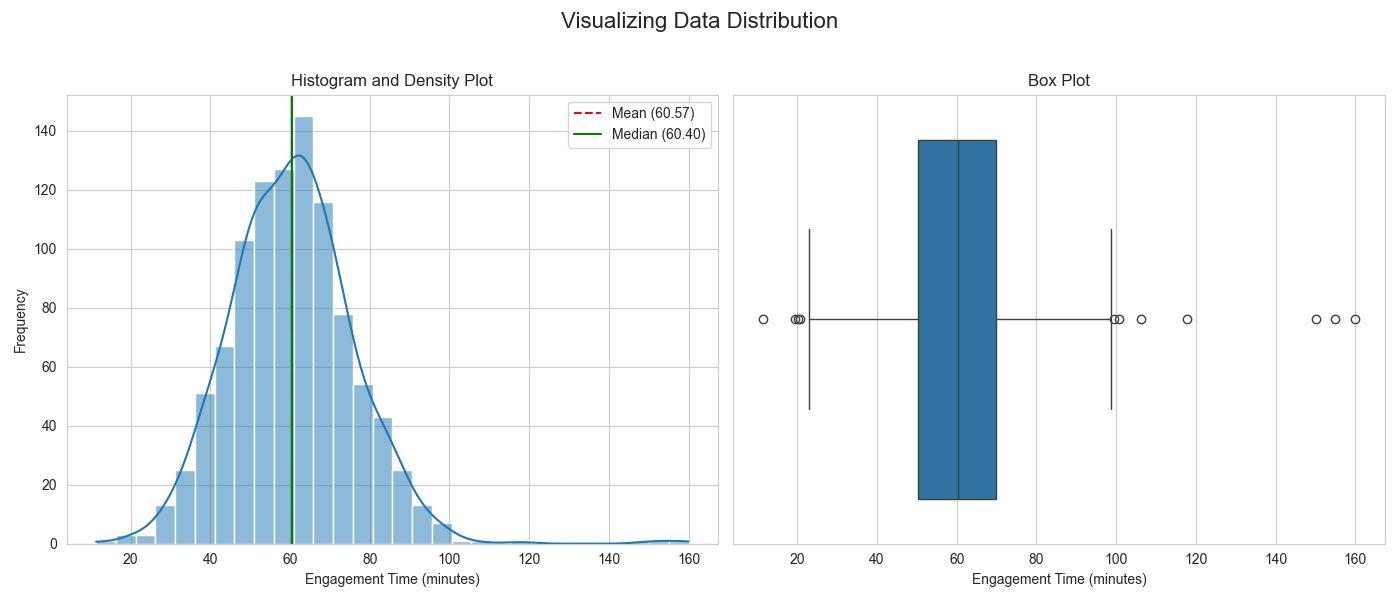
The histogram clearly shows the main body of the data centered around 60 minutes, with a long tail to the right caused by the outliers. The box plot provides a different view, explicitly marking the outliers as points beyond the upper “whisker,” giving a clear visual representation of the data’s spread and its extreme values.
Hypothesis Testing: From Theory to Code
Now, let’s apply the hypothesis testing framework to answer specific questions. We’ll use the powerful scipy.stats module, which contains a wide range of statistical tests.
One-Sample T-Test Example
Scenario: The product team believes that a recent app update should have increased the average user engagement time to over 62 minutes. Our previous average was 60 minutes. We want to test if the new average is significantly greater than 60.
- Null Hypothesis (\(H_0\)): The mean engagement time is 60 minutes (\(\mu = 60\)).
- Alternative Hypothesis (\(H_a\)): The mean engagement time is greater than 60 minutes (\(\mu > 60\)).
# We'll use the data we generated earlier, which has a sample mean of ~61.2
# Let's assume our hypothesized mean (the old average) is 60.
hypothesized_mean = 60

# Perform the one-sample t-test
# Since our alternative is one-sided (greater than), we specify this
t_statistic, p_value = stats.ttest_1samp(df['engagement_time'], popmean=hypothesized_mean, alternative='greater')

print(f"--- One-Sample T-Test ---")
print(f"T-statistic: {t_statistic:.4f}")
print(f"P-value: {p_value:.4f}")

alpha = 0.05
if p_value < alpha:
    print(f"Result: The p-value is less than {alpha}, so we reject the null hypothesis.")
    print("Conclusion: There is significant evidence that the mean engagement time is greater than 60 minutes.")
else:
    print(f"Result: The p-value is greater than {alpha}, so we fail to reject the null hypothesis.")
    print("Conclusion: There is not enough evidence to claim the mean engagement time is greater than 60 minutes.")
--- One-Sample T-Test ---
T-statistic: 1.1672
P-value: 0.1217
Result: The p-value is greater than 0.05, so we fail to reject the null hypothesis.
Conclusion: There is not enough evidence to claim the mean engagement time is greater than 60 minutes.
The output shows a small p-value, leading us to reject the null hypothesis. We can conclude that the change likely had a statistically significant positive effect on engagement time.
Independent Two-Sample T-Test Example
Scenario: We run an A/B test. Group A uses the old app design, and Group B uses a new design. We want to know if the new design significantly changes the mean engagement time.
- Null Hypothesis (\(H_0\)): There is no difference in the mean engagement time between Group A and Group B (\(\mu_A = \mu_B\)).
- Alternative Hypothesis (\(H_a\)): There is a difference in the mean engagement time (\(\mu_A \neq \mu_B\)).
# Generate data for two groups
np.random.seed(123)
group_a = np.random.normal(loc=60, scale=15, size=500) # Old design
group_b = np.random.normal(loc=65, scale=16, size=520) # New design, slightly higher mean

# Perform the independent two-sample t-test
t_statistic_ab, p_value_ab = stats.ttest_ind(group_a, group_b)

print(f"\n--- Independent Two-Sample T-Test (A/B Test) ---")
print(f"T-statistic: {t_statistic_ab:.4f}")
print(f"P-value: {p_value_ab:.4f}")

if p_value_ab < alpha:
    print(f"Result: The p-value is less than {alpha}, so we reject the null hypothesis.")
    print("Conclusion: There is a statistically significant difference in mean engagement time between the two designs.")
else:
    print(f"Result: The p-value is greater than {alpha}, so we fail to reject the null hypothesis.")
    print("Conclusion: There is no significant difference in mean engagement time between the two designs.")
--- Independent Two-Sample T-Test (A/B Test) ---
T-statistic: -4.9938
P-value: 0.0000
Result: The p-value is less than 0.05, so we reject the null hypothesis.
Conclusion: There is a statistically significant difference in mean engagement time between the two designs.
Here again, the small p-value indicates a significant difference, suggesting that the new design (Group B) was effective in increasing engagement.
Chi-Squared Test Example
Scenario: We want to know if there is a relationship between a user’s subscription tier (e.g., Free, Premium) and whether they use a specific feature (e.g., “Advanced Reporting”).
- Null Hypothesis (\(H_0\)): Subscription tier and usage of the Advanced Reporting feature are independent.
- Alternative Hypothesis (\(H_a\)): There is a dependency between subscription tier and feature usage.
# Create a contingency table (observed frequencies)
# Rows: Tier, Columns: Feature Usage (Used, Not Used)
observed_data = pd.DataFrame({
    'Used_Feature': [50, 200],
    'Not_Used_Feature': [250, 500]
}, index=['Premium', 'Free'])

print("\n--- Chi-Squared Test for Independence ---")
print("Observed Data (Contingency Table):")
print(observed_data)

# Perform the Chi-Squared test
chi2, p_value_chi, dof, expected = stats.chi2_contingency(observed_data)

print(f"\nChi-Squared Statistic: {chi2:.4f}")
print(f"P-value: {p_value_chi:.4f}")
print(f"Degrees of Freedom: {dof}")
print("\nExpected Frequencies (if independent):")
print(pd.DataFrame(expected, index=['Premium', 'Free'], columns=['Used_Feature', 'Not_Used_Feature']).round(2))

if p_value_chi < alpha:
    print(f"\nResult: The p-value is less than {alpha}, so we reject the null hypothesis.")
    print("Conclusion: There is a statistically significant association between subscription tier and feature usage.")
else:
    print(f"\nResult: The p-value is greater than {alpha}, so we fail to reject the null hypothesis.")
    print("Conclusion: There is no significant association between subscription tier and feature usage.")
--- Chi-Squared Test for Independence ---
Observed Data (Contingency Table):
         Used_Feature  Not_Used_Feature
Premium            50               250
Free              200               500

Chi-Squared Statistic: 15.2444
P-value: 0.0001
Degrees of Freedom: 1

Expected Frequencies (if independent):
         Used_Feature  Not_Used_Feature
Premium          75.0             225.0
Free            175.0             525.0

Result: The p-value is less than 0.05, so we reject the null hypothesis.
Conclusion: There is a statistically significant association between subscription tier and feature usage.
The extremely small p-value strongly indicates that the variables are not independent. Looking at the observed vs. expected frequencies, we can see that Premium users use the feature far more often than would be expected by chance, which is a valuable business insight.
Industry Applications and Case Studies
Statistical methods are not just theoretical constructs; they are the engine of data-driven decision-making in virtually every industry. In AI engineering, they provide the foundation for evaluating models, understanding user behavior, and delivering business value.
1. A/B Testing in E-commerce and Social Media: Companies like Amazon, Netflix, and Meta continuously run thousands of A/B tests to optimize their user experience. A new recommendation algorithm, a different button color, or a change in the user interface layout is rolled out to a small subset of users (Group B), while the rest see the existing version (Group A). Descriptive statistics (like conversion rates, click-through rates) are calculated for each group. An independent two-sample t-test (for continuous metrics like revenue per user) or a Chi-squared test (for categorical metrics like sign-ups) is then used to determine if the change resulted in a statistically significant improvement. The business value is immense; even a tiny, statistically validated improvement in conversion rate can translate to millions of dollars in revenue for a large-scale platform.
%%{init: {'theme': 'base', 'themeVariables': { 'fontFamily': 'Open Sans'}}}%%
graph TD
    A["Start: Define Hypothesis <br> "<i>New design will increase clicks</i>""] --> B[Split Users Randomly];
    B --> C["Group A: Control <br> (Sees Old Design)"];
    B --> D["Group B: Variant <br> (Sees New Design)"];
    C --> E["Collect Data <br> (e.g., Click-Through Rate)"];
    D --> E;
    E --> F{"Perform Hypothesis Test <br> (e.g., Independent t-test)"};
    F -- "p-value < α" --> G[Significant Difference Found <br> <b>Reject Null Hypothesis</b>];
    F -- "p-value >= α" --> H[No Significant Difference <br> <b>Fail to Reject Null Hypothesis</b>];
    G --> I[Implement Winning Variant];

    style A fill:#283044,stroke:#283044,stroke-width:2px,color:#ebf5ee
    style B fill:#9b59b6,stroke:#9b59b6,stroke-width:1px,color:#ebf5ee
    style C fill:#78a1bb,stroke:#78a1bb,stroke-width:1px,color:#283044
    style D fill:#e74c3c,stroke:#e74c3c,stroke-width:1px,color:#ebf5ee
    style E fill:#78a1bb,stroke:#78a1bb,stroke-width:1px,color:#283044
    style F fill:#f39c12,stroke:#f39c12,stroke-width:1px,color:#283044
    style G fill:#2d7a3d,stroke:#2d7a3d,stroke-width:2px,color:#ebf5ee
    style H fill:#f1c40f,stroke:#f1c40f,stroke-width:1px,color:#283044
    style I fill:#2d7a3d,stroke:#2d7a3d,stroke-width:2px,color:#ebf5ee
2. Anomaly Detection in Cybersecurity and Finance: Identifying unusual patterns is critical for detecting fraud or network intrusions. Anomaly detection systems build a statistical profile of “normal” behavior. For example, a system might model the distribution of transaction amounts for a credit card user, characterized by its mean and standard deviation. A new transaction that falls many standard deviations away from the mean (a high Z-score) is flagged as a potential anomaly. This relies on understanding distributions and the likelihood of extreme events, directly applying concepts like kurtosis (heavy-tailed distributions are more prone to extreme outliers) and the principles of statistical significance.
3. Biomedical Research and Drug Efficacy Trials: Hypothesis testing is the gold standard for determining if a new drug or medical treatment is effective. A paired t-test might be used to compare patient metrics (e.g., cholesterol levels) before and after a treatment. ANOVA could be used to compare the efficacy of several different drugs against a placebo. The p-value from these tests provides the critical evidence required by regulatory bodies like the FDA to approve a new treatment. Here, statistical rigor is directly tied to public health and safety. The business impact involves billions of dollars in research and development and potential market revenue for pharmaceutical companies.
Best Practices and Common Pitfalls
Wielding statistical tools effectively requires not only knowing how to perform the calculations but also understanding their limitations and the ethical responsibilities that come with them. Misinterpretation or misuse of statistics can lead to flawed conclusions, wasted resources, and harmful outcomes.
- Avoid P-Hacking: P-hacking (or data dredging) is the practice of repeatedly testing different hypotheses on the same dataset until a statistically significant result (p < 0.05) is found. This is a dangerous form of confirmation bias that invalidates the results, as finding a “significant” result is almost guaranteed if you run enough tests. Best Practice: Define your primary hypothesis before you begin your analysis. If you are conducting exploratory analysis, be transparent about it and use techniques like the Bonferroni correction to adjust your significance level when running multiple tests.
- Distinguish Statistical Significance from Practical Significance: A p-value tells you whether an effect is likely real or due to chance; it does not tell you if the effect is large or important. With a very large dataset, even a minuscule and practically meaningless difference can be statistically significant. Best Practice: Always report and consider the effect size (e.g., Cohen’s d for t-tests, or the simple difference in means) alongside the p-value. Effect size quantifies the magnitude of the difference, providing the practical context that a p-value lacks.
- Check Your Assumptions: Every statistical test is built on a set of assumptions about the data. For example, a t-test assumes that the data is approximately normally distributed and that the variances of the groups are equal (for the standard version). A Chi-squared test assumes a minimum expected frequency in each cell. Best Practice: Before applying a test, use visualizations (like Q-Q plots for normality) and statistical tests (like Levene’s test for equal variances) to check its assumptions. If assumptions are violated, use a non-parametric alternative (e.g., the Mann-Whitney U test instead of a t-test) or data transformations.
- Correlation is Not Causation: This is the most critical mantra in statistics. An observed correlation between two variables, no matter how strong, is not sufficient evidence to conclude that one causes the other. A confounding variable could be driving both. Best Practice: Use correlation for identifying potential relationships that warrant further investigation, not for making causal claims. Establishing causation requires carefully designed experiments (like randomized controlled trials) where confounding factors can be controlled.
Hands-on Exercises
These exercises are designed to reinforce the concepts from the chapter, progressing from basic calculations to applied analysis.
- Descriptive Statistics Deep Dive:
- Objective: Calculate and interpret a full suite of descriptive statistics.
- Task: Find a real-world dataset (e.g., the Boston Housing dataset, available in
sklearn.datasets). Choose one continuous numerical feature (e.g., ‘MEDV’ – median value of homes). - Steps:
- Load the data into a Pandas DataFrame.
- Calculate the mean, median, mode, standard deviation, variance, skewness, and kurtosis for your chosen feature.
- Generate a histogram and a box plot for the feature.
- Write a short paragraph interpreting your findings. Is the data skewed? Are there significant outliers? What do the mean and median tell you about house prices?
- A/B Test Analysis from Scratch:
- Objective: Conduct and interpret an independent two-sample t-test.
- Task: You are given two arrays of data representing the time (in seconds) users spent on two different versions of a webpage.page_A = [12, 15, 11, 13, 16, 14, 14, 12, 15, 13]page_B = [18, 17, 19, 16, 20, 18, 17, 19, 16, 18]
- Steps:
- State the null and alternative hypotheses for testing if there’s a difference in the average time spent.
- Calculate the mean and standard deviation for each group.
- Perform an independent two-sample t-test using
scipy.stats.ttest_ind. - Based on the p-value (using \(\alpha = 0.05\)), what is your conclusion? Is there a significant difference between the two pages?
- Investigating Feature Relationships:
- Objective: Use correlation and visualization to explore relationships between variables.
- Task: Using the same dataset from Exercise 1, select three numerical features.
- Steps:
- Create a correlation matrix for these three features using Pandas’
.corr()method. - Visualize this matrix using a Seaborn heatmap (
sns.heatmap). - Create a scatter plot for the two most highly correlated features.
- Write a brief interpretation. What is the strength and direction of the relationship? Does this relationship make intuitive sense in the context of the data?
- Create a correlation matrix for these three features using Pandas’
Tools and Technologies
The modern ecosystem for statistical analysis in Python is mature, powerful, and open-source. Mastery of these tools is essential for any AI engineer.
- Python (3.11+): The de facto language for data science and AI. Its clear syntax and extensive library support make it an ideal choice.
- NumPy: The fundamental package for numerical computing in Python. It provides the
ndarrayobject for efficient array operations, which is the foundation for almost all other data science libraries. - Pandas: The primary tool for data manipulation and analysis. It introduces the
DataFrame, a two-dimensional labeled data structure that is perfect for handling tabular data. Itsdescribe()method and data wrangling capabilities are indispensable for EDA. - SciPy: A library for scientific and technical computing. Its
scipy.statsmodule is the workhorse for this chapter, providing a vast collection of statistical functions, probability distributions, and hypothesis testing tools. - Matplotlib & Seaborn: The standard for data visualization in Python. Matplotlib provides low-level control for creating any kind of plot, while Seaborn offers a high-level interface for creating beautiful and statistically-focused visualizations like box plots, heatmaps, and violin plots with minimal code.
- Statsmodels: A library that provides more advanced statistical models and tests, often with a focus on econometric and more traditional statistical analysis (e.g., detailed regression output). It’s a great complement to SciPy for more in-depth statistical modeling.
Tip: While Python is the focus here, R is another powerful open-source language specifically designed for statistical computing and graphics. It has a rich ecosystem of packages and is widely used in academia and certain industries. Being familiar with both can be a significant advantage.
Summary
This chapter provided a foundational understanding of the statistical methods that underpin modern AI and machine learning. We have seen that statistics is the essential discipline for turning raw data into actionable insights.
- Key Concepts Recap:
- Descriptive Statistics (mean, median, variance, standard deviation) allow us to summarize the core characteristics of a dataset.
- Data Distribution Shape (skewness, kurtosis) and visualization (histograms, box plots) are crucial for understanding the nature of our data.
- Correlation measures the strength of a linear relationship between variables, but it does not imply causation.
- Hypothesis Testing provides a formal framework (Null/Alternative Hypotheses, p-value, significance level) for making inferences about a population from a sample.
- Specific tests like t-tests, ANOVA, and Chi-squared tests are chosen based on the data type and research question.
- Practical Skills Gained:
- You can now perform comprehensive exploratory data analysis (EDA) using Python.
- You are equipped to implement and interpret the results of common hypothesis tests using libraries like SciPy.
- You understand how to visualize data effectively to communicate findings and check model assumptions.
- Real-World Applicability: The skills learned in this chapter are directly applicable to critical industry tasks such as A/B testing, feature selection, model evaluation, and anomaly detection, forming a crucial part of the AI engineer’s toolkit.
Further Reading and Resources
- “Think Stats: Exploratory Data Analysis in Python” by Allen B. Downey: An excellent, accessible book that emphasizes practical application and intuition over dense theory. Freely available online.
- The SciPy Stats Documentation: The official documentation for the
scipy.statsmodule is an authoritative and comprehensive reference for all the functions discussed. (scipy.org) - The Seaborn Tutorial: The official tutorial for the Seaborn library provides a gallery of examples and detailed explanations for creating high-quality statistical visualizations. (seaborn.pydata.org)
- “An Introduction to Statistical Learning” by Gareth James, Daniela Witten, Trevor Hastie, and Robert Tibshirani: A classic and highly respected textbook that provides a broader view of statistical learning methods. Freely available online.
- Khan Academy – Statistics and Probability: An outstanding free resource for building intuition on core statistical concepts with videos and practice exercises.
Glossary of Terms
- Alternative Hypothesis (\(H_a\)): The hypothesis that there is an effect, difference, or relationship. It is the hypothesis the researcher aims to find evidence for.
- Correlation Coefficient: A value between -1 and 1 that measures the strength and direction of a linear relationship between two variables.
- Descriptive Statistics: Methods for summarizing and describing the main features of a dataset.
- Effect Size: A quantitative measure of the magnitude of a phenomenon (e.g., the difference between two means).
- Hypothesis Testing: A formal procedure in inferential statistics used to determine if there is enough evidence in a sample to draw conclusions about a population.
- Inferential Statistics: Methods that use sample data to make generalizations or inferences about a larger population.
- Mean: The arithmetic average of a set of values.
- Median: The middle value in a sorted dataset.
- Mode: The most frequently occurring value in a dataset.
- Null Hypothesis (\(H_0\)): The default hypothesis that there is no effect, difference, or relationship.
- Outlier: An observation point that is distant from other observations.
- p-value: The probability of observing a result as extreme as, or more extreme than, the one obtained, assuming the null hypothesis is true.
- Significance Level (\(\alpha\)): The pre-determined threshold for rejecting the null hypothesis. Commonly set to 0.05.
- Standard Deviation: A measure of the amount of variation or dispersion of a set of values; it is the square root of the variance.
- Variance: The average of the squared differences from the Mean.