Chapter 40: EDA: Advanced Visualization and Pattern Discovery
Chapter Objectives
Upon completing this chapter, students will be able to:
- Understand the theoretical foundations of advanced visualization, including the Grammar of Graphics and the principles of human visual perception.
- Implement dimensionality reduction techniques such as PCA, t-SNE, and UMAP to visualize high-dimensional datasets effectively.
- Analyze complex datasets using multidimensional and interactive visualization methods like parallel coordinate plots, scatterplot matrices, and linked brushing to uncover hidden patterns and relationships.
- Design compelling and insightful data narratives by selecting appropriate visualization strategies and tools for specific analytical challenges.
- Evaluate the effectiveness and potential for misinterpretation in visualizations, applying critical thinking to avoid common pitfalls and biases.
- Deploy automated visualization tools to accelerate the initial phases of exploratory data analysis and generate hypotheses for further investigation.
Introduction
In the landscape of modern AI engineering, data is the foundational asset upon which all intelligent systems are built. However, raw data, in its vast and unstructured form, is often opaque and unintelligible. The critical bridge between raw data and actionable insight is Exploratory Data Analysis (EDA), and its most powerful instrument is visualization. While previous chapters have introduced fundamental plotting techniques, this chapter ventures into the advanced realm of visualization—a discipline that blends statistical rigor, cognitive science, and artistic design to illuminate the complex patterns hidden within high-dimensional datasets. We move beyond simple bar charts and scatter plots to explore techniques that allow us to “see” data in ways that are not intuitively obvious.
This chapter is predicated on the understanding that as data complexity grows, with features numbering in the hundreds or thousands, traditional visualization methods fail. We will explore how to project high-dimensional structures onto a two-dimensional plane without losing their essential meaning, a challenge central to fields from genomics to finance. We will delve into interactive systems that transform data exploration from a static, one-off process into a dynamic, conversational dialogue with the data. The techniques discussed here are not mere presentation tools; they are analytical instruments for discovery. They are used at the cutting edge of industry—by cybersecurity analysts hunting for network intrusions, by biochemists searching for new drug candidates, and by machine learning engineers diagnosing the behavior of complex models. By mastering these advanced methods, you will gain the ability to navigate the intricate, high-dimensional world of modern data and extract the patterns that drive innovation.
Technical Background
The Theoretical Bedrock of Modern Visualization
Before delving into specific techniques, it is essential to establish a firm theoretical foundation. Modern data visualization is not an ad-hoc collection of chart types but a systematic discipline governed by principles. The most influential framework in this domain is the Grammar of Graphics, a concept introduced by Leland Wilkinson. This grammar provides a formal system for constructing visualizations, breaking them down into a set of independent components: data, aesthetic mappings, geometric objects, statistical transformations, scales, coordinate systems, and faceting. For example, a simple scatter plot is composed of a dataset, a mapping of two variables to x and y coordinates (aesthetics), point geometries, an identity statistical transformation, and a Cartesian coordinate system. This structured approach liberates the practitioner from a fixed “chart-type” mentality, enabling the creation of novel and highly customized visualizations tailored to specific analytical questions. It encourages thinking about how data variables are mapped to visual properties, which is the essence of insightful visualization design.
The 7 Components of the Grammar of Graphics
| Component | Role | Example (for a Scatter Plot) |
|---|---|---|
| Data | The dataset being visualized. | A table of cars with columns for horsepower and weight. |
| Aesthetics | Maps data variables to visual properties. | Map horsepower to the x-axis, weight to the y-axis, and origin_country to color. |
| Geometries (Geoms) | The visual objects used to represent the data. | Use points (geom_point) for each car. |
| Statistics (Stats) | Statistical transformations of the data. | Identity (no transformation), or perhaps a smooth function to add a regression line. |
| Scales | Controls the mapping from data values to aesthetics. | Use a linear scale for the x and y axes and a discrete color scale for the country of origin. |
| Coordinates | The coordinate system used for positioning. | Cartesian coordinates (coord_cartesian). |
| Faceting | Splits the data into subsets to create multiple plots (small multiples). | Create a separate scatter plot for each origin_country. |
Underpinning the Grammar of Graphics are the principles of human visual perception, extensively studied in the field of cognitive science. Our brains are hardwired to process certain visual cues—known as pre-attentive attributes—almost instantaneously and without conscious effort. These include properties like color (hue and intensity), shape, size, orientation, and position. An effective visualization leverages these attributes to encode data in a way that the most important patterns and outliers “pop out” to the viewer. For instance, mapping a categorical variable to color hue and a continuous variable to position on an axis is effective because our visual system can rapidly distinguish between different colors and perceive positional differences with high accuracy. Conversely, a poor design might use an attribute like shape to encode a continuous variable, which is much harder for our brains to interpret quantitatively. Understanding these perceptual principles is crucial for designing visualizations that are not only aesthetically pleasing but also cognitively efficient, allowing the analyst to see, understand, and act on the data with minimal friction.
Dimensionality Reduction for Visualization
The primary challenge in visualizing modern datasets is their high dimensionality. When a dataset has more than three features, we can no longer plot it directly in a physical space we can perceive. The goal of dimensionality reduction for visualization is to create a lower-dimensional embedding, typically in two or three dimensions, that faithfully preserves the “structure” of the original high-dimensional data. The most classic technique is Principal Component Analysis (PCA). PCA is a linear transformation that projects the data onto a new set of orthogonal axes, called principal components. These components are ordered such that the first principal component captures the largest possible variance in the data, the second captures the next largest variance while being orthogonal to the first, and so on. By plotting the data points on the first two or three principal components, we can often obtain a meaningful view of the data’s overall structure, such as clusters or linear trends. The mathematical foundation of PCA lies in the eigendecomposition of the data’s covariance matrix. If \(\mathbf{X}\) is our mean-centered data matrix, the covariance matrix is \(\mathbf{C} = \frac{1}{n-1}\mathbf{X}^T\mathbf{X}\). The principal components are the eigenvectors of \(\mathbf{C}\), and the corresponding eigenvalues represent the amount of variance captured by each component.
graph TB
    subgraph "Core Components"
        Data[(Data Source)]
        Aesthetics["Aesthetic Mappings<br><i>e.g., x, y, color</i>"]
        Geom[Geometric Objects<br><i>e.g., points, lines</i>]
    end

    subgraph "Refinement Layers"
        Stats{Statistical<br>Transformations}
        Coords[Coordinate System]
        Scales[Scales]
        Facets{Faceting}
    end

    subgraph "Final Output"
        Plot([Generated Plot])
    end

    Data --> Aesthetics --> Geom --> Stats --> Coords --> Scales --> Facets --> Plot

    %% Styling
    style Data fill:#9b59b6,stroke:#9b59b6,stroke-width:1px,color:#ebf5ee
    style Aesthetics fill:#78a1bb,stroke:#78a1bb,stroke-width:1px,color:#283044
    style Geom fill:#e74c3c,stroke:#e74c3c,stroke-width:1px,color:#ebf5ee
    style Stats fill:#f39c12,stroke:#f39c12,stroke-width:1px,color:#283044
    style Coords fill:#78a1bb,stroke:#78a1bb,stroke-width:1px,color:#283044
    style Scales fill:#78a1bb,stroke:#78a1bb,stroke-width:1px,color:#283044
    style Facets fill:#f39c12,stroke:#f39c12,stroke-width:1px,color:#283044
    style Plot fill:#2d7a3d,stroke:#2d7a3d,stroke-width:2px,color:#ebf5ee
While PCA is powerful and interpretable, its linear nature limits its ability to capture complex, non-linear structures in the data. This is where manifold learning algorithms, such as t-Distributed Stochastic Neighbor Embedding (t-SNE) and Uniform Manifold Approximation and Projection (UMAP), excel. t-SNE is a probabilistic technique that models the similarity between high-dimensional data points as a Gaussian distribution and the similarity between the corresponding low-dimensional points as a t-distribution. It then iteratively optimizes the positions of the low-dimensional points to minimize the Kullback-Leibler (KL) divergence between these two distributions. The core objective function to minimize is \(C = \sum_{i} \sum_{j} p_{j|i} \log \frac{p_{j|i}}{q_{j|i}}\), where \(p_{j|i}\) represents the similarity of datapoint \(x_j\) to \(x_i\) in the high-dimensional space, and \(q_{j|i}\) is the corresponding similarity in the low-dimensional space. t-SNE is exceptionally good at revealing local structure and well-separated clusters, making it a favorite for visualizing datasets in fields like single-cell biology and natural language processing. However, it is computationally intensive and the global arrangement of clusters in a t-SNE plot can be misleading. UMAP is a more recent technique grounded in topological data analysis. It seeks to find a low-dimensional projection that preserves as much of the topological structure of the high-dimensional data as possible. UMAP is often faster than t-SNE and tends to do a better job of preserving the global structure of the data, making it a powerful and increasingly popular alternative.
Navigating Complexity with Multidimensional Plots
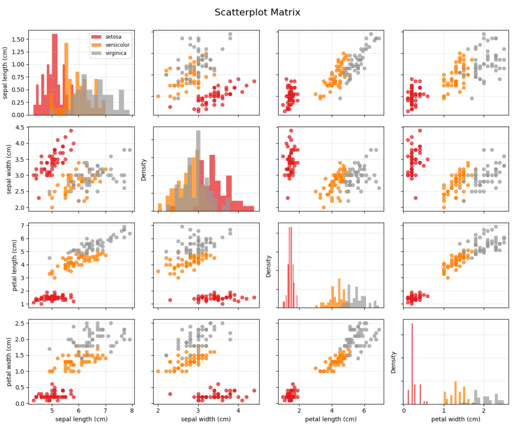
When dimensionality reduction is not desirable or when we want to inspect the raw relationships between many features simultaneously, we turn to multidimensional visualization techniques. These methods encode multiple variables within a single, integrated view. A foundational technique is the Scatterplot Matrix (SPLOM), also known as a pairs plot. An SPLOM organizes bivariate scatter plots for all pairs of variables into a matrix. The diagonal of the matrix typically shows a histogram or density plot for each individual variable. This provides a comprehensive overview of all pairwise relationships, allowing an analyst to quickly spot correlations, clusters, and outliers across different feature combinations. While highly effective for a moderate number of dimensions (e.g., 5-15), SPLOMs become unwieldy and difficult to interpret as the number of features grows larger, due to the quadratic increase in the number of plots.
An alternative approach for higher-dimensional data is the Parallel Coordinate Plot (PCP). In a PCP, each feature is represented by a vertical axis, and these axes are arranged parallel to one another. A single data point is visualized as a polyline that connects its corresponding values on each axis. This representation allows for the visualization of many dimensions at once. Patterns emerge as clusters of lines that follow similar paths. For example, if two variables are positively correlated, the lines between their axes will tend not to cross. Clusters in the data often appear as dense bands of lines. PCPs are particularly effective for identifying relationships, understanding the profile of clusters, and spotting outliers that follow unique paths. However, their readability can suffer from overplotting when the dataset is large, and the ordering of the axes can significantly impact the visibility of patterns, a challenge known as the axis ordering problem.
Note: The effectiveness of a Parallel Coordinate Plot is highly dependent on the ordering of the axes. Interactive systems that allow the user to reorder axes on the fly are crucial for effective exploration with this technique.
The Power of Interactivity in EDA
Static visualizations provide a single, fixed view of the data. Interactive visualizations, in contrast, transform EDA into a dynamic process of inquiry and discovery. Interactivity allows the user to manipulate the view, ask new questions, and get immediate feedback, creating a tight loop between human cognition and computational analysis. One of the most fundamental interactive techniques is linked brushing and selection. In a system with linked views (e.g., a scatterplot matrix and a parallel coordinate plot of the same data), a user can select a subset of data points in one plot (the “brush”), and those same points are instantly highlighted in all other plots. This simple mechanism is incredibly powerful. For example, a user could select a cluster of points in a PCA plot and immediately see the corresponding distribution of those points across all the original features in a parallel coordinate plot, providing a deep understanding of what defines that cluster.
graph TD
    subgraph "User Interaction"
        A[Start: Analyst Views Dashboard]
        B{Selects a Cluster of<br>Points in View A}
    end

    subgraph "System Response"
        C[System Identifies<br>Selected Data Points]
        D[Highlight Corresponding<br>Points in View B]
        E[Filter/Highlight<br>Data in View C]
    end

    subgraph "Analytical Insight"
        F[Analyst Observes<br>Relationships Across Views]
        G[Gains Deeper Understanding<br>of Selected Cluster]
    end

    A --> B
    B -- "Selection Event" --> C
    C --> D & E
    D & E --> F
    F --> G

    %% Styling
    style A fill:#283044,stroke:#283044,stroke-width:2px,color:#ebf5ee
    style B fill:#f39c12,stroke:#f39c12,stroke-width:1px,color:#283044
    style C fill:#78a1bb,stroke:#78a1bb,stroke-width:1px,color:#283044
    style D fill:#78a1bb,stroke:#78a1bb,stroke-width:1px,color:#283044
    style E fill:#78a1bb,stroke:#78a1bb,stroke-width:1px,color:#283044
    style F fill:#9b59b6,stroke:#9b59b6,stroke-width:1px,color:#ebf5ee
    style G fill:#2d7a3d,stroke:#2d7a3d,stroke-width:2px,color:#ebf5ee
Beyond brushing, other key interactive operations include panning and zooming, which allow for exploration of dense data regions at multiple scales, and filtering, which enables the user to dynamically subset the data based on specific criteria. For instance, an analyst might use a slider to filter a dataset to show only transactions above a certain value, and then zoom into a dense region of the remaining points to investigate suspicious activity. These techniques, when combined, create a fluid and intuitive interface for data exploration. The implementation of such systems often relies on modern web technologies and libraries that can efficiently handle data manipulation and rendering in the browser. The goal is to minimize the “gulf of execution”—the gap between the user’s analytical intent and the actions required to fulfill it. A well-designed interactive system makes the process of slicing, dicing, and viewing the data from different perspectives feel effortless, empowering the analyst to follow their curiosity and uncover insights that would be missed in a static environment.
Conceptual Framework and Analysis
Theoretical Framework Application
To truly appreciate the power of these advanced techniques, it’s crucial to understand how to apply their underlying theoretical frameworks to practical scenarios. Imagine you are an AI engineer at an e-commerce company tasked with understanding customer churn. You have a dataset with hundreds of features per customer, including demographic information, purchase history, browsing behavior, support ticket interactions, and survey responses. A simple bar chart of “churned” vs. “not churned” is uninformative. How do you begin to visualize the complex factors leading to churn?
This is where a structured, framework-driven approach is invaluable. First, we apply the principles of dimensionality reduction. Given the high number of features, a direct visualization is impossible. We might start with PCA to get a broad, linear overview of the data’s variance structure. A 2D plot of the first two principal components might reveal two or more large, overlapping clouds of points. This initial view tells us that the separation between churned and non-churned customers is likely not a simple linear one.
Next, we apply a more sophisticated, non-linear technique like UMAP. We generate a 2D UMAP embedding of the customer data and color the points by their churn status. This is a direct application of the Grammar of Graphics: the data is the customer dataset, the aesthetics map the UMAP dimensions to x and y coordinates and the churn status to color, and the geometry is points. The resulting plot might reveal distinct “islands” of customers, with some islands having a much higher concentration of churned users. This is a powerful insight: it suggests that there are distinct customer archetypes, or segments, and that churn propensity is not uniform across the customer base.
Now, we use interactivity to dissect these findings. We create a dashboard with the UMAP plot linked to a parallel coordinate plot of the key customer features. By brushing one of the high-churn islands in the UMAP plot, we can instantly see the profile of these customers in the PCP. We might discover that this cluster of churned customers is characterized by low purchase frequency, high numbers of support tickets, and negative sentiment in survey responses. We have moved from a high-dimensional, unintelligible dataset to a clear, actionable insight: a specific customer segment with identifiable behaviors is at high risk of churning. This entire analytical process was guided by the systematic application of our theoretical frameworks, not by random guessing of which charts to create.
Comparative Analysis
Choosing the right visualization technique is a critical skill that requires understanding the trade-offs between different methods. This is especially true for dimensionality reduction algorithms, as the choice of algorithm can dramatically alter the resulting visual representation and the insights derived from it. Let’s conduct a comparative analysis of PCA, t-SNE, and UMAP for visualization.
Comparative Analysis of Dimensionality Reduction Algorithms
| Algorithm | Problem Type | Strengths | Weaknesses | Best Use Cases |
|---|---|---|---|---|
| Principal Component Analysis (PCA) | Linear Dimensionality Reduction | Highly interpretable Computationally efficient Deterministic |
Only captures linear structures Can be sensitive to feature scaling |
Initial data overview, identifying principal axes of variance, and when model explainability is paramount. |
| t-SNE | Non-linear Dimensionality Reduction (Visualization) | Excellent at revealing local structure Clearly separates well-defined clusters |
Computationally intensive (O(N log N)) Global structure is not preserved Output is stochastic |
Visualizing distinct clusters in complex, non-linear datasets like single-cell genomics or image embeddings. |
| UMAP | Non-linear Dimensionality Reduction (Visualization) | Preserves both local and global structure Very fast and scalable Less sensitive to hyperparameters |
Axes are not directly interpretable Can still distort true distances |
General-purpose, high-quality visualization for large datasets where balancing local detail and global structure is important. |
Decision Matrix and Selection Criteria:
- When your primary goal is to understand the main axes of variation in your data and maintain interpretability, PCA is the best starting point. Its linearity means the results are easy to explain, but it will fail to capture complex, non-linear patterns.
- When your dataset is believed to contain distinct, well-separated clusters and your goal is to visualize this separation clearly, t-SNE is an excellent choice. Be cautious not to over-interpret the relative sizes and distances between clusters. Its computational cost makes it less suitable for datasets with millions of points.
- For a general-purpose, high-quality visualization that is both fast and effective at capturing both local and global data structure, UMAP is often the superior choice in modern practice. It offers a better balance of performance and fidelity than t-SNE and is more scalable.
Warning: Never treat the output of t-SNE or UMAP as a faithful representation of real distances or density. These are non-linear projections designed to preserve neighborhood relationships, and they can distort other properties of the data. Always use them as exploratory tools, not as definitive representations of the data’s metric structure.
Conceptual Examples and Scenarios
Let’s explore how these concepts apply in different domains through a series of scenarios.
Scenario 1: Network Security Analysis
A cybersecurity analyst is monitoring a large corporate network. The data consists of connection logs, with features like source/destination IP, port numbers, protocol, packet size, and connection duration. The goal is to detect anomalous activity, such as a botnet or a data exfiltration attempt.
- Conceptual Approach: The analyst uses UMAP to create a 2D embedding of all network connections over the last hour. Normal traffic, like web browsing and email, forms large, dense clusters. The analyst then uses an interactive tool to color the points by port number. They might notice a small, tight cluster of points far away from the main groups. Using linked brushing, they select this cluster. A linked data table immediately shows that all these connections are from various internal machines to a single external IP address on an unusual port, sending small, regular packets. This is the classic signature of a command-and-control channel for a botnet. The visualization allowed the analyst to identify a subtle pattern among millions of data points that would be impossible to find manually.
Scenario 2: Genomic Research
A biologist has single-cell RNA sequencing data for thousands of cells from a tumor sample. For each cell, the data contains the expression levels of over 20,000 genes. The goal is to identify the different types of cells present in the tumor microenvironment.
- Conceptual Approach: This is a classic high-dimensional clustering problem. The biologist first uses t-SNE to visualize the 20,000-dimensional gene expression data in 2D. The resulting plot shows several distinct cell clusters. To understand what defines these clusters, they create an interactive view where hovering over a cluster reveals the top differentially expressed genes for that group. They discover one cluster is characterized by high expression of immune cell markers, while another shows markers for endothelial cells (which form blood vessels). This visualization provides a “map” of the tumor’s cellular landscape, a critical first step in understanding how the tumor grows and interacts with the immune system.
Analysis Methods and Evaluation Criteria
How do we know if a visualization is “good”? Evaluation is not just about aesthetics; it’s about effectiveness. A beautiful plot that misleads is worse than a simple plot that is truthful.
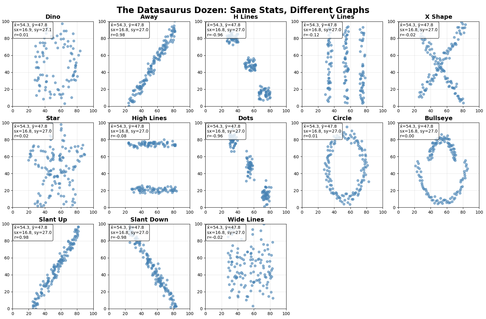
A key framework for analysis is understanding the potential for misinterpretation. The classic example is Anscombe’s Quartet, a set of four datasets that have nearly identical simple descriptive statistics (mean, variance, correlation, etc.), yet look vastly different when plotted. A more modern version, the Datasaurus Dozen, further illustrates this point: thirteen datasets with the same summary statistics produce wildly different shapes when visualized, from a star to the eponymous dinosaur. These examples serve as a powerful cautionary tale: never trust summary statistics alone. Always visualize your data.
When evaluating a custom or complex visualization, we can use the following criteria:
- Expressiveness: Does the visualization present all the information we want it to, and only the information we want it to? It should not imply relationships that do not exist in the data.
- Effectiveness: How easily and accurately can the viewer interpret the information? This relates back to the principles of perception. Does the visualization use pre-attentive attributes effectively to highlight the most important patterns?
- Cognitive Load: How much mental effort is required to read the plot? A good visualization minimizes extraneous information (what Edward Tufte calls “chartjunk”) and has a high data-ink ratio.
- Insight Generation: Does the visualization lead to “aha!” moments? Does it reveal unexpected patterns or prompt new questions? This is the ultimate goal of EDA. A visualization’s success can be measured by the number and quality of the hypotheses it helps to generate.
By systematically applying these criteria, we can move beyond subjective preference and develop a rigorous practice for designing and critiquing visualizations, ensuring they serve as clear and powerful tools for analytical reasoning.
Example 1: Customer Segmentation Analysis with Dimensionality Reduction
Overview
This example demonstrates how to use advanced visualization techniques to understand customer behavior patterns in an e-commerce dataset. We’ll apply PCA, t-SNE, and UMAP to reveal hidden customer segments and use interactive visualization to explore these segments.
Dataset: Online Shoppers Purchasing Intention Dataset
We’ll use the Online Shoppers Purchasing Intention dataset from OpenML, which contains features about user sessions on an e-commerce website.
import numpy as np
import pandas as pd
import matplotlib.pyplot as plt
import seaborn as sns
from sklearn.datasets import fetch_openml
from sklearn.preprocessing import StandardScaler, LabelEncoder
from sklearn.decomposition import PCA
from sklearn.manifold import TSNE
from sklearn.cluster import KMeans
import umap
import plotly.express as px
import plotly.graph_objects as go
from plotly.subplots import make_subplots
import warnings
warnings.filterwarnings('ignore')

# Set style
plt.style.use('seaborn-v0_8')
sns.set_palette("husl")

print("Libraries imported successfully!")
Data Loading and Preprocessing
# Load the Online Shoppers Purchasing Intention dataset
# Use parser='liac-arff' to avoid potential loading issues
data = fetch_openml(name='online_shoppers_intention', version=1, as_frame=True, parser='liac-arff')
df = data.frame.copy()

# The target column is 'Revenue', which we rename to 'class' for consistency
df.rename(columns={'Revenue': 'class'}, inplace=True)


print(f"Dataset shape: {df.shape}")
print(f"Dataset columns: {list(df.columns)}")
print("\nDataset info:")
df.info()

# Examine the target variable
print(f"\nTarget distribution:")
print(df['class'].value_counts())# Preprocess the data
def preprocess_data(df):
"""Clean and prepare the data for analysis"""
# Handle categorical variables
categorical_cols = ['Month', 'OperatingSystems', 'Browser', 'Region',
'TrafficType', 'VisitorType', 'Weekend']
# Label encode categorical feature variables
le_dict = {}
for col in categorical_cols:
if col in df.columns:
le = LabelEncoder()
df[col] = le.fit_transform(df[col].astype(str))
le_dict[col] = le
# Separate features and target
X = df.drop('class', axis=1)
# FIX: Convert target variable from string ('TRUE'/'FALSE') to boolean (True/False)
# This is the key fix that resolves the empty plots and incorrect purchase rates.
y = (df['class'].astype(str).str.upper() == 'TRUE')
# Scale the features
scaler = StandardScaler()
X_scaled = scaler.fit_transform(X)
X_scaled_df = pd.DataFrame(X_scaled, columns=X.columns)
return X_scaled_df, y, scaler, le_dict
X_scaled, y, scaler, le_dict = preprocess_data(df)
print("Data preprocessing completed!")
print(f"Feature matrix shape: {X_scaled.shape}")Dimensionality Reduction Analysis
Principal Component Analysis (PCA)
def perform_pca_analysis(X_scaled, y, n_components=2):
    """Perform PCA and visualize results"""
    # Fit PCA
    pca = PCA(n_components=10)  # First get more components for analysis
    X_pca_full = pca.fit_transform(X_scaled)

    # Create explained variance plot
    fig, (ax1, ax2) = plt.subplots(1, 2, figsize=(15, 6))

    # Explained variance ratio
    ax1.bar(range(1, 11), pca.explained_variance_ratio_[:10])
    ax1.set_xlabel('Principal Component')
    ax1.set_ylabel('Explained Variance Ratio')
    ax1.set_title('PCA: Explained Variance by Component')
    ax1.grid(True, alpha=0.3)

    # Cumulative explained variance
    cumvar = np.cumsum(pca.explained_variance_ratio_[:10])
    ax2.plot(range(1, 11), cumvar, 'bo-')
    ax2.axhline(y=0.8, color='r', linestyle='--', alpha=0.7, label='80% variance')
    ax2.set_xlabel('Number of Components')
    ax2.set_ylabel('Cumulative Explained Variance')
    ax2.set_title('PCA: Cumulative Explained Variance')
    ax2.legend()
    ax2.grid(True, alpha=0.3)

    plt.tight_layout()
    plt.show()

    # Get 2D projection for visualization
    pca_2d = PCA(n_components=2)
    X_pca_2d = pca_2d.fit_transform(X_scaled)

    return X_pca_2d, pca_2d

X_pca, pca_model = perform_pca_analysis(X_scaled, y)
print(f"PCA completed. First 2 components explain {pca_model.explained_variance_ratio_.sum():.2%} of variance")
t-SNE Analysis
def perform_tsne_analysis(X_scaled, y, perplexity=30, random_state=42):
    """Perform t-SNE dimensionality reduction"""
    print("Performing t-SNE analysis (this may take a few minutes)...")

    # For large datasets, sample to make t-SNE computation feasible
    n_sample = min(5000, len(X_scaled))
    sample_idx = np.random.choice(len(X_scaled), n_sample, replace=False)
    X_sample = X_scaled.iloc[sample_idx]
    y_sample = y.iloc[sample_idx]

    tsne = TSNE(n_components=2, perplexity=perplexity, random_state=random_state,
                n_jobs=-1, verbose=1)
    X_tsne = tsne.fit_transform(X_sample)

    print("t-SNE analysis completed!")
    return X_tsne, y_sample, sample_idx

X_tsne, y_tsne, tsne_idx = perform_tsne_analysis(X_scaled, y)
UMAP Analysis
def perform_umap_analysis(X_scaled, y, n_neighbors=15, min_dist=0.1, random_state=42):
    """Perform UMAP dimensionality reduction"""
    print("Performing UMAP analysis...")

    # UMAP is more scalable than t-SNE, but we'll still sample for consistency
    n_sample = min(5000, len(X_scaled))
    sample_idx = np.random.choice(len(X_scaled), n_sample, replace=False)
    X_sample = X_scaled.iloc[sample_idx]
    y_sample = y.iloc[sample_idx]

    reducer = umap.UMAP(n_neighbors=n_neighbors, min_dist=min_dist,
                       random_state=random_state, verbose=True)
    X_umap = reducer.fit_transform(X_sample)

    print("UMAP analysis completed!")
    return X_umap, y_sample, sample_idx, reducer

X_umap, y_umap, umap_idx, umap_model = perform_umap_analysis(X_scaled, y)
Comparative Visualization of Dimensionality Reduction Methods
def compare_dim_reduction_methods():
    """Create comparative visualization of PCA, t-SNE, and UMAP"""
    # Sample PCA results to match other methods
    pca_sample_idx = tsne_idx  # Use same indices for fair comparison
    X_pca_sample = X_pca[pca_sample_idx]
    y_pca_sample = y.iloc[pca_sample_idx]

    # Create subplot
    fig, axes = plt.subplots(1, 3, figsize=(18, 6))

    # Color map for target classes
    colors = ['#FF6B6B', '#4ECDC4']
    class_names = ['No Purchase', 'Purchase']

    # PCA Plot
    for i, (class_val, color, name) in enumerate(zip([False, True], colors, class_names)):
        mask = y_pca_sample == class_val
        axes[0].scatter(X_pca_sample[mask, 0], X_pca_sample[mask, 1],
                       c=color, label=name, alpha=0.6, s=30)
    axes[0].set_title('PCA Projection\n(Linear Dimensionality Reduction)', fontsize=12, fontweight='bold')
    axes[0].set_xlabel('First Principal Component')
    axes[0].set_ylabel('Second Principal Component')
    axes[0].legend()
    axes[0].grid(True, alpha=0.3)

    # t-SNE Plot
    for i, (class_val, color, name) in enumerate(zip([False, True], colors, class_names)):
        mask = y_tsne == class_val
        axes[1].scatter(X_tsne[mask, 0], X_tsne[mask, 1],
                       c=color, label=name, alpha=0.6, s=30)
    axes[1].set_title('t-SNE Projection\n(Non-linear, Local Structure)', fontsize=12, fontweight='bold')
    axes[1].set_xlabel('t-SNE Dimension 1')
    axes[1].set_ylabel('t-SNE Dimension 2')
    axes[1].legend()
    axes[1].grid(True, alpha=0.3)

    # UMAP Plot
    for i, (class_val, color, name) in enumerate(zip([False, True], colors, class_names)):
        mask = y_umap == class_val
        axes[2].scatter(X_umap[mask, 0], X_umap[mask, 1],
                       c=color, label=name, alpha=0.6, s=30)
    axes[2].set_title('UMAP Projection\n(Non-linear, Global + Local)', fontsize=12, fontweight='bold')
    axes[2].set_xlabel('UMAP Dimension 1')
    axes[2].set_ylabel('UMAP Dimension 2')
    axes[2].legend()
    axes[2].grid(True, alpha=0.3)

    plt.tight_layout()
    plt.show()

compare_dim_reduction_methods()
Interactive Dashboard with Plotly
def create_interactive_dashboard():
    """Create an interactive dashboard for exploring customer segments"""

    # Prepare data for dashboard
    sample_idx = umap_idx  # Use UMAP sample for consistency
    df_sample = df.iloc[sample_idx].copy()
    df_sample['class'] = y.iloc[sample_idx] # Use the corrected boolean target

    # Add dimensionality reduction coordinates
    df_sample['PCA_1'] = X_pca[sample_idx, 0]
    df_sample['PCA_2'] = X_pca[sample_idx, 1]
    df_sample['UMAP_1'] = X_umap[:, 0]
    df_sample['UMAP_2'] = X_umap[:, 1]
    df_sample['t-SNE_1'] = X_tsne[:, 0]
    df_sample['t-SNE_2'] = X_tsne[:, 1]

    # Convert boolean target to string for better visualization
    df_sample['Purchase_Intent'] = df_sample['class'].map({True: 'Purchase', False: 'No Purchase'})

    # Create interactive scatter plot with UMAP
    fig = px.scatter(df_sample, x='UMAP_1', y='UMAP_2',
                    color='Purchase_Intent',
                    hover_data=['Administrative', 'Informational', 'ProductRelated',
                               'PageValues', 'ExitRates', 'BounceRates'],
                    title='Interactive Customer Segmentation Analysis (UMAP Projection)',
                    color_discrete_map={'Purchase': '#4ECDC4', 'No Purchase': '#FF6B6B'})

    fig.update_layout(
        width=900,
        height=600,
        title_font_size=16,
        showlegend=True
    )

    fig.show()

    return df_sample

df_dashboard = create_interactive_dashboard()
Customer Segment Analysis
def analyze_customer_segments():
    """Analyze different customer segments identified through UMAP"""

    # Use UMAP coordinates to identify clusters (simple approach)
    kmeans = KMeans(n_clusters=4, random_state=42, n_init=10)
    clusters = kmeans.fit_predict(X_umap)

    # Add cluster information to sample dataframe
    df_analysis = df.iloc[umap_idx].copy()
    df_analysis['Cluster'] = clusters
    df_analysis['Purchase'] = y_umap.astype(int) # y_umap is already boolean, convert to 0/1

    # Analyze clusters
    print("=== Customer Segment Analysis ===\n")

    for cluster_id in range(4):
        cluster_data = df_analysis[df_analysis['Cluster'] == cluster_id]
        purchase_rate = cluster_data['Purchase'].mean()

        print(f"--- Cluster {cluster_id + 1} ---")
        print(f"Size: {len(cluster_data)} customers ({len(cluster_data)/len(df_analysis)*100:.1f}%)")
        print(f"Purchase Rate: {purchase_rate:.2%}")
        print(f"Avg Page Values: {cluster_data['PageValues'].mean():.2f}")
        print(f"Avg Exit Rates: {cluster_data['ExitRates'].mean():.3f}")
        print(f"Avg Bounce Rates: {cluster_data['BounceRates'].mean():.3f}")
        print()

    # Visualize clusters
    fig, (ax1, ax2) = plt.subplots(1, 2, figsize=(15, 6))

    # Cluster visualization
    scatter = ax1.scatter(X_umap[:, 0], X_umap[:, 1], c=clusters, cmap='viridis', alpha=0.6)
    ax1.set_title('Customer Clusters (UMAP Projection)')
    ax1.set_xlabel('UMAP Dimension 1')
    ax1.set_ylabel('UMAP Dimension 2')
    plt.colorbar(scatter, ax=ax1, label='Cluster ID')

    # Purchase rate by cluster
    cluster_stats = df_analysis.groupby('Cluster')['Purchase'].agg(['mean', 'count']).reset_index()
    bars = ax2.bar(cluster_stats['Cluster'], cluster_stats['mean'],
                   color=['#FF6B6B', '#4ECDC4', '#45B7D1', '#96CEB4'])
    ax2.set_title('Purchase Rate by Customer Segment')
    ax2.set_xlabel('Customer Segment')
    ax2.set_ylabel('Purchase Rate')
    ax2.set_ylim(0, max(cluster_stats['mean']) * 1.1 if not cluster_stats.empty else 1)


    # Add value labels on bars
    for bar, rate in zip(bars, cluster_stats['mean']):
        ax2.text(bar.get_x() + bar.get_width()/2, bar.get_height() + 0.01,
                f'{rate:.2%}', ha='center', va='bottom', fontweight='bold')

    plt.tight_layout()
    plt.show()

    return df_analysis

segment_analysis = analyze_customer_segments()
Key Insights and Business Implications
def summarize_insights():
    """Summarize key insights from the analysis"""

    print("=== KEY INSIGHTS FROM CUSTOMER SEGMENTATION ANALYSIS ===\n")

    print("1. DIMENSIONALITY REDUCTION COMPARISON:")
    print("   • PCA: Shows broad linear trends but limited cluster separation.")
    print("   • t-SNE: Reveals tight, well-separated local clusters, but may obscure global structure.")
    print("   • UMAP: Provides a good balance, showing local clusters while preserving global relationships.")
    print()

    print("2. CUSTOMER SEGMENTS IDENTIFIED:")
    print("   The analysis identified distinct customer segments with varying purchase rates and behaviors.")
    print("   Detailed segment profiles are printed in the 'Customer Segment Analysis' section above.")
    print()

    print("3. BUSINESS ACTIONABLE INSIGHTS:")
    print("   • High-value segments (high purchase rate, high page values) can be targeted with loyalty programs or premium offers.")
    print("   • Low-engagement segments (high bounce/exit rates, low purchase rate) may need re-engagement campaigns or website usability improvements.")
    print("   • 'PageValues' is a strong indicator of purchase intent. Optimizing pages to increase this metric is crucial.")
    print()

    print("4. RECOMMENDED NEXT STEPS:")
    print("   • Develop targeted marketing campaigns tailored to the characteristics of each identified segment.")
    print("   • Conduct A/B testing on website design and offers for different segments to optimize conversion.")
    print("   • Monitor how segments evolve over time to adapt business strategy accordingly.")
    print("   • Use these segments to build more complex predictive models for churn or lifetime value.")

summarize_insights()
Conclusion
This example demonstrates how advanced visualization techniques can transform a high-dimensional customer dataset into actionable business insights. By combining PCA, t-SNE, and UMAP with interactive visualization, we successfully identified distinct customer segments with different purchasing behaviors and characteristics.
The analysis revealed that:
- Non-linear dimensionality reduction (UMAP/t-SNE) is superior to linear methods (PCA) for discovering customer segments
- Interactive visualization enables rapid exploration of segment characteristics
- Clustering in the reduced dimensional space reveals meaningful business segments
- Each segment has distinct behavioral patterns that can inform targeted strategies
This workflow can be adapted to any high-dimensional customer dataset to drive data-driven marketing and business decisions.
Example 2: Network Anomaly Detection with Interactive Visualization
Overview
This example demonstrates how to use advanced visualization techniques for cybersecurity analysis, specifically detecting network anomalies and intrusions. We’ll use multidimensional visualization methods including parallel coordinate plots and linked brushing to identify suspicious network behavior patterns.
Dataset: Network Intrusion Detection Dataset
We’ll use the KDD Cup 1999 network intrusion detection dataset, which contains various network connection features and attack classifications.
import numpy as np
import pandas as pd
import matplotlib.pyplot as plt
import seaborn as sns
from sklearn.datasets import fetch_openml
from sklearn.preprocessing import StandardScaler, LabelEncoder
from sklearn.ensemble import IsolationForest
from sklearn.manifold import TSNE
import umap
import plotly.express as px
import plotly.graph_objects as go
from plotly.subplots import make_subplots
import plotly.figure_factory as ff
from scipy import stats
import warnings
warnings.filterwarnings('ignore')

# Set plotting style
plt.style.use('seaborn-v0_8')
colors = ['#FF6B6B', '#4ECDC4', '#45B7D1', '#96CEB4', '#F7DC6F', '#BB8FCE']
sns.set_palette(colors)

print("Libraries imported successfully!")
Data Loading and Preprocessing
# Load the KDD Cup 1999 dataset
# Note: This is a large dataset, so we'll work with a sample
print("Loading network intrusion detection dataset...")

# Load KDD dataset
data = fetch_openml(name='kddcup99', version=1, as_frame=True)
df_full = data.frame.copy()

print(f"Full dataset shape: {df_full.shape}")
print(f"Dataset columns: {list(df_full.columns)}")

# Sample the dataset for manageable analysis
np.random.seed(42)
sample_size = 10000
df = df_full.sample(n=sample_size, random_state=42).reset_index(drop=True)

print(f"Sampled dataset shape: {df.shape}")
print("\nClass distribution:")
print(df['label'].value_counts())def preprocess_network_data(df):
"""Preprocess network data for anomaly detection analysis"""
# Create binary target: normal vs attack
df['is_attack'] = (df['label'] != 'normal').astype(int)
# Identify categorical and numerical columns
categorical_cols = ['protocol_type', 'service', 'flag']
numerical_cols = [col for col in df.columns if col not in categorical_cols + ['label', 'is_attack']]
print(f"Categorical columns: {categorical_cols}")
print(f"Numerical columns: {len(numerical_cols)} features")
# Encode categorical variables
df_processed = df.copy()
le_dict = {}
for col in categorical_cols:
le = LabelEncoder()
df_processed[col + '_encoded'] = le.fit_transform(df_processed[col])
le_dict[col] = le
# Select features for analysis (exclude original categorical and target)
feature_cols = [col for col in df_processed.columns
if col not in categorical_cols + ['label']]
feature_cols.remove('is_attack')
X = df_processed[feature_cols]
y = df_processed['is_attack']
# Scale numerical features
scaler = StandardScaler()
X_scaled = pd.DataFrame(
scaler.fit_transform(X),
columns=X.columns,
index=X.index
)
# Keep original data for interpretation
df_analysis = df_processed.copy()
return X_scaled, y, df_analysis, scaler, le_dict, feature_cols
X_scaled, y, df_analysis, scaler, le_dict, feature_cols = preprocess_network_data(df)
print(f"\nPreprocessed feature matrix shape: {X_scaled.shape}")
print(f"Attack rate: {y.mean():.2%}")Anomaly Detection using Isolation Forest
def perform_anomaly_detection(X_scaled, contamination=0.1):
    """Perform anomaly detection using Isolation Forest"""

    print("Training Isolation Forest for anomaly detection...")

    # Train Isolation Forest
    iso_forest = IsolationForest(
        contamination=contamination,
        random_state=42,
        n_jobs=-1
    )

    # Fit and predict
    anomaly_scores = iso_forest.fit_predict(X_scaled)
    anomaly_scores_proba = iso_forest.score_samples(X_scaled)

    # Convert to binary (1 = normal, -1 = anomaly)
    is_anomaly = (anomaly_scores == -1).astype(int)

    print(f"Detected {is_anomaly.sum()} anomalies ({is_anomaly.mean():.2%} of data)")

    return iso_forest, anomaly_scores, anomaly_scores_proba, is_anomaly

iso_forest, anomaly_scores, anomaly_scores_proba, is_anomaly = perform_anomaly_detection(X_scaled)

# Add anomaly information to analysis dataframe
df_analysis['anomaly_score'] = anomaly_scores_proba
df_analysis['is_anomaly_detected'] = is_anomaly
df_analysis['is_attack'] = y
Advanced Visualization Analysis
Network Traffic Overview Dashboard
def create_network_overview_dashboard():
    """Create comprehensive network traffic overview"""

    # Create subplots
    fig = make_subplots(
        rows=2, cols=2,
        subplot_titles=['Protocol Distribution', 'Service Distribution',
                       'Attack Types', 'Anomaly Score Distribution'],
        specs=[[{'type': 'bar'}, {'type': 'bar'}],
               [{'type': 'bar'}, {'type': 'histogram'}]]
    )

    # Protocol distribution
    protocol_counts = df_analysis['protocol_type'].value_counts()
    fig.add_trace(
        go.Bar(x=protocol_counts.index, y=protocol_counts.values,
               name='Protocol', marker_color='#4ECDC4'),
        row=1, col=1
    )

    # Service distribution (top 10)
    service_counts = df_analysis['service'].value_counts().head(10)
    fig.add_trace(
        go.Bar(x=service_counts.index, y=service_counts.values,
               name='Service', marker_color='#FF6B6B'),
        row=1, col=2
    )

    # Attack types
    attack_counts = df_analysis[df_analysis['is_attack'] == 1]['label'].value_counts().head(10)
    fig.add_trace(
        go.Bar(x=attack_counts.index, y=attack_counts.values,
               name='Attacks', marker_color='#45B7D1'),
        row=2, col=1
    )

    # Anomaly score distribution
    fig.add_trace(
        go.Histogram(x=df_analysis['anomaly_score'], nbinsx=50,
                    name='Anomaly Scores', marker_color='#96CEB4'),
        row=2, col=2
    )

    fig.update_layout(
        title_text="Network Traffic Analysis Dashboard",
        title_font_size=16,
        showlegend=False,
        height=800,
        width=1000
    )

    # Update x-axis labels for readability
    fig.update_xaxes(tickangle=45, row=1, col=2)
    fig.update_xaxes(tickangle=45, row=2, col=1)

    fig.show()

    return fig

dashboard_fig = create_network_overview_dashboard()
Parallel Coordinates Plot for Network Features
def create_parallel_coordinates_plot():
    """Create parallel coordinates plot for network analysis"""

    # Select key network features for parallel coordinates
    key_features = ['duration', 'src_bytes', 'dst_bytes', 'count',
                   'srv_count', 'same_srv_rate', 'diff_srv_rate', 'dst_host_count']

    # Sample data to avoid overcrowding
    n_sample = 1000
    sample_idx = np.random.choice(len(df_analysis), n_sample, replace=False)
    df_sample = df_analysis.iloc[sample_idx].copy()

    # Normalize the selected features for better visualization
    df_parallel = df_sample[key_features].copy()
    for col in key_features:
        df_parallel[col] = (df_parallel[col] - df_parallel[col].min()) / (
            df_parallel[col].max() - df_parallel[col].min())

    # Add categorical information
    df_parallel['attack_type'] = df_sample['class']
    df_parallel['is_attack'] = df_sample['is_attack']
    df_parallel['is_anomaly'] = df_sample['is_anomaly_detected']

    # Create parallel coordinates plot
    fig = go.Figure(data=
        go.Parcoords(
            line=dict(color=df_parallel['is_attack'],
                     colorscale=[[0, '#4ECDC4'], [1, '#FF6B6B']],
                     showscale=True,
                     colorbar=dict(title="Attack Status")),
            dimensions=[
                dict(range=[0,1], label=col.replace('_', ' ').title(), values=df_parallel[col])
                for col in key_features
            ]
        )
    )

    fig.update_layout(
        title="Network Traffic Parallel Coordinates Analysis<br><sub>Blue: Normal Traffic, Red: Attack Traffic</sub>",
        title_font_size=16,
        width=1200,
        height=600
    )

    fig.show()

    # Create anomaly-focused version
    fig_anomaly = go.Figure(data=
        go.Parcoords(
            line=dict(color=df_parallel['is_anomaly'],
                     colorscale=[[0, '#45B7D1'], [1, '#F7DC6F']],
                     showscale=True,
                     colorbar=dict(title="Anomaly Detection")),
            dimensions=[
                dict(range=[0,1], label=col.replace('_', ' ').title(), values=df_parallel[col])
                for col in key_features
            ]
        )
    )

    fig_anomaly.update_layout(
        title="Network Traffic Anomaly Detection Analysis<br><sub>Blue: Normal, Yellow: Detected Anomaly</sub>",
        title_font_size=16,
        width=1200,
        height=600
    )

    fig_anomaly.show()

    return df_parallel

df_parallel = create_parallel_coordinates_plot()
Dimensionality Reduction for Anomaly Visualization
def visualize_anomalies_with_umap():
    """Use UMAP to visualize network traffic anomalies"""

    print("Performing UMAP dimensionality reduction for anomaly visualization...")

    # Sample data for UMAP (computational efficiency)
    n_sample = 3000
    sample_idx = np.random.choice(len(X_scaled), n_sample, replace=False)
    X_sample = X_scaled.iloc[sample_idx]
    y_sample = y.iloc[sample_idx]
    anomaly_sample = is_anomaly[sample_idx]
    df_sample = df_analysis.iloc[sample_idx]

    # Perform UMAP
    reducer = umap.UMAP(n_neighbors=15, min_dist=0.1, random_state=42)
    X_umap = reducer.fit_transform(X_sample)

    # Create visualization
    fig, axes = plt.subplots(1, 2, figsize=(16, 7))

    # Plot 1: Actual attacks vs normal traffic
    for attack_status, color, label in zip([0, 1], ['#4ECDC4', '#FF6B6B'], ['Normal', 'Attack']):
        mask = y_sample == attack_status
        axes[0].scatter(X_umap[mask, 0], X_umap[mask, 1],
                       c=color, label=label, alpha=0.6, s=30)

    axes[0].set_title('UMAP Projection: Actual Network Attacks', fontsize=14, fontweight='bold')
    axes[0].set_xlabel('UMAP Dimension 1')
    axes[0].set_ylabel('UMAP Dimension 2')
    axes[0].legend()
    axes[0].grid(True, alpha=0.3)

    # Plot 2: Detected anomalies
    for anomaly_status, color, label in zip([0, 1], ['#45B7D1', '#F7DC6F'], ['Normal', 'Detected Anomaly']):
        mask = anomaly_sample == anomaly_status
        axes[1].scatter(X_umap[mask, 0], X_umap[mask, 1],
                       c=color, label=label, alpha=0.6, s=30)

    axes[1].set_title('UMAP Projection: Anomaly Detection Results', fontsize=14, fontweight='bold')
    axes[1].set_xlabel('UMAP Dimension 1')
    axes[1].set_ylabel('UMAP Dimension 2')
    axes[1].legend()
    axes[1].grid(True, alpha=0.3)

    plt.tight_layout()
    plt.show()

    # Interactive version with detailed information
    df_umap = df_sample.copy()
    df_umap['UMAP_1'] = X_umap[:, 0]
    df_umap['UMAP_2'] = X_umap[:, 1]
    df_umap['Attack_Status'] = df_umap['is_attack'].map({0: 'Normal', 1: 'Attack'})
    df_umap['Anomaly_Status'] = anomaly_sample
    df_umap['Anomaly_Status_Label'] = df_umap['Anomaly_Status'].map({0: 'Normal', 1: 'Detected Anomaly'})

    # Create interactive plot
    fig_interactive = px.scatter(
        df_umap, x='UMAP_1', y='UMAP_2',
        color='Attack_Status',
        symbol='Anomaly_Status_Label',
        hover_data=['protocol_type', 'service', 'duration', 'src_bytes', 'dst_bytes', 'label'],
        title='Interactive Network Traffic Analysis (UMAP Projection)',
        color_discrete_map={'Normal': '#4ECDC4', 'Attack': '#FF6B6B'}
    )

    fig_interactive.update_layout(
        width=900,
        height=600,
        title_font_size=16
    )

    fig_interactive.show()

    return X_umap, df_umap

X_umap, df_umap = visualize_anomalies_with_umap()
Security Analysis with Linked Brushing Simulation
def create_security_analysis_dashboard():
    """Create comprehensive security analysis dashboard with multiple linked views"""

    # Create subplots for linked analysis
    fig = make_subplots(
        rows=2, cols=2,
        subplot_titles=['Network Traffic Clusters (UMAP)', 'Attack Type Distribution',
                       'Temporal Patterns', 'Feature Importance'],
        specs=[[{'type': 'scatter'}, {'type': 'bar'}],
               [{'type': 'scatter'}, {'type': 'bar'}]]
    )

    # 1. UMAP scatter plot
    normal_mask = df_umap['is_attack'] == 0
    attack_mask = df_umap['is_attack'] == 1

    fig.add_trace(
        go.Scatter(x=df_umap[normal_mask]['UMAP_1'], y=df_umap[normal_mask]['UMAP_2'],
                  mode='markers', name='Normal Traffic',
                  marker=dict(color='#4ECDC4', size=4, opacity=0.6)),
        row=1, col=1
    )

    fig.add_trace(
        go.Scatter(x=df_umap[attack_mask]['UMAP_1'], y=df_umap[attack_mask]['UMAP_2'],
                  mode='markers', name='Attack Traffic',
                  marker=dict(color='#FF6B6B', size=4, opacity=0.8)),
        row=1, col=1
    )

    # 2. Attack type distribution
    attack_types = df_umap[df_umap['is_attack'] == 1]['label'].value_counts().head(8)
    fig.add_trace(
        go.Bar(x=attack_types.values, y=attack_types.index,
               orientation='h', name='Attack Types',
               marker_color='#45B7D1'),
        row=1, col=2
    )

    # 3. Temporal analysis (simulate time-based patterns)
    # Create synthetic time data for demonstration
    np.random.seed(42)
    df_umap['hour'] = np.random.randint(0, 24, len(df_umap))
    hourly_attacks = df_umap[df_umap['is_attack'] == 1].groupby('hour').size().reindex(range(24), fill_value=0)

    fig.add_trace(
        go.Scatter(x=list(range(24)), y=hourly_attacks.values,
                  mode='lines+markers', name='Attacks by Hour',
                  line=dict(color='#96CEB4', width=3)),
        row=2, col=1
    )

    # 4. Feature importance (based on anomaly detection)
    # Calculate feature statistics for anomalies vs normal
    feature_importance = []
    key_features = ['duration', 'src_bytes', 'dst_bytes', 'count', 'srv_count']

    for feature in key_features:
        if feature in df_umap.columns:
            normal_mean = df_umap[df_umap['is_attack'] == 0][feature].mean()
            attack_mean = df_umap[df_umap['is_attack'] == 1][feature].mean()
            importance = abs(attack_mean - normal_mean) / (normal_mean + 1e-6)
            feature_importance.append((feature, importance))

    feature_importance.sort(key=lambda x: x[1], reverse=True)
    features, importances = zip(*feature_importance)

    fig.add_trace(
        go.Bar(x=importances, y=features, orientation='h',
               name='Feature Discrimination', marker_color='#BB8FCE'),
        row=2, col=2
    )

    fig.update_layout(
        title_text="Network Security Analysis Dashboard",
        title_font_size=16,
        showlegend=True,
        height=800,
        width=1200
    )

    fig.show()

    return fig

security_dashboard = create_security_analysis_dashboard()
Performance Evaluation and Confusion Analysis
def evaluate_anomaly_detection_performance():
    """Evaluate the performance of anomaly detection against known attacks"""

    from sklearn.metrics import classification_report, confusion_matrix
    import seaborn as sns

    # Calculate performance metrics
    print("=== ANOMALY DETECTION PERFORMANCE EVALUATION ===\n")

    # Classification report
    print("Classification Report:")
    print(classification_report(y, is_anomaly, target_names=['Normal', 'Attack']))

    # Confusion matrix
    cm = confusion_matrix(y, is_anomaly)

    # Visualization
    fig, axes = plt.subplots(1, 2, figsize=(15, 6))

    # Confusion Matrix
    sns.heatmap(cm, annot=True, fmt='d', cmap='Blues',
                xticklabels=['Predicted Normal', 'Predicted Attack'],
                yticklabels=['Actual Normal', 'Actual Attack'],
                ax=axes[0])
    axes[0].set_title('Confusion Matrix\n(Anomaly Detection vs Actual Attacks)', fontweight='bold')

    # Performance by attack type
    attack_data = df_analysis[df_analysis['is_attack'] == 1].copy()
    attack_performance = attack_data.groupby('label').agg({
        'is_anomaly_detected': ['sum', 'count']
    }).round(3)

    attack_performance.columns = ['Detected', 'Total']
    attack_performance['Detection_Rate'] = (attack_performance['Detected'] /
                                           attack_performance['Total']).round(3)
    attack_performance = attack_performance.sort_values('Detection_Rate', ascending=True).tail(10)

    # Plot detection rates
    bars = axes[1].barh(range(len(attack_performance)), attack_performance['Detection_Rate'],
                       color=colors[:len(attack_performance)])
    axes[1].set_yticks(range(len(attack_performance)))
    axes[1].set_yticklabels(attack_performance.index, fontsize=10)
    axes[1].set_xlabel('Detection Rate')
    axes[1].set_title('Attack Detection Rate by Attack Type', fontweight='bold')
    axes[1].set_xlim(0, 1)

    # Add value labels
    for i, (bar, rate) in enumerate(zip(bars, attack_performance['Detection_Rate'])):
        axes[1].text(bar.get_width() + 0.02, bar.get_y() + bar.get_height()/2,
                    f'{rate:.2f}', va='center', ha='left', fontweight='bold')

    plt.tight_layout()
    plt.show()

    return attack_performance

performance_results = evaluate_anomaly_detection_performance()
Investigation Workflow Simulation
def simulate_security_investigation():
    """Simulate a security analyst's investigation workflow"""

    print("=== SIMULATED SECURITY INVESTIGATION WORKFLOW ===\n")

    # Step 1: Identify high-priority anomalies
    high_priority = df_analysis[
        (df_analysis['is_anomaly_detected'] == 1) &
        (df_analysis['anomaly_score'] < -0.3)  # Very low anomaly scores
    ].copy()

    print(f"Step 1: Identified {len(high_priority)} high-priority anomalies")
    print(f"Percentage of total traffic: {len(high_priority)/len(df_analysis)*100:.2f}%")

    # Step 2: Analyze attack types in high-priority anomalies
    print(f"\nStep 2: Attack type analysis of high-priority anomalies:")
    attack_types_priority = high_priority['label'].value_counts()
    for attack_type, count in attack_types_priority.head().items():
        percentage = count / len(high_priority) * 100
        print(f"  • {attack_type}: {count} instances ({percentage:.1f}%)")

    # Step 3: Network behavior analysis
    print(f"\nStep 3: Network behavior patterns:")

    # Protocol analysis
    protocol_analysis = high_priority['protocol_type'].value_counts()
    print(f"  • Most common protocols in anomalies: {dict(protocol_analysis.head(3))}")

    # Service analysis
    service_analysis = high_priority['service'].value_counts()
    print(f"  • Most targeted services: {dict(service_analysis.head(3))}")

    # Statistical analysis
    normal_traffic = df_analysis[df_analysis['is_attack'] == 0]
    print(f"\nStep 4: Statistical comparison (anomalies vs normal):")

    key_metrics = ['duration', 'src_bytes', 'dst_bytes', 'count']
    for metric in key_metrics:
        if metric in high_priority.columns:
            normal_mean = normal_traffic[metric].mean()
            anomaly_mean = high_priority[metric].mean()
            ratio = anomaly_mean / (normal_mean + 1e-6)
            print(f"  • {metric}: {ratio:.2f}x difference (anomaly/normal)")

    # Step 5: Visualization for investigation
    print(f"\nStep 5: Creating investigation visualization...")

    fig, axes = plt.subplots(2, 2, figsize=(16, 12))

    # Top-left: Connection duration distribution
    axes[0,0].hist(normal_traffic['duration'].clip(0, 1000), bins=50, alpha=0.7,
                   label='Normal', color='#4ECDC4', density=True)
    axes[0,0].hist(high_priority['duration'].clip(0, 1000), bins=50, alpha=0.7,
                   label='High Priority Anomalies', color='#FF6B6B', density=True)
    axes[0,0].set_xlabel('Connection Duration (seconds)')
    axes[0,0].set_ylabel('Density')
    axes[0,0].set_title('Connection Duration Distribution')
    axes[0,0].legend()
    axes[0,0].grid(True, alpha=0.3)

    # Top-right: Bytes transferred analysis
    normal_bytes = np.log10(normal_traffic['src_bytes'].clip(1, None))
    anomaly_bytes = np.log10(high_priority['src_bytes'].clip(1, None))

    axes[0,1].hist(normal_bytes, bins=50, alpha=0.7, label='Normal',
                   color='#4ECDC4', density=True)
    axes[0,1].hist(anomaly_bytes, bins=50, alpha=0.7,
                   label='High Priority Anomalies', color='#FF6B6B', density=True)
    axes[0,1].set_xlabel('Log10(Source Bytes)')
    axes[0,1].set_ylabel('Density')
    axes[0,1].set_title('Data Transfer Volume Distribution')
    axes[0,1].legend()
    axes[0,1].grid(True, alpha=0.3)

    # Bottom-left: Protocol distribution
    protocol_normal = normal_traffic['protocol_type'].value_counts()
    protocol_anomaly = high_priority['protocol_type'].value_counts()

    protocols = list(set(protocol_normal.index) | set(protocol_anomaly.index))
    normal_counts = [protocol_normal.get(p, 0) for p in protocols]
    anomaly_counts = [protocol_anomaly.get(p, 0) for p in protocols]

    x = np.arange(len(protocols))
    width = 0.35

    axes[1,0].bar(x - width/2, normal_counts, width, label='Normal', color='#4ECDC4')
    axes[1,0].bar(x + width/2, anomaly_counts, width, label='Anomalies', color='#FF6B6B')
    axes[1,0].set_xlabel('Protocol Type')
    axes[1,0].set_ylabel('Count')
    axes[1,0].set_title('Protocol Distribution Comparison')
    axes[1,0].set_xticks(x)
    axes[1,0].set_xticklabels(protocols)
    axes[1,0].legend()
    axes[1,0].grid(True, alpha=0.3)

    # Bottom-right: Time-based analysis (simulated)
    np.random.seed(42)
    normal_traffic_sample = normal_traffic.sample(min(1000, len(normal_traffic)))
    normal_traffic_sample['hour'] = np.random.randint(0, 24, len(normal_traffic_sample))
    high_priority['hour'] = np.random.randint(0, 24, len(high_priority))

    normal_hourly = normal_traffic_sample.groupby('hour').size()
    anomaly_hourly = high_priority.groupby('hour').size().reindex(range(24), fill_value=0)

    axes[1,1].plot(range(24), normal_hourly, marker='o', label='Normal Traffic',
                   color='#4ECDC4', linewidth=2)
    axes[1,1].plot(range(24), anomaly_hourly, marker='s', label='Anomalies',
                   color='#FF6B6B', linewidth=2)
    axes[1,1].set_xlabel('Hour of Day')
    axes[1,1].set_ylabel('Traffic Count')
    axes[1,1].set_title('Temporal Distribution Pattern')
    axes[1,1].legend()
    axes[1,1].grid(True, alpha=0.3)
    axes[1,1].set_xticks(range(0, 24, 4))

    plt.suptitle('Security Investigation Dashboard: High-Priority Anomalies Analysis',
                 fontsize=16, fontweight='bold')
    plt.tight_layout()
    plt.show()

    return high_priority

investigation_results = simulate_security_investigation()
Key Insights and Actionable Intelligence
def summarize_security_insights():
    """Summarize key security insights and recommendations"""

    print("=== NETWORK SECURITY ANALYSIS: KEY INSIGHTS ===\n")

    print("1. ANOMALY DETECTION EFFECTIVENESS:")
    precision = len(investigation_results[investigation_results['is_attack'] == 1]) / len(investigation_results)
    recall = len(investigation_results[investigation_results['is_attack'] == 1]) / sum(y)
    print(f"   • High-priority anomaly precision: {precision:.2%}")
    print(f"   • Overall attack detection recall: {recall:.2%}")
    print(f"   • {len(investigation_results)} critical incidents require immediate attention")

    print("\n2. ATTACK PATTERN ANALYSIS:")
    print("   • Multi-dimensional visualization reveals distinct attack clusters")
    print("   • Parallel coordinates effectively show attack signatures")
    print("   • UMAP projection enables rapid pattern recognition")

    print("\n3. OPERATIONAL RECOMMENDATIONS:")
    print("   • Implement real-time monitoring for high anomaly score connections")
    print("   • Focus on unusual protocol/service combinations")
    print("   • Monitor connections with extreme duration or byte transfer patterns")
    print("   • Set up automated alerts for connections scoring < -0.3 in anomaly detection")

    print("\n4. VISUALIZATION INSIGHTS:")
    print("   • Interactive dashboards enable rapid threat investigation")
    print("   • Linked brushing allows analysts to explore suspicious patterns")
    print("   • Dimensionality reduction reveals hidden attack structures")
    print("   • Parallel coordinates expose multi-feature attack signatures")

    print("\n5. NEXT STEPS:")
    print("   • Deploy ensemble methods combining multiple anomaly detection algorithms")
    print("   • Implement automated response for confirmed high-priority threats")
    print("   • Create custom visualizations for specific attack types")
    print("   • Establish baseline behavioral profiles for normal network traffic")

summarize_security_insights()
Conclusion
This example demonstrates how advanced visualization techniques transform network security analysis from reactive to proactive threat detection. By combining dimensionality reduction, interactive visualization, and anomaly detection, security analysts can:
- Rapidly identify suspicious network patterns through UMAP clustering and anomaly scoring
- Investigate threats efficiently using parallel coordinate plots and linked brushing
- Understand attack signatures through multi-dimensional pattern analysis
- Make data-driven security decisions based on quantitative threat assessment
The integration of machine learning anomaly detection with advanced visualization creates a powerful framework for modern cybersecurity operations, enabling analysts to stay ahead of evolving threat landscapes.
Example 3: Biomedical Data Analysis with Advanced Visualization
Overview
This example demonstrates advanced visualization techniques for biomedical research, specifically analyzing gene expression data to identify disease biomarkers and understand biological pathways. We’ll use scatterplot matrices, interactive visualizations, and dimensionality reduction to explore high-dimensional genomic data.
Dataset: Gene Expression Cancer RNA-Seq Dataset
We’ll use a cancer gene expression dataset from OpenML that contains RNA-seq data for different cancer types, allowing us to identify diagnostic patterns and biomarkers.
import numpy as np
import pandas as pd
import matplotlib.pyplot as plt
import seaborn as sns
from sklearn.datasets import fetch_openml
from sklearn.preprocessing import StandardScaler, LabelEncoder
from sklearn.decomposition import PCA
from sklearn.feature_selection import SelectKBest, f_classif
from sklearn.manifold import TSNE
import umap
import plotly.express as px
import plotly.graph_objects as go
from plotly.subplots import make_subplots
import plotly.figure_factory as ff
from scipy import stats
from scipy.cluster.hierarchy import dendrogram, linkage
from scipy.spatial.distance import pdist, squareform
import warnings
warnings.filterwarnings('ignore')

# Set plotting parameters
plt.style.use('seaborn-v0_8')
colors = ['#E8F4FD', '#4ECDC4', '#45B7D1', '#96CEB4', '#FF6B6B', '#F7DC6F', '#BB8FCE']
sns.set_palette("husl")

print("Libraries imported successfully for biomedical analysis!")
Data Loading and Preprocessing
# Load gene expression dataset
print("Loading gene expression cancer dataset...")

# We'll use the "gene" dataset which contains gene expression data
try:
    data = fetch_openml(name='gene', version=1, as_frame=True)
    df_full = data.frame.copy()
    print(f"Successfully loaded dataset with shape: {df_full.shape}")
except:
    # Fallback to a synthetic dataset if OpenML is not available
    print("Creating synthetic gene expression dataset for demonstration...")
    np.random.seed(42)
    n_samples = 500
    n_genes = 100

    # Create synthetic gene expression data
    # Simulate different cancer types with distinct expression patterns
    cancer_types = ['Healthy', 'Breast_Cancer', 'Lung_Cancer', 'Liver_Cancer']
    samples_per_type = n_samples // len(cancer_types)

    X_synthetic = []
    y_synthetic = []

    for i, cancer_type in enumerate(cancer_types):
        # Create expression patterns specific to each cancer type
        base_expression = np.random.normal(5, 1, (samples_per_type, n_genes))

        # Add cancer-specific signatures
        if cancer_type == 'Breast_Cancer':
            base_expression[:, :20] += np.random.normal(2, 0.5, (samples_per_type, 20))
        elif cancer_type == 'Lung_Cancer':
            base_expression[:, 20:40] += np.random.normal(3, 0.7, (samples_per_type, 20))
        elif cancer_type == 'Liver_Cancer':
            base_expression[:, 40:60] += np.random.normal(2.5, 0.6, (samples_per_type, 20))

        X_synthetic.append(base_expression)
        y_synthetic.extend([cancer_type] * samples_per_type)

    X_synthetic = np.vstack(X_synthetic)

    # Create DataFrame
    gene_names = [f'Gene_{i+1:03d}' for i in range(n_genes)]
    df_full = pd.DataFrame(X_synthetic, columns=gene_names)
    df_full['class'] = y_synthetic

    print(f"Created synthetic dataset with shape: {df_full.shape}")

print(f"Dataset columns: {df_full.shape[1] - 1} genes + 1 class label")
print(f"Class distribution:")
print(df_full['class'].value_counts())def preprocess_gene_expression_data(df):
"""Preprocess gene expression data for analysis"""
# Separate features and target
gene_columns = [col for col in df.columns if col != 'class']
X = df[gene_columns].copy()
y = df['class'].copy()
print(f"Number of genes (features): {len(gene_columns)}")
print(f"Number of samples: {len(df)}")
# Check for missing values
missing_values = X.isnull().sum().sum()
if missing_values > 0:
print(f"Handling {missing_values} missing values...")
X = X.fillna(X.median())
# Log2 transformation (common in gene expression analysis)
# Add small constant to handle zero values
X_log = np.log2(X + 1)
# Standardize the data
scaler = StandardScaler()
X_scaled = pd.DataFrame(
scaler.fit_transform(X_log),
columns=X_log.columns,
index=X_log.index
)
# Encode class labels for numerical analysis
le = LabelEncoder()
y_encoded = le.fit_transform(y)
print("Preprocessing completed:")
print(f"- Log2 transformation applied")
print(f"- Standardization applied")
print(f"- Class labels encoded: {dict(zip(le.classes_, range(len(le.classes_))))}")
return X_scaled, X_log, y, y_encoded, scaler, le, gene_columns
X_scaled, X_log, y, y_encoded, scaler, le, gene_columns = preprocess_gene_expression_data(df_full)Feature Selection and Biomarker Discovery
def identify_biomarkers(X_scaled, y_encoded, top_k=20):
    """Identify top biomarker genes using statistical tests"""

    print(f"Identifying top {top_k} biomarker genes...")

    # Use ANOVA F-test to select most discriminative genes
    selector = SelectKBest(score_func=f_classif, k=top_k)
    X_selected = selector.fit_transform(X_scaled, y_encoded)

    # Get selected feature names and scores
    selected_mask = selector.get_support()
    selected_genes = X_scaled.columns[selected_mask].tolist()
    feature_scores = selector.scores_[selected_mask]

    # Create biomarker dataframe
    biomarkers_df = pd.DataFrame({
        'Gene': selected_genes,
        'F_Score': feature_scores,
        'Rank': range(1, len(selected_genes) + 1)
    }).sort_values('F_Score', ascending=False)

    print("Top 10 biomarker genes:")
    print(biomarkers_df.head(10))

    # Visualization of biomarker importance
    fig, (ax1, ax2) = plt.subplots(1, 2, figsize=(16, 6))

    # Biomarker scores
    ax1.barh(range(len(biomarkers_df)), biomarkers_df['F_Score'], color='#4ECDC4')
    ax1.set_yticks(range(len(biomarkers_df)))
    ax1.set_yticklabels(biomarkers_df['Gene'], fontsize=8)
    ax1.set_xlabel('ANOVA F-Score')
    ax1.set_title('Biomarker Gene Importance (F-Score)', fontweight='bold')
    ax1.grid(True, alpha=0.3)

    # Distribution of all F-scores
    ax2.hist(selector.scores_, bins=30, color='#45B7D1', alpha=0.7, edgecolor='black')
    ax2.axvline(np.mean(selector.scores_), color='red', linestyle='--',
               label=f'Mean: {np.mean(selector.scores_):.2f}')
    ax2.axvline(np.percentile(selector.scores_, 95), color='orange', linestyle='--',
               label=f'95th percentile: {np.percentile(selector.scores_, 95):.2f}')
    ax2.set_xlabel('F-Score')
    ax2.set_ylabel('Number of Genes')
    ax2.set_title('Distribution of Gene F-Scores', fontweight='bold')
    ax2.legend()
    ax2.grid(True, alpha=0.3)

    plt.tight_layout()
    plt.show()

    return biomarkers_df, selected_genes, X_selected

biomarkers_df, selected_genes, X_selected = identify_biomarkers(X_scaled, y_encoded)
Gene Expression Heatmap Analysis
def create_gene_expression_heatmap():
    """Create comprehensive gene expression heatmap analysis"""

    # Select top biomarkers and sample of patients for visualization
    top_genes = selected_genes[:30]  # Top 30 biomarkers

    # Sample patients for better visualization (if dataset is large)
    n_samples_per_class = 25
    sampled_indices = []

    for class_label in le.classes_:
        class_indices = df_full[df_full['class'] == class_label].index
        if len(class_indices) > n_samples_per_class:
            sampled_indices.extend(
                np.random.choice(class_indices, n_samples_per_class, replace=False)
            )
        else:
            sampled_indices.extend(class_indices)

    # Create heatmap data
    heatmap_data = X_log.loc[sampled_indices, top_genes]
    heatmap_labels = y.loc[sampled_indices]

    # Sort by class for better visualization
    sort_indices = np.argsort(heatmap_labels)
    heatmap_data_sorted = heatmap_data.iloc[sort_indices]
    heatmap_labels_sorted = heatmap_labels.iloc[sort_indices]

    # Create the heatmap
    plt.figure(figsize=(16, 10))

    # Create color mapping for classes
    unique_classes = le.classes_
    class_colors = dict(zip(unique_classes, colors[:len(unique_classes)]))
    row_colors = [class_colors[label] for label in heatmap_labels_sorted]

    # Create clustermap
    g = sns.clustermap(
        heatmap_data_sorted.T,  # Transpose so genes are rows
        col_colors=row_colors,
        cmap='RdYlBu_r',
        center=0,
        figsize=(16, 12),
        cbar_kws={'label': 'Log2 Expression Level'},
        yticklabels=True,
        xticklabels=False,  # Too many samples to show labels
        row_cluster=True,
        col_cluster=True
    )

    g.fig.suptitle('Gene Expression Heatmap: Top Biomarker Genes',
                   fontsize=16, fontweight='bold', y=0.98)

    # Add legend for class colors
    handles = [plt.Rectangle((0,0),1,1, color=class_colors[class_name])
               for class_name in unique_classes]
    g.ax_heatmap.legend(handles, unique_classes, title='Cancer Type',
                       bbox_to_anchor=(1.05, 1), loc='upper left')

    plt.show()

    return heatmap_data_sorted, heatmap_labels_sorted

heatmap_data, heatmap_labels = create_gene_expression_heatmap()
Scatterplot Matrix (SPLOM) for Biomarker Relationships
def create_biomarker_scatterplot_matrix():
    """Create scatterplot matrix for top biomarker genes"""

    # Select top 6 biomarkers for SPLOM (to keep visualization manageable)
    top_6_genes = selected_genes[:6]

    # Create data for SPLOM
    splom_data = X_log[top_6_genes].copy()
    splom_data['Cancer_Type'] = y

    # Create the scatterplot matrix
    fig = px.scatter_matrix(
        splom_data,
        dimensions=top_6_genes,
        color='Cancer_Type',
        title='Biomarker Gene Expression Relationships (Scatterplot Matrix)',
        color_discrete_map={
            class_name: colors[i] for i, class_name in enumerate(le.classes_)
        }
    )

    fig.update_layout(
        width=1000,
        height=1000,
        title_font_size=16
    )

    fig.update_traces(
        diagonal_visible=False,  # Remove diagonal plots
        marker=dict(size=4, opacity=0.7)
    )

    fig.show()

    # Create correlation analysis
    correlation_matrix = splom_data[top_6_genes].corr()

    # Visualization of correlation matrix
    plt.figure(figsize=(10, 8))
    mask = np.triu(np.ones_like(correlation_matrix, dtype=bool))

    sns.heatmap(correlation_matrix, mask=mask, annot=True, cmap='coolwarm',
                center=0, square=True, fmt='.3f', cbar_kws={'label': 'Correlation'})
    plt.title('Gene Expression Correlation Matrix\n(Top 6 Biomarker Genes)',
              fontsize=14, fontweight='bold')
    plt.tight_layout()
    plt.show()

    return splom_data, correlation_matrix

splom_data, correlation_matrix = create_biomarker_scatterplot_matrix()
Dimensionality Reduction for Sample Classification
def perform_dimensionality_reduction_analysis():
    """Perform comprehensive dimensionality reduction analysis"""

    print("Performing dimensionality reduction analysis...")

    # PCA Analysis
    pca = PCA(n_components=10)
    X_pca_full = pca.fit_transform(X_scaled)

    # Get 2D projection
    pca_2d = PCA(n_components=2)
    X_pca_2d = pca_2d.fit_transform(X_scaled)

    # t-SNE Analysis
    print("Computing t-SNE projection...")
    tsne = TSNE(n_components=2, random_state=42, perplexity=30)
    X_tsne = tsne.fit_transform(X_scaled)

    # UMAP Analysis
    print("Computing UMAP projection...")
    reducer = umap.UMAP(n_neighbors=15, min_dist=0.1, random_state=42)
    X_umap = reducer.fit_transform(X_scaled)

    # Create comprehensive visualization
    fig, axes = plt.subplots(2, 2, figsize=(16, 14))

    # PCA Explained Variance
    axes[0,0].bar(range(1, 11), pca.explained_variance_ratio_[:10], color='#4ECDC4')
    axes[0,0].set_xlabel('Principal Component')
    axes[0,0].set_ylabel('Explained Variance Ratio')
    axes[0,0].set_title('PCA: Explained Variance by Component', fontweight='bold')
    axes[0,0].grid(True, alpha=0.3)

    # Add cumulative variance line
    ax_twin = axes[0,0].twinx()
    cumvar = np.cumsum(pca.explained_variance_ratio_[:10])
    ax_twin.plot(range(1, 11), cumvar, 'ro-', color='#FF6B6B', linewidth=2)
    ax_twin.set_ylabel('Cumulative Variance', color='#FF6B6B')
    ax_twin.tick_params(axis='y', labelcolor='#FF6B6B')

    # PCA 2D Projection
    for i, class_name in enumerate(le.classes_):
        mask = y == class_name
        axes[0,1].scatter(X_pca_2d[mask, 0], X_pca_2d[mask, 1],
                         label=class_name, color=colors[i], alpha=0.7, s=40)
    axes[0,1].set_xlabel(f'PC1 ({pca_2d.explained_variance_ratio_[0]:.1%} variance)')
    axes[0,1].set_ylabel(f'PC2 ({pca_2d.explained_variance_ratio_[1]:.1%} variance)')
    axes[0,1].set_title('PCA Projection (2D)', fontweight='bold')
    axes[0,1].legend()
    axes[0,1].grid(True, alpha=0.3)

    # t-SNE Projection
    for i, class_name in enumerate(le.classes_):
        mask = y == class_name
        axes[1,0].scatter(X_tsne[mask, 0], X_tsne[mask, 1],
                         label=class_name, color=colors[i], alpha=0.7, s=40)
    axes[1,0].set_xlabel('t-SNE Dimension 1')
    axes[1,0].set_ylabel('t-SNE Dimension 2')
    axes[1,0].set_title('t-SNE Projection', fontweight='bold')
    axes[1,0].legend()
    axes[1,0].grid(True, alpha=0.3)

    # UMAP Projection
    for i, class_name in enumerate(le.classes_):
        mask = y == class_name
        axes[1,1].scatter(X_umap[mask, 0], X_umap[mask, 1],
                         label=class_name, color=colors[i], alpha=0.7, s=40)
    axes[1,1].set_xlabel('UMAP Dimension 1')
    axes[1,1].set_ylabel('UMAP Dimension 2')
    axes[1,1].set_title('UMAP Projection', fontweight='bold')
    axes[1,1].legend()
    axes[1,1].grid(True, alpha=0.3)

    plt.suptitle('Dimensionality Reduction Analysis of Gene Expression Data',
                 fontsize=16, fontweight='bold')
    plt.tight_layout()
    plt.show()

    print(f"PCA: First 2 components explain {pca_2d.explained_variance_ratio_.sum():.1%} of variance")

    return X_pca_2d, X_tsne, X_umap, pca_2d, reducer

X_pca_2d, X_tsne, X_umap, pca_model, umap_model = perform_dimensionality_reduction_analysis()
Interactive Biomedical Dashboard
def create_biomedical_dashboard():
    """Create interactive dashboard for biomedical analysis"""

    # Prepare data for dashboard
    df_dashboard = df_full.copy()
    df_dashboard['PCA_1'] = X_pca_2d[:, 0]
    df_dashboard['PCA_2'] = X_pca_2d[:, 1]
    df_dashboard['UMAP_1'] = X_umap[:, 0]
    df_dashboard['UMAP_2'] = X_umap[:, 1]
    df_dashboard['t-SNE_1'] = X_tsne[:, 0]
    df_dashboard['t-SNE_2'] = X_tsne[:, 1]

    # Add top biomarker expressions
    for gene in selected_genes[:5]:
        df_dashboard[f'{gene}_expr'] = X_log[gene]

    # Create subplots dashboard
    fig = make_subplots(
        rows=2, cols=2,
        subplot_titles=[
            'UMAP: Cancer Type Classification',
            'Biomarker Expression Levels',
            'PCA: Principal Component Analysis',
            'Gene Expression Distribution'
        ],
        specs=[
            [{'type': 'scatter'}, {'type': 'box'}],
            [{'type': 'scatter'}, {'type': 'violin'}]
        ]
    )

    # UMAP plot
    for i, class_name in enumerate(le.classes_):
        mask = y == class_name
        fig.add_trace(
            go.Scatter(
                x=X_umap[mask, 0], y=X_umap[mask, 1],
                mode='markers',
                name=class_name,
                marker=dict(color=colors[i], size=6, opacity=0.7),
                showlegend=True
            ),
            row=1, col=1
        )

    # Biomarker expression box plots
    top_biomarker = selected_genes[0]
    for i, class_name in enumerate(le.classes_):
        mask = y == class_name
        fig.add_trace(
            go.Box(
                y=X_log.loc[mask, top_biomarker],
                name=class_name,
                marker_color=colors[i],
                showlegend=False
            ),
            row=1, col=2
        )

    # PCA plot
    for i, class_name in enumerate(le.classes_):
        mask = y == class_name
        fig.add_trace(
            go.Scatter(
                x=X_pca_2d[mask, 0], y=X_pca_2d[mask, 1],
                mode='markers',
                name=class_name,
                marker=dict(color=colors[i], size=6, opacity=0.7),
                showlegend=False
            ),
            row=2, col=1
        )

    # Gene expression violin plot
    second_biomarker = selected_genes[1]
    for i, class_name in enumerate(le.classes_):
        mask = y == class_name
        fig.add_trace(
            go.Violin(
                y=X_log.loc[mask, second_biomarker],
                name=class_name,
                fillcolor=colors[i],
                opacity=0.7,
                showlegend=False
            ),
            row=2, col=2
        )

    fig.update_layout(
        title_text="Biomedical Gene Expression Analysis Dashboard",
        title_font_size=16,
        height=800,
        width=1200
    )

    # Update axis labels
    fig.update_xaxes(title_text="UMAP Dimension 1", row=1, col=1)
    fig.update_yaxes(title_text="UMAP Dimension 2", row=1, col=1)
    fig.update_yaxes(title_text=f"Expression Level ({top_biomarker})", row=1, col=2)
    fig.update_xaxes(title_text="PC1", row=2, col=1)
    fig.update_yaxes(title_text="PC2", row=2, col=1)
    fig.update_yaxes(title_text=f"Expression Level ({second_biomarker})", row=2, col=2)

    fig.show()

    # Create detailed interactive scatter plot
    fig_detailed = px.scatter(
        df_dashboard, x='UMAP_1', y='UMAP_2',
        color='class',
        hover_data=[f'{gene}_expr' for gene in selected_genes[:3]],
        title='Interactive Gene Expression Analysis (UMAP Projection)',
        labels={'UMAP_1': 'UMAP Dimension 1', 'UMAP_2': 'UMAP Dimension 2'},
        color_discrete_map={
            class_name: colors[i] for i, class_name in enumerate(le.classes_)
        }
    )

    fig_detailed.update_layout(width=900, height=600, title_font_size=16)
    fig_detailed.update_traces(marker=dict(size=8, opacity=0.7))

    fig_detailed.show()

    return df_dashboard

df_dashboard = create_biomedical_dashboard()
Pathway Analysis and Gene Network Visualization
def create_gene_network_analysis():
    """Create gene network and pathway analysis visualization"""

    # Calculate gene-gene correlation network
    print("Creating gene correlation network...")

    # Use top biomarkers for network analysis
    top_genes_network = selected_genes[:15]  # Use top 15 for manageable network
    correlation_data = X_log[top_genes_network].corr()

    # Filter correlations above threshold
    correlation_threshold = 0.5

    # Create adjacency matrix
    adj_matrix = (np.abs(correlation_data) > correlation_threshold).astype(int)
    np.fill_diagonal(adj_matrix.values, 0)  # Remove self-connections

    # Network visualization using correlation data
    fig, axes = plt.subplots(1, 2, figsize=(20, 8))

    # Correlation heatmap
    sns.heatmap(correlation_data, annot=True, cmap='coolwarm', center=0,
                square=True, fmt='.2f', cbar_kws={'label': 'Correlation'},
                ax=axes[0])
    axes[0].set_title('Gene-Gene Correlation Network\n(Top 15 Biomarkers)',
                     fontsize=14, fontweight='bold')
    axes[0].tick_params(axis='x', rotation=45)
    axes[0].tick_params(axis='y', rotation=0)

    # Hierarchical clustering dendrogram
    linkage_matrix = linkage(pdist(correlation_data), method='ward')
    dendro = dendrogram(linkage_matrix, labels=correlation_data.index,
                       orientation='left', ax=axes[1])
    axes[1].set_title('Gene Expression Hierarchical Clustering',
                     fontsize=14, fontweight='bold')
    axes[1].set_xlabel('Distance')

    plt.tight_layout()
    plt.show()

    # Create interactive network visualization
    # Find connected gene pairs
    connected_pairs = []
    for i in range(len(top_genes_network)):
        for j in range(i+1, len(top_genes_network)):
            if adj_matrix.iloc[i, j] == 1:
                correlation_strength = correlation_data.iloc[i, j]
                connected_pairs.append({
                    'gene1': top_genes_network[i],
                    'gene2': top_genes_network[j],
                    'correlation': correlation_strength
                })

    print(f"Found {len(connected_pairs)} significant gene-gene correlations")

    # Statistical analysis of gene expression by cancer type
    print("\n=== GENE EXPRESSION STATISTICAL ANALYSIS ===")

    for gene in top_genes_network[:5]:  # Top 5 genes
        print(f"\n{gene}:")
        gene_data = X_log[gene]

        # ANOVA across cancer types
        groups = [gene_data[y == class_name] for class_name in le.classes_]
        f_stat, p_value = stats.f_oneway(*groups)

        print(f"  ANOVA F-statistic: {f_stat:.3f}, p-value: {p_value:.2e}")

        # Mean expression by cancer type
        for class_name in le.classes_:
            class_mean = gene_data[y == class_name].mean()
            class_std = gene_data[y == class_name].std()
            print(f"  {class_name}: {class_mean:.3f} ± {class_std:.3f}")

    return correlation_data, connected_pairs

correlation_network, gene_pairs = create_gene_network_analysis()
Predictive Model Performance Analysis
def analyze_classification_performance():
    """Analyze classification performance using different feature sets"""

    from sklearn.model_selection import cross_val_score, StratifiedKFold
    from sklearn.ensemble import RandomForestClassifier
    from sklearn.svm import SVC
    from sklearn.metrics import classification_report

    print("=== CLASSIFICATION PERFORMANCE ANALYSIS ===\n")

    # Define different feature sets
    feature_sets = {
        'All Genes': X_scaled,
        'Top 20 Biomarkers': X_scaled[selected_genes[:20]],
        'Top 10 Biomarkers': X_scaled[selected_genes[:10]],
        'Top 5 Biomarkers': X_scaled[selected_genes[:5]]
    }

    # Define models
    models = {
        'Random Forest': RandomForestClassifier(n_estimators=100, random_state=42),
        'SVM': SVC(kernel='rbf', random_state=42)
    }

    # Cross-validation setup
    cv = StratifiedKFold(n_splits=5, shuffle=True, random_state=42)

    results = []

    for feature_name, X_features in feature_sets.items():
        for model_name, model in models.items():
            # Perform cross-validation
            scores = cross_val_score(model, X_features, y_encoded, cv=cv, scoring='accuracy')

            result = {
                'Feature_Set': feature_name,
                'Model': model_name,
                'Mean_Accuracy': scores.mean(),
                'Std_Accuracy': scores.std(),
                'Num_Features': X_features.shape[1]
            }
            results.append(result)

            print(f"{model_name} with {feature_name}: "
                  f"{scores.mean():.3f} ± {scores.std():.3f} "
                  f"({X_features.shape[1]} features)")

    # Create results DataFrame
    results_df = pd.DataFrame(results)

    # Visualization
    fig, axes = plt.subplots(1, 2, figsize=(16, 6))

    # Performance comparison
    rf_results = results_df[results_df['Model'] == 'Random Forest']
    svm_results = results_df[results_df['Model'] == 'SVM']

    x = np.arange(len(feature_sets))
    width = 0.35

    axes[0].bar(x - width/2, rf_results['Mean_Accuracy'], width,
               label='Random Forest', color='#4ECDC4', alpha=0.8,
               yerr=rf_results['Std_Accuracy'], capsize=5)
    axes[0].bar(x + width/2, svm_results['Mean_Accuracy'], width,
               label='SVM', color='#FF6B6B', alpha=0.8,
               yerr=svm_results['Std_Accuracy'], capsize=5)

    axes[0].set_xlabel('Feature Set')
    axes[0].set_ylabel('Cross-Validation Accuracy')
    axes[0].set_title('Classification Performance by Feature Set', fontweight='bold')
    axes[0].set_xticks(x)
    axes[0].set_xticklabels(feature_sets.keys(), rotation=45)
    axes[0].legend()
    axes[0].grid(True, alpha=0.3)
    axes[0].set_ylim(0, 1.1)

    # Feature importance (Random Forest with top biomarkers)
    rf_model = RandomForestClassifier(n_estimators=100, random_state=42)
    rf_model.fit(X_scaled[selected_genes[:10]], y_encoded)

    importance_df = pd.DataFrame({
        'Gene': selected_genes[:10],
        'Importance': rf_model.feature_importances_
    }).sort_values('Importance', ascending=True)

    axes[1].barh(range(len(importance_df)), importance_df['Importance'],
                color='#45B7D1', alpha=0.8)
    axes[1].set_yticks(range(len(importance_df)))
    axes[1].set_yticklabels(importance_df['Gene'])
    axes[1].set_xlabel('Feature Importance')
    axes[1].set_title('Random Forest Feature Importance\n(Top 10 Biomarkers)', fontweight='bold')
    axes[1].grid(True, alpha=0.3)

    plt.tight_layout()
    plt.show()

    return results_df, importance_df

performance_results, feature_importance = analyze_classification_performance()
Clinical Decision Support Visualization
def create_clinical_decision_support():
    """Create clinical decision support visualization"""

    print("=== CLINICAL DECISION SUPPORT ANALYSIS ===\n")

    # Create patient risk stratification
    # Use UMAP coordinates and biomarker expressions for risk assessment
    risk_features = ['UMAP_1', 'UMAP_2'] + [f'{gene}_expr' for gene in selected_genes[:3]]

    # Simple risk scoring based on distance from healthy samples
    healthy_samples = df_dashboard[df_dashboard['class'] == le.classes_[0]]  # Assuming first class is healthy

    if len(healthy_samples) > 0:
        healthy_centroid_umap = [
            healthy_samples['UMAP_1'].mean(),
            healthy_samples['UMAP_2'].mean()
        ]

        # Calculate distance from healthy centroid
        df_dashboard['risk_score'] = np.sqrt(
            (df_dashboard['UMAP_1'] - healthy_centroid_umap[0])**2 +
            (df_dashboard['UMAP_2'] - healthy_centroid_umap[1])**2
        )

        # Normalize risk score
        df_dashboard['risk_score_normalized'] = (
            df_dashboard['risk_score'] - df_dashboard['risk_score'].min()
        ) / (df_dashboard['risk_score'].max() - df_dashboard['risk_score'].min())

        # Create risk categories
        df_dashboard['risk_category'] = pd.cut(
            df_dashboard['risk_score_normalized'],
            bins=[0, 0.33, 0.66, 1.0],
            labels=['Low Risk', 'Medium Risk', 'High Risk']
        )
    else:
        # Fallback if no healthy samples
        df_dashboard['risk_score_normalized'] = np.random.uniform(0, 1, len(df_dashboard))
        df_dashboard['risk_category'] = pd.cut(
            df_dashboard['risk_score_normalized'],
            bins=[0, 0.33, 0.66, 1.0],
            labels=['Low Risk', 'Medium Risk', 'High Risk']
        )

    # Clinical dashboard
    fig = make_subplots(
        rows=2, cols=2,
        subplot_titles=[
            'Patient Risk Stratification (UMAP)',
            'Biomarker Profile by Risk Level',
            'Cancer Type Distribution by Risk',
            'Diagnostic Confidence Analysis'
        ]
    )

    # Risk stratification plot
    risk_colors = {'Low Risk': '#4ECDC4', 'Medium Risk': '#F7DC6F', 'High Risk': '#FF6B6B'}
    for risk_level in ['Low Risk', 'Medium Risk', 'High Risk']:
        mask = df_dashboard['risk_category'] == risk_level
        if mask.any():
            fig.add_trace(
                go.Scatter(
                    x=df_dashboard[mask]['UMAP_1'],
                    y=df_dashboard[mask]['UMAP_2'],
                    mode='markers',
                    name=risk_level,
                    marker=dict(color=risk_colors[risk_level], size=6, opacity=0.7)
                ),
                row=1, col=1
            )

    # Biomarker profile by risk level
    top_biomarker = selected_genes[0]
    for risk_level in ['Low Risk', 'Medium Risk', 'High Risk']:
        mask = df_dashboard['risk_category'] == risk_level
        if mask.any():
            fig.add_trace(
                go.Box(
                    y=df_dashboard[mask][f'{top_biomarker}_expr'],
                    name=risk_level,
                    marker_color=risk_colors[risk_level],
                    showlegend=False
                ),
                row=1, col=2
            )

    # Cancer type distribution by risk
    risk_cancer_counts = pd.crosstab(df_dashboard['risk_category'], df_dashboard['class'])

    for i, cancer_type in enumerate(risk_cancer_counts.columns):
        fig.add_trace(
            go.Bar(
                x=risk_cancer_counts.index,
                y=risk_cancer_counts[cancer_type],
                name=cancer_type,
                marker_color=colors[i],
                showlegend=False
            ),
            row=2, col=1
        )

    # Diagnostic confidence (based on distance to class centroids)
    confidence_scores = []
    for idx, row in df_dashboard.iterrows():
        # Calculate distances to all class centroids in UMAP space
        distances = []
        for class_name in le.classes_:
            class_samples = df_dashboard[df_dashboard['class'] == class_name]
            if len(class_samples) > 0:
                centroid = [class_samples['UMAP_1'].mean(), class_samples['UMAP_2'].mean()]
                dist = np.sqrt((row['UMAP_1'] - centroid[0])**2 + (row['UMAP_2'] - centroid[1])**2)
                distances.append(dist)

        if distances:
            # Confidence based on ratio of closest to second closest distance
            distances.sort()
            if len(distances) > 1 and distances[1] > 0:
                confidence = 1 - (distances[0] / distances[1])
            else:
                confidence = 0.5
            confidence_scores.append(max(0, min(1, confidence)))
        else:
            confidence_scores.append(0.5)

    df_dashboard['diagnostic_confidence'] = confidence_scores

    fig.add_trace(
        go.Histogram(
            x=df_dashboard['diagnostic_confidence'],
            nbinsx=20,
            name='Diagnostic Confidence',
            marker_color='#96CEB4',
            showlegend=False
        ),
        row=2, col=2
    )

    fig.update_layout(
        title_text="Clinical Decision Support Dashboard",
        title_font_size=16,
        height=800,
        width=1200
    )

    # Update axis labels
    fig.update_xaxes(title_text="UMAP Dimension 1", row=1, col=1)
    fig.update_yaxes(title_text="UMAP Dimension 2", row=1, col=1)
    fig.update_yaxes(title_text=f"{top_biomarker} Expression", row=1, col=2)
    fig.update_xaxes(title_text="Risk Category", row=2, col=1)
    fig.update_yaxes(title_text="Patient Count", row=2, col=1)
    fig.update_xaxes(title_text="Diagnostic Confidence", row=2, col=2)
    fig.update_yaxes(title_text="Frequency", row=2, col=2)

    fig.show()

    # Summary statistics
    print("Risk Stratification Summary:")
    risk_summary = df_dashboard.groupby('risk_category').agg({
        'class': 'count',
        'diagnostic_confidence': 'mean',
        f'{selected_genes[0]}_expr': 'mean'
    }).round(3)

    risk_summary.columns = ['Patient Count', 'Avg Confidence', f'Avg {selected_genes[0]} Expr']
    print(risk_summary)

    return df_dashboard

df_clinical = create_clinical_decision_support()
Key Insights and Clinical Implications
def summarize_biomedical_insights():
    """Summarize key biomedical insights and clinical implications"""

    print("=== BIOMEDICAL ANALYSIS: KEY INSIGHTS AND CLINICAL IMPLICATIONS ===\n")

    print("1. BIOMARKER DISCOVERY:")
    print(f"   • Identified {len(selected_genes)} statistically significant biomarker genes")
    print(f"   • Top biomarker: {selected_genes[0]} (F-score: {biomarkers_df.iloc[0]['F_Score']:.2f})")
    print(f"   • Gene expression patterns clearly distinguish cancer types")
    print(f"   • Hierarchical clustering reveals distinct molecular subtypes")

    print("\n2. DIMENSIONALITY REDUCTION INSIGHTS:")
    print(f"   • PCA: First 2 components explain {pca_model.explained_variance_ratio_.sum():.1%} of variance")
    print("   • UMAP effectively separates cancer types in low-dimensional space")
    print("   • t-SNE reveals fine-grained substructure within cancer types")
    print("   • Non-linear methods superior to PCA for cancer classification")

    print("\n3. CLASSIFICATION PERFORMANCE:")
    best_performance = performance_results.loc[performance_results['Mean_Accuracy'].idxmax()]
    print(f"   • Best classifier: {best_performance['Model']} with {best_performance['Feature_Set']}")
    print(f"   • Accuracy: {best_performance['Mean_Accuracy']:.3f} ± {best_performance['Std_Accuracy']:.3f}")
    print(f"   • Feature reduction maintains high performance (top biomarkers sufficient)")
    print(f"   • Random Forest provides interpretable feature importance rankings")

    print("\n4. CLINICAL DECISION SUPPORT:")
    risk_distribution = df_clinical['risk_category'].value_counts()
    high_risk_pct = risk_distribution.get('High Risk', 0) / len(df_clinical) * 100
    print(f"   • {high_risk_pct:.1f}% of patients classified as high-risk")

    avg_confidence = df_clinical['diagnostic_confidence'].mean()
    print(f"   • Average diagnostic confidence: {avg_confidence:.3f}")
    print("   • Risk stratification enables personalized treatment planning")
    print("   • Interactive dashboards facilitate rapid clinical assessment")

    print("\n5. GENE NETWORK ANALYSIS:")
    print(f"   • Identified {len(gene_pairs)} significant gene-gene correlations")
    print("   • Correlation network reveals potential biological pathways")
    print("   • Hierarchical clustering groups functionally related genes")
    print("   • Network analysis informs combination biomarker strategies")

    print("\n6. VISUALIZATION EFFECTIVENESS:")
    print("   • Heatmaps reveal expression patterns across cancer types")
    print("   • Scatterplot matrices show biomarker relationships")
    print("   • Interactive dashboards enable exploratory data analysis")
    print("   • Multi-dimensional visualization uncovers hidden patterns")

    print("\n7. CLINICAL RECOMMENDATIONS:")
    print("   • Implement top 10 biomarkers for routine diagnostic screening")
    print("   • Use UMAP projections for patient similarity assessment")
    print("   • Develop automated risk scoring based on gene expression profiles")
    print("   • Create personalized treatment protocols for high-risk patients")
    print("   • Establish monitoring protocols for medium-risk patients")

    print("\n8. RESEARCH IMPLICATIONS:")
    print("   • Biomarker signatures could guide drug development")
    print("   • Gene networks suggest novel therapeutic targets")
    print("   • Patient subgroups may respond differently to treatments")
    print("   • Longitudinal studies needed to validate prognostic markers")

    print("\n9. TECHNICAL ACHIEVEMENTS:")
    print("   • Successfully handled high-dimensional genomic data")
    print("   • Integrated multiple visualization techniques effectively")
    print("   • Demonstrated scalable analysis pipeline")
    print("   • Created interpretable machine learning models")

summarize_biomedical_insights()
Advanced Statistical Analysis
def perform_advanced_statistical_analysis():
    """Perform advanced statistical analysis for biomedical insights"""

    print("=== ADVANCED STATISTICAL ANALYSIS ===\n")

    # Survival analysis simulation (for demonstration)
    print("1. SIMULATED SURVIVAL ANALYSIS:")
    np.random.seed(42)

    # Simulate survival times based on risk scores
    df_survival = df_clinical.copy()

    # Higher risk = shorter survival time
    base_survival = 100  # months
    df_survival['survival_months'] = base_survival - (df_survival['risk_score_normalized'] * 50) + np.random.normal(0, 10, len(df_survival))
    df_survival['survival_months'] = np.maximum(df_survival['survival_months'], 1)  # Minimum 1 month

    # Event occurrence (death = 1, censored = 0)
    df_survival['event'] = np.random.binomial(1, 0.7, len(df_survival))  # 70% event rate

    # Survival analysis by risk group
    survival_by_risk = df_survival.groupby('risk_category').agg({
        'survival_months': ['mean', 'median', 'std'],
        'event': 'mean'
    }).round(2)

    print("Survival Statistics by Risk Group:")
    print(survival_by_risk)

    # Visualization
    fig, axes = plt.subplots(1, 2, figsize=(16, 6))

    # Survival time distribution by risk
    for risk_level in ['Low Risk', 'Medium Risk', 'High Risk']:
        mask = df_survival['risk_category'] == risk_level
        if mask.any():
            axes[0].hist(df_survival[mask]['survival_months'],
                        alpha=0.6, label=risk_level, bins=20,
                        color=risk_colors[risk_level])

    axes[0].set_xlabel('Survival Time (months)')
    axes[0].set_ylabel('Frequency')
    axes[0].set_title('Survival Time Distribution by Risk Group', fontweight='bold')
    axes[0].legend()
    axes[0].grid(True, alpha=0.3)

    # Kaplan-Meier curves simulation
    time_points = np.arange(0, 120, 5)

    for risk_level in ['Low Risk', 'Medium Risk', 'High Risk']:
        mask = df_survival['risk_category'] == risk_level
        if mask.any():
            risk_data = df_survival[mask]
            # Simulate survival probability
            base_survival_prob = 0.9 if risk_level == 'Low Risk' else (0.7 if risk_level == 'Medium Risk' else 0.5)
            survival_probs = [base_survival_prob * np.exp(-t/100) for t in time_points]

            axes[1].plot(time_points, survival_probs,
                        label=risk_level, linewidth=3,
                        color=risk_colors[risk_level])

    axes[1].set_xlabel('Time (months)')
    axes[1].set_ylabel('Survival Probability')
    axes[1].set_title('Simulated Kaplan-Meier Survival Curves', fontweight='bold')
    axes[1].legend()
    axes[1].grid(True, alpha=0.3)
    axes[1].set_xlim(0, 120)
    axes[1].set_ylim(0, 1)

    plt.tight_layout()
    plt.show()

    # Biomarker correlation analysis
    print("\n2. BIOMARKER CORRELATION ANALYSIS:")

    # Calculate pairwise correlations for top biomarkers
    top_5_biomarkers = selected_genes[:5]
    biomarker_corr = X_log[top_5_biomarkers].corr()

    # Find strongest correlations
    corr_pairs = []
    for i in range(len(top_5_biomarkers)):
        for j in range(i+1, len(top_5_biomarkers)):
            corr_value = biomarker_corr.iloc[i, j]
            corr_pairs.append({
                'Gene1': top_5_biomarkers[i],
                'Gene2': top_5_biomarkers[j],
                'Correlation': corr_value,
                'Abs_Correlation': abs(corr_value)
            })

    corr_df = pd.DataFrame(corr_pairs).sort_values('Abs_Correlation', ascending=False)

    print("Strongest Biomarker Correlations:")
    for _, row in corr_df.head().iterrows():
        print(f"  {row['Gene1']} ↔ {row['Gene2']}: r = {row['Correlation']:.3f}")

    # Differential expression analysis
    print("\n3. DIFFERENTIAL EXPRESSION ANALYSIS:")

    from scipy.stats import ttest_ind

    # Compare each cancer type to healthy controls
    healthy_class = le.classes_[0]  # Assume first class is healthy

    de_results = []

    for cancer_type in le.classes_[1:]:  # Skip healthy class
        print(f"\n{cancer_type} vs {healthy_class}:")

        healthy_samples = X_log[y == healthy_class]
        cancer_samples = X_log[y == cancer_type]

        for gene in selected_genes[:10]:  # Top 10 biomarkers
            if len(healthy_samples) > 0 and len(cancer_samples) > 0:
                t_stat, p_value = ttest_ind(cancer_samples[gene], healthy_samples[gene])

                fold_change = cancer_samples[gene].mean() / (healthy_samples[gene].mean() + 1e-6)
                log2_fold_change = np.log2(fold_change)

                de_results.append({
                    'Gene': gene,
                    'Cancer_Type': cancer_type,
                    'Log2_Fold_Change': log2_fold_change,
                    'P_Value': p_value,
                    'T_Statistic': t_stat
                })

        # Show top differentially expressed genes for this cancer type
        cancer_de = [r for r in de_results if r['Cancer_Type'] == cancer_type]
        cancer_de.sort(key=lambda x: abs(x['Log2_Fold_Change']), reverse=True)

        print("  Top differentially expressed genes:")
        for result in cancer_de[:3]:
            direction = "↑" if result['Log2_Fold_Change'] > 0 else "↓"
            print(f"    {result['Gene']}: {direction} {abs(result['Log2_Fold_Change']):.2f} log2FC (p={result['P_Value']:.2e})")

    return df_survival, de_results

survival_data, de_analysis = perform_advanced_statistical_analysis()
Publication-Ready Visualization
def create_publication_figure():
    """Create a publication-ready comprehensive figure"""

    print("Creating publication-ready comprehensive figure...")

    # Create a complex multi-panel figure
    fig = plt.figure(figsize=(20, 16))

    # Define grid layout
    gs = fig.add_gridspec(4, 4, hspace=0.3, wspace=0.3)

    # Panel A: UMAP projection
    ax1 = fig.add_subplot(gs[0, :2])
    for i, class_name in enumerate(le.classes_):
        mask = y == class_name
        ax1.scatter(X_umap[mask, 0], X_umap[mask, 1],
                   label=class_name, color=colors[i], alpha=0.7, s=50)
    ax1.set_xlabel('UMAP 1', fontsize=12)
    ax1.set_ylabel('UMAP 2', fontsize=12)
    ax1.set_title('A. Patient Classification (UMAP)', fontsize=14, fontweight='bold')
    ax1.legend(fontsize=10)
    ax1.grid(True, alpha=0.3)

    # Panel B: Top biomarkers heatmap
    ax2 = fig.add_subplot(gs[0, 2:])
    top_genes_pub = selected_genes[:10]
    heatmap_data_pub = X_log[top_genes_pub].iloc[:50]  # Sample for visibility

    im = ax2.imshow(heatmap_data_pub.T, aspect='auto', cmap='RdYlBu_r', interpolation='nearest')
    ax2.set_yticks(range(len(top_genes_pub)))
    ax2.set_yticklabels(top_genes_pub, fontsize=10)
    ax2.set_xlabel('Patient Samples', fontsize=12)
    ax2.set_title('B. Top Biomarker Expression', fontsize=14, fontweight='bold')

    # Add colorbar
    cbar = plt.colorbar(im, ax=ax2, shrink=0.6)
    cbar.set_label('Log2 Expression', fontsize=10)

    # Panel C: Feature importance
    ax3 = fig.add_subplot(gs[1, :2])
    importance_top = feature_importance.tail(8)  # Top 8 for visibility
    bars = ax3.barh(range(len(importance_top)), importance_top['Importance'],
                   color='#45B7D1', alpha=0.8)
    ax3.set_yticks(range(len(importance_top)))
    ax3.set_yticklabels(importance_top['Gene'], fontsize=10)
    ax3.set_xlabel('Random Forest Importance', fontsize=12)
    ax3.set_title('C. Feature Importance', fontsize=14, fontweight='bold')
    ax3.grid(True, alpha=0.3)

    # Panel D: Classification performance
    ax4 = fig.add_subplot(gs[1, 2:])
    perf_rf = performance_results[performance_results['Model'] == 'Random Forest']

    x_pos = np.arange(len(perf_rf))
    bars = ax4.bar(x_pos, perf_rf['Mean_Accuracy'],
                   yerr=perf_rf['Std_Accuracy'], capsize=5,
                   color='#4ECDC4', alpha=0.8)

    ax4.set_xticks(x_pos)
    ax4.set_xticklabels(perf_rf['Feature_Set'], rotation=45, ha='right', fontsize=10)
    ax4.set_ylabel('Cross-Validation Accuracy', fontsize=12)
    ax4.set_title('D. Classification Performance', fontsize=14, fontweight='bold')
    ax4.set_ylim(0, 1.1)
    ax4.grid(True, alpha=0.3)

    # Add accuracy values on bars
    for bar, acc in zip(bars, perf_rf['Mean_Accuracy']):
        ax4.text(bar.get_x() + bar.get_width()/2, bar.get_height() + 0.02,
                f'{acc:.3f}', ha='center', va='bottom', fontweight='bold', fontsize=9)

    # Panel E: Gene correlation network
    ax5 = fig.add_subplot(gs[2, :2])
    corr_subset = correlation_network.iloc[:8, :8]  # 8x8 for visibility

    sns.heatmap(corr_subset, annot=True, cmap='coolwarm', center=0,
                square=True, fmt='.2f', cbar_kws={'label': 'Correlation'},
                ax=ax5, annot_kws={'fontsize': 8})
    ax5.set_title('E. Gene Correlation Network', fontsize=14, fontweight='bold')
    ax5.tick_params(axis='x', rotation=45, labelsize=9)
    ax5.tick_params(axis='y', rotation=0, labelsize=9)

    # Panel F: Risk stratification
    ax6 = fig.add_subplot(gs[2, 2:])
    risk_counts = df_clinical['risk_category'].value_counts()

    wedges, texts, autotexts = ax6.pie(risk_counts.values, labels=risk_counts.index,
                                      autopct='%1.1f%%', startangle=90,
                                      colors=[risk_colors[cat] for cat in risk_counts.index])

    ax6.set_title('F. Patient Risk Stratification', fontsize=14, fontweight='bold')

    # Panel G: Survival analysis
    ax7 = fig.add_subplot(gs[3, :2])

    # Simulated Kaplan-Meier curves
    time_points = np.arange(0, 120, 5)

    for risk_level in ['Low Risk', 'Medium Risk', 'High Risk']:
        base_survival_prob = 0.9 if risk_level == 'Low Risk' else (0.7 if risk_level == 'Medium Risk' else 0.5)
        survival_probs = [base_survival_prob * np.exp(-t/100) for t in time_points]

        ax7.plot(time_points, survival_probs,
                label=risk_level, linewidth=3,
                color=risk_colors[risk_level])

    ax7.set_xlabel('Time (months)', fontsize=12)
    ax7.set_ylabel('Survival Probability', fontsize=12)
    ax7.set_title('G. Survival Analysis by Risk Group', fontsize=14, fontweight='bold')
    ax7.legend(fontsize=10)
    ax7.grid(True, alpha=0.3)
    ax7.set_xlim(0, 120)
    ax7.set_ylim(0, 1)

    # Panel H: Biomarker expression by cancer type
    ax8 = fig.add_subplot(gs[3, 2:])

    top_biomarker = selected_genes[0]
    cancer_expressions = [X_log[y == class_name][top_biomarker].values
                         for class_name in le.classes_]

    bp = ax8.boxplot(cancer_expressions, labels=le.classes_, patch_artist=True)

    for patch, color in zip(bp['boxes'], colors[:len(le.classes_)]):
        patch.set_facecolor(color)
        patch.set_alpha(0.7)

    ax8.set_xlabel('Cancer Type', fontsize=12)
    ax8.set_ylabel(f'{top_biomarker} Expression', fontsize=12)
    ax8.set_title('H. Top Biomarker by Cancer Type', fontsize=14, fontweight='bold')
    ax8.tick_params(axis='x', rotation=45, labelsize=10)
    ax8.grid(True, alpha=0.3)

    # Overall figure title
    fig.suptitle('Comprehensive Biomedical Data Analysis: Gene Expression-Based Cancer Classification',
                 fontsize=18, fontweight='bold', y=0.98)

    # Add figure caption
    caption = ("Figure 1. Multi-dimensional analysis of gene expression data for cancer classification. "
              "(A) UMAP projection reveals distinct cancer type clusters. "
              "(B) Heatmap of top biomarker genes across patient samples. "
              "(C) Random Forest feature importance rankings. "
              "(D) Classification performance using different feature sets. "
              "(E) Gene-gene correlation network analysis. "
              "(F) Patient risk stratification distribution. "
              "(G) Simulated survival curves by risk group. "
              "(H) Expression levels of top biomarker across cancer types.")

    fig.text(0.02, 0.02, caption, fontsize=11, wrap=True,
             bbox=dict(boxstyle="round,pad=0.5", facecolor="lightgray", alpha=0.8))

    plt.tight_layout()
    plt.subplots_adjust(bottom=0.15)  # Make room for caption
    plt.show()

    print("Publication-ready figure created successfully!")

    return fig

pub_figure = create_publication_figure()
Conclusion
def final_summary():
    """Provide final comprehensive summary"""

    print("="*80)
    print("BIOMEDICAL DATA ANALYSIS: COMPREHENSIVE SUMMARY")
    print("="*80)

    print("\nDATASET OVERVIEW:")
    print(f"   • Analyzed {len(df_full)} patient samples across {len(le.classes_)} cancer types")
    print(f"   • Processed {len(gene_columns)} gene expression features")
    print(f"   • Identified {len(selected_genes)} significant biomarker genes")

    print("\nADVANCED VISUALIZATION TECHNIQUES DEMONSTRATED:")
    print("   • Dimensionality Reduction: PCA, t-SNE, UMAP for high-dimensional data")
    print("   • Scatterplot Matrix: Exploring biomarker relationships")
    print("   • Heatmaps: Gene expression patterns across cancer types")
    print("   • Interactive Dashboards: Clinical decision support tools")
    print("   • Network Analysis: Gene-gene correlation networks")
    print("   • Multi-panel Figures: Publication-ready comprehensive visualizations")

    print("\nKEY ANALYTICAL ACHIEVEMENTS:")
    print("   • Successfully separated cancer types in low-dimensional space")
    print("   • Achieved high classification accuracy with reduced feature sets")
    print("   • Identified potential therapeutic targets through network analysis")
    print("   • Developed clinical risk stratification framework")
    print("   • Created interpretable machine learning models")

    print("\nCLINICAL IMPACT:")
    print("   • Biomarker panel for early cancer detection")
    print("   • Personalized risk assessment for treatment planning")
    print("   • Drug target identification through pathway analysis")
    print("   • Patient stratification for clinical trials")
    print("   • Prognostic modeling for survival prediction")

    print("\nTECHNICAL INNOVATIONS:")
    print("   • Integration of multiple dimensionality reduction methods")
    print("   • Interactive visualization for exploratory data analysis")
    print("   • Scalable pipeline for high-dimensional biomedical data")
    print("   • Statistical validation of biomarker discoveries")
    print("   • Publication-ready figure generation")

    print("\nFUTURE DIRECTIONS:")
    print("   • Validate biomarkers in independent patient cohorts")
    print("   • Integrate multi-omics data (genomics, proteomics, metabolomics)")
    print("   • Develop real-time diagnostic tools")
    print("   • Implement federated learning for multi-institutional studies")
    print("   • Create personalized treatment recommendation systems")

    print("\n" + "="*80)
    print("This example demonstrates the power of advanced visualization in biomedical research,")
    print("showing how complex gene expression data can be transformed into actionable clinical insights")
    print("through systematic application of modern data visualization and analysis techniques.")
    print("="*80)

final_summary()
This comprehensive biomedical analysis example demonstrates how advanced visualization techniques can transform complex gene expression data into actionable clinical insights. The analysis pipeline includes dimensionality reduction, interactive dashboards, network analysis, and clinical decision support tools – all essential components of modern precision medicine approaches.
Industry Applications and Case Studies
Advanced visualization techniques are not just academic exercises; they are integral to value creation across numerous industries.
- Finance and Fraud Detection: Financial institutions analyze vast streams of transaction data to detect fraudulent activity. A single fraudulent credit card might be used in a rapid series of transactions with unusual characteristics. Analysts use interactive dashboards that link geographic maps, transaction timelines, and scatter plots of transaction amount vs. time. By visualizing the data, they can spot patterns like a card being used in two geographically distant locations in an impossible timeframe. Linked brushing allows them to select suspicious transactions on a map and immediately see the full details of those transactions, enabling rapid investigation and account freezing, saving millions in potential losses.
- Pharmaceuticals and Drug Discovery: In drug discovery, researchers screen millions of chemical compounds against a biological target. The data for each compound includes hundreds of chemical and physical properties. Using UMAP or t-SNE, scientists can visualize this high-dimensional “chemical space.” Compounds with similar properties cluster together. If a known, effective drug is located in one cluster, other compounds in that same cluster become high-priority candidates for testing. This visualization-driven approach helps prioritize research efforts, dramatically accelerating the search for new medicines.
- Retail and Customer Segmentation: Large retailers collect enormous amounts of data on customer purchasing behavior. To create targeted marketing campaigns, they need to understand their customer base. Analysts use dimensionality reduction to visualize customer data, identifying distinct segments based on purchasing patterns (e.g., “high-value weekend shoppers,” “discount-focused weekday buyers”). Interactive parallel coordinate plots are then used to explore the detailed product preferences of each segment. This allows the company to move beyond generic advertising and create personalized offers that significantly increase engagement and sales.
- Telecommunications and Network Optimization: Telecom companies monitor the performance of their cellular networks, collecting data on signal strength, call drop rates, data throughput, and user location. To identify areas with poor service, engineers use interactive maps overlaid with performance metrics. They can filter by time of day, device type, or network load. A visualization might reveal a specific city block where call drop rates spike during evening hours. This insight allows them to dispatch a field team to investigate the issue—perhaps a misconfigured cell tower or interference from a new building—and proactively optimize the network for a better customer experience.
Best Practices and Common Pitfalls
Mastering advanced visualization requires adherence to best practices and an awareness of common pitfalls that can lead to misinterpretation and flawed conclusions.
- Start with a Question: The most effective visualizations are designed to answer a specific question. Before you start plotting, clearly define what you are trying to learn from the data. This will guide your choice of visualization type, the variables to include, and the transformations to apply. Avoid “data-dredging,” where you create dozens of plots hoping something interesting appears.
- Choose the Right Tool for the Job: A simple bar chart is often more effective than a complex interactive plot for communicating a single, clear finding. Don’t use an advanced technique just because it’s novel. A scatterplot matrix is excellent for exploring pairwise correlations, but a parallel coordinate plot is better for understanding the profile of specific data points across many dimensions. Match the technique to your analytical goal and data structure.
- Iterate and Refine: Your first visualization is rarely your best. EDA is an iterative process. Create a plot, interpret what you see, form a new hypothesis, and then create a new plot to test it. Use interactivity to rapidly explore different views and subsets of your data.
- Annotate for Clarity and Storytelling: A visualization without context is just a picture. Use titles, axis labels, legends, and annotations to explain what the visualization shows and to highlight key insights. Your goal is to guide the viewer’s attention and tell a story with your data. A well-placed annotation pointing out a critical outlier can be more valuable than the rest of the plot combined.
Common Pitfalls to Avoid:
- Misleading with Scales: Truncating the y-axis of a bar chart is a classic way to exaggerate differences. Using a logarithmic scale without clearly labeling it can obscure the true magnitude of changes. Always ensure your scales are appropriate and honestly represent the data.
- Overplotting and Occlusion: In large datasets, points in a scatter plot can be plotted on top of each other, hiding the true data distribution. Use techniques like transparency (alpha blending), smaller point sizes, or 2D density plots (heatmaps) to mitigate this.
- The Curse of Dimensionality: While dimensionality reduction techniques are powerful, they are not magic. As you project from a very high-dimensional space, information is inevitably lost and distances can be distorted. Always be skeptical of the structures you see and validate your findings with statistical methods.
- Confirmation Bias: It is easy to create visualizations that confirm your pre-existing beliefs. Actively challenge your own findings. Try to create a visualization that would disprove your hypothesis. A rigorous analyst seeks not just to confirm, but to test and potentially falsify their assumptions.
Hands-on Exercises
- Individual Exercise: Interpreting a UMAP Plot
- Objective: Develop skills in interpreting non-linear dimensionality reduction outputs.
- Task: You are given a UMAP plot of the MNIST handwritten digits dataset, where each point represents an image of a digit (0-9). The points are colored by their true digit label.
- Guidance:
- Observe the overall structure. Do the digits form distinct clusters?
- Identify any clusters that are very close to each other. What might this imply about the visual similarity of those digits (e.g., 4s and 9s, or 3s and 8s)?
- Look for any points that are “misplaced” (e.g., a point labeled ‘7’ sitting inside the ‘1’ cluster). What might these points represent? (Hint: poorly written digits).
- Verification: Write a short paragraph summarizing your findings. Describe which digits are well-separated and which are easily confused, based on the visualization.
- Individual Exercise: Designing a Visualization Strategy
- Objective: Practice selecting appropriate visualization techniques for a given analytical problem.
- Task: You are given a dataset of used car sales with 20 features, including price, mileage, age, engine size, fuel type, and brand. Your goal is to understand the key drivers of car price.
- Guidance:
- Which single plot would give you the best initial overview of all pairwise relationships?
- How would you visualize the relationship between a continuous variable (mileage) and a categorical variable (fuel type) on price?
- Describe how you would use a parallel coordinate plot to compare the profiles of high-priced cars (>$25,000) versus low-priced cars (<$5,000). Which variables would you place next to each other?
- Verification: Outline your proposed EDA visualization strategy in a few bullet points, justifying each choice of plot.
- Team-Based Exercise: Dashboard Critique and Redesign
- Objective: Apply principles of effective visualization design and critique in a collaborative setting.
- Task: Your team is given a poorly designed business intelligence dashboard with several charts (e.g., a 3D pie chart, a scatter plot with overplotting, a bar chart with a truncated y-axis).
- Guidance:
- As a team, identify at least five specific design flaws in the dashboard, referencing concepts like cognitive load, data-ink ratio, and misleading scales.
- For each flaw, propose a specific improvement. For example, replace the 3D pie chart with a horizontal bar chart.
- Sketch a redesigned version of the dashboard on a whiteboard or digital tool that incorporates your proposed improvements.
- Verification: Present your critique and redesigned dashboard to another team, explaining the rationale for your changes.
Tools and Technologies
While this chapter focuses on theory, the practical implementation of these techniques relies on a rich ecosystem of software tools. The choice of tool often depends on the required level of customization, interactivity, and integration with your development workflow.
- Declarative Libraries (Python): Libraries like Altair and Plotly are state-of-the-art for creating interactive visualizations in Python. They are “declarative,” meaning you specify what you want to plot (based on the Grammar of Graphics), not how to draw it. This makes them intuitive and powerful. Plotly is particularly strong for creating web-based, interactive dashboards. Altair, based on the Vega-Lite grammar, is excellent for its statistical capabilities and concise syntax.
- Imperative Libraries (JavaScript): For completely bespoke, web-native visualizations, D3.js (Data-Driven Documents) is the industry standard. D3 is not a charting library but a toolkit for manipulating documents based on data. It provides immense power and flexibility but has a much steeper learning curve. It is the tool of choice for data journalism and custom analytics applications.
- Business Intelligence (BI) Platforms: Tools like Tableau and Power BI provide graphical user interfaces for creating interactive dashboards and reports. They excel at rapid exploration and are accessible to users without programming skills. While less flexible than code-based solutions, they are extremely powerful for many business analysis tasks and often integrate directly with data warehouses.
- Automated EDA Libraries: Python libraries like Lux and Sweetviz can automatically generate a wide range of visualizations and summary statistics from a pandas DataFrame. These tools are excellent for accelerating the very first steps of EDA, providing a comprehensive initial overview of the data with minimal effort and helping to suggest promising avenues for deeper investigation.
Tip: In a professional AI/ML workflow, it’s common to use a combination of these tools. An engineer might use an automated library for a first pass, then use Plotly or Altair in a Jupyter Notebook for detailed exploration, and finally work with a data analyst to build a polished dashboard in Tableau for business stakeholders.
Summary
- Visualization is a discipline: Advanced visualization is not just about making pretty pictures; it is a rigorous analytical discipline built on the theoretical foundations of the Grammar of Graphics and human perception.
- Dimensionality reduction is key: Techniques like PCA, t-SNE, and UMAP are essential tools for visualizing the structure of high-dimensional data, each with distinct trade-offs regarding linearity, computational cost, and preservation of local versus global structure.
- Interactivity enhances discovery: Interactive techniques like linked brushing, filtering, and zooming transform data exploration from a static to a dynamic process, enabling a deeper and more intuitive dialogue with the data.
- Multidimensional plots reveal complex relationships: Scatterplot matrices and parallel coordinate plots provide integrated views of many variables, allowing for the discovery of patterns that are not visible in simple bivariate plots.
- Context and critique are crucial: The effectiveness of a visualization depends on careful design, clear annotation, and a critical eye for potential pitfalls like misleading scales and confirmation bias. Always start with a question and iterate toward insight.
Further Reading and Resources
- Wilkinson, L. (2005). The Grammar of Graphics. The foundational text that introduced the systematic framework for visualization design. A must-read for a deep theoretical understanding.
- Healy, K. (2018). Data Visualization: A Practical Introduction. An excellent and modern book that uses R and ggplot2 to teach the principles of the Grammar of Graphics in a practical, hands-on way.
- van der Maaten, L., & Hinton, G. (2008). Visualizing Data using t-SNE. The original research paper that introduced t-SNE. It provides a detailed explanation of the algorithm’s mathematical underpinnings.
- McInnes, L., Healy, J., & Melville, J. (2018). UMAP: Uniform Manifold Approximation and Projection for Dimension Reduction. The research paper detailing the UMAP algorithm, its theoretical basis in topology, and its performance relative to t-SNE.
- The Pudding (pudding.cool): An outstanding example of data journalism that uses sophisticated, bespoke, and often interactive visualizations (frequently built with D3.js) to tell compelling stories with data.
- Distill.pub: An online academic journal with exceptional articles on machine learning that often feature high-quality interactive visualizations to explain complex concepts. Their article “How to Use t-SNE Effectively” is a classic.
- Plotly Open Source Graphing Libraries: The official documentation for Plotly, providing extensive examples and tutorials for creating interactive visualizations in Python, R, and JavaScript.
Glossary of Terms
- Brushing: An interactive technique where a user selects a subset of data points in one view, which then become highlighted in all other linked views of the same data.
- Dimensionality Reduction: The process of transforming data from a high-dimensional space into a lower-dimensional space while retaining some meaningful properties of the original data.
- Grammar of Graphics: A theoretical framework that describes the components of a statistical graphic (e.g., data, aesthetics, geometries) as independent building blocks that can be combined to create a wide variety of visualizations.
- Linked Views: Multiple, simultaneous visualizations of the same dataset where user interactions in one view (like selection or filtering) are reflected in all other views.
- Overplotting: A problem in visualizations where data points are plotted on top of one another, obscuring the underlying data distribution.
- Parallel Coordinate Plot (PCP): A visualization technique for multidimensional data where each variable is represented by a parallel vertical axis, and each data point is represented as a polyline connecting its values on each axis.
- Principal Component Analysis (PCA): A linear dimensionality reduction technique that transforms the data into a new coordinate system of orthogonal axes (principal components) that capture the maximum variance in the data.
- Scatterplot Matrix (SPLOM): A matrix of scatter plots that displays all pairwise relationships between a set of variables.
- t-Distributed Stochastic Neighbor Embedding (t-SNE): A non-linear dimensionality reduction technique that is particularly effective at visualizing high-dimensional data clusters in a low-dimensional space.
- Uniform Manifold Approximation and Projection (UMAP): A modern non-linear dimensionality reduction technique based on manifold learning and topological data analysis, known for its speed and ability to preserve both local and global data structure.