Chapter 39: Exploratory Data Analysis (EDA): Statistical Analysis
Chapter Objectives
Upon completing this chapter, you will be able to:
- Understand the foundational principles of Exploratory Data Analysis and its critical role in the machine learning lifecycle.
- Implement statistical techniques to calculate and interpret measures of central tendency, dispersion, and distribution shape using Python libraries like NumPy, pandas, and SciPy.
- Analyze relationships between variables using correlation analysis and fundamental hypothesis testing to validate initial findings.
- Design and execute a systematic EDA workflow to uncover patterns, identify anomalies, and derive actionable insights from complex datasets.
- Optimize data preprocessing and feature engineering strategies based on statistical insights gained during EDA.
- Evaluate data quality and the underlying assumptions of potential models, avoiding common pitfalls like misinterpreting correlation or confirmation bias.
Introduction
In the landscape of modern AI engineering, data is the fundamental raw material from which intelligent systems are forged. However, raw data is rarely, if ever, ready for direct consumption by machine learning algorithms. It is often messy, incomplete, and filled with hidden complexities. This is where Exploratory Data Analysis (EDA) emerges not merely as a preliminary step, but as a foundational discipline. Coined by the influential statistician John Tukey, EDA is an approach to analyzing datasets to summarize their main characteristics, often with visual methods. It is a philosophy of data investigation that prioritizes open-mindedness, skepticism, and the discovery of the unexpected.
This chapter positions statistical EDA as the critical bridge between raw data and effective model development. Before a single line of a sophisticated neural network is coded, a thorough statistical exploration must be conducted. This process allows us to understand the structure of our data, the distributions of its features, the presence of outliers, and the intricate relationships that exist between variables. In industry, this translates directly to business value. For a financial institution, statistical EDA can uncover subtle patterns of fraud that might otherwise go unnoticed. In e-commerce, it can reveal customer segments that inform personalized marketing strategies. For manufacturing, it can identify statistical anomalies in sensor data that predict equipment failure.
We will move beyond simply calculating metrics and delve into the art and science of data interrogation. You will learn to use statistical tools not as a rigid checklist, but as a lens through which to view your data, ask meaningful questions, and formulate hypotheses. By mastering the techniques in this chapter, you will develop the critical intuition required to transform noisy, complex data into a clean, well-understood foundation for building robust, accurate, and reliable AI systems.
Technical Background
The Philosophy and Goals of Statistical EDA
Exploratory Data Analysis is fundamentally an investigative process. Its primary objective is not to confirm pre-existing hypotheses—that is the domain of confirmatory data analysis—but rather to generate them. It is the initial, open-ended conversation we have with our data. The philosophy, as championed by John Tukey, emphasizes flexibility, graphical representation, and a deep-seated curiosity. Before we impose rigid models or assumptions, we must first allow the data to reveal its own underlying structure, patterns, anomalies, and relationships. The core goals of this statistical exploration are fourfold: to uncover the underlying structure of the data, to identify important variables, to detect outliers and anomalies, and to formulate testable hypotheses that can inform subsequent modeling.
In the context of the AI/ML lifecycle, EDA is the cornerstone of data understanding. It directly influences every subsequent stage. The insights gained during EDA inform data cleaning procedures, guide the process of feature engineering, and help in the crucial task of model selection. For instance, if EDA reveals that a key predictor variable has a highly skewed distribution, this insight immediately suggests that a transformation, such as a logarithmic function, might be necessary before feeding it into a linear model. Similarly, identifying a strong correlation between two features might lead to a decision to remove one to avoid multicollinearity, a common issue in regression models. Without this initial exploratory phase, an AI engineer would be flying blind, risking the development of a model that is not only inaccurate but also potentially based on flawed or misunderstood data. This process minimizes surprises down the line, ensuring that the data being used is appropriate for the problem at hand and robust enough for a production environment.
        graph TD
            A[Start: Raw Data] --> B{Data Cleaning & Preprocessing};
            B --> C(Univariate Analysis);
            C --> D(Bivariate & Multivariate Analysis);
            D --> E{Feature Engineering};
            E --> F[Generate Hypotheses];
            F --> G((End: Insights for Modeling));

            style A fill:#283044,stroke:#283044,stroke-width:2px,color:#ebf5ee
            style B fill:#78a1bb,stroke:#78a1bb,stroke-width:1px,color:#283044
            style C fill:#78a1bb,stroke:#78a1bb,stroke-width:1px,color:#283044
            style D fill:#78a1bb,stroke:#78a1bb,stroke-width:1px,color:#283044
            style E fill:#f39c12,stroke:#f39c12,stroke-width:1px,color:#283044
            style F fill:#9b59b6,stroke:#9b59b6,stroke-width:1px,color:#ebf5ee
            style G fill:#2d7a3d,stroke:#2d7a3d,stroke-width:2px,color:#ebf5ee
Core Terminology and Mathematical Foundations
At the heart of statistical EDA are descriptive statistics, a set of metrics that quantitatively summarize the key features of a dataset. These metrics are broadly categorized into measures of central tendency, measures of dispersion, and measures of shape.
Measures of Central Tendency describe the center point of a distribution. The most common is the mean (or average), denoted as \(\mu\) for a population and \(\bar{x}\) for a sample. It is calculated as the sum of all values divided by the number of values: \[ \bar{x} = \frac{1}{n} \sum_{i=1}^{n} x_i \]
While the mean is intuitive, it is highly sensitive to outliers. A single extreme value can significantly skew it. The median is the middle value of a dataset when it is sorted in ascending order. For a dataset with \(n\) observations, if \(n\) is odd, it is the value at position \((\frac{n+1}{2})\). If \(n\) is even, it is the average of the two middle values. The median is robust to outliers, making it a more reliable measure of central tendency for skewed distributions. The mode is simply the most frequently occurring value in a dataset. It is most useful for categorical data but can also be applied to discrete numerical data.
Descriptive Statistics: Central Tendency & Dispersion
| Measure | Category | Definition | Sensitivity to Outliers |
|---|---|---|---|
| Mean | Central Tendency | The arithmetic average of all data points. | High |
| Median | Central Tendency | The middle value of a sorted dataset. | Low (Robust) |
| Mode | Central Tendency | The most frequently occurring value in a dataset. | Low (Robust) |
| Standard Deviation | Dispersion | Measures the average distance of data points from the mean. | High |
| Variance | Dispersion | The square of the standard deviation. | High |
| Interquartile Range (IQR) | Dispersion | The range of the middle 50% of the data (Q3 – Q1). | Low (Robust) |
Measures of Dispersion (or variability) describe the spread of the data. The range is the simplest measure, calculated as the difference between the maximum and minimum values. However, like the mean, it is very sensitive to outliers. A more robust and widely used measure is the variance, which quantifies the average squared deviation from the mean. The sample variance, denoted \(s^2\), is calculated as: \[ s^2 = \frac{1}{n-1} \sum_{i=1}^{n} (x_i – \bar{x})^2 \]
The use of \(n-1\) in the denominator is Bessel’s correction, which provides an unbiased estimate of the population variance. The standard deviation (\(s\)) is the square root of the variance, returning the spread to the original units of the data, making it more interpretable. A low standard deviation indicates that the data points tend to be close to the mean, while a high standard deviation indicates that the data points are spread out over a wider range. The Interquartile Range (IQR) is another robust measure of spread, representing the range of the middle 50% of the data, calculated as the difference between the 75th percentile (Q3) and the 25th percentile (Q1).
The Shape of Data: Skewness and Kurtosis
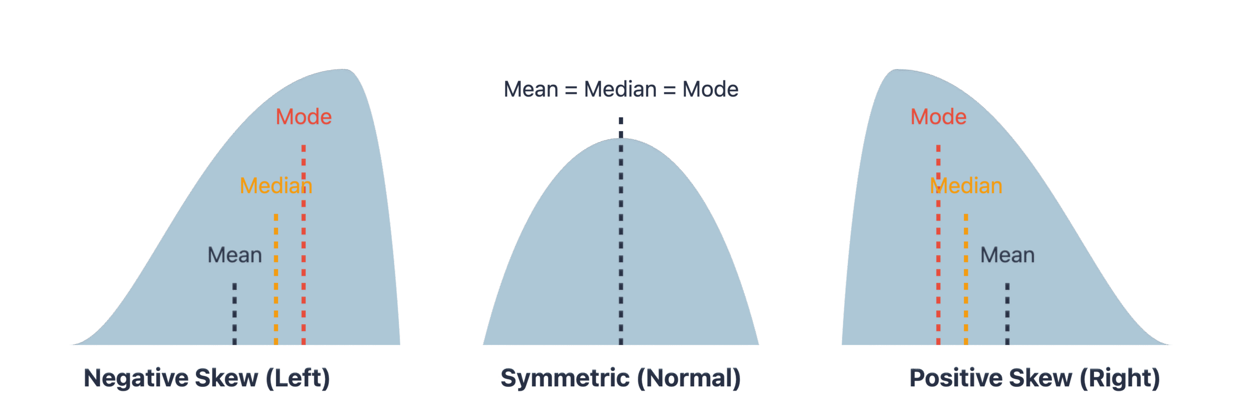
Beyond center and spread, the shape of a distribution provides critical insights. Skewness measures the asymmetry of the probability distribution of a real-valued random variable about its mean. A distribution can be positively skewed (right-skewed), where the tail on the right side is longer or fatter than the left side, indicating that the mean and median are greater than the mode. This is common in data like income levels or housing prices. A negatively skewed (left-skewed) distribution has a longer left tail. A symmetrical distribution, like the normal distribution, has a skewness of zero. The formula for sample skewness is: \[ g_1 = \frac{\frac{1}{n} \sum_{i=1}^{n} (x_i – \bar{x})^3}{(\frac{1}{n} \sum_{i=1}^{n} (x_i – \bar{x})^2)^{3/2}} \]
Understanding skewness is vital because many machine learning models, particularly linear models, assume that variables are normally distributed. High skewness can violate this assumption and degrade model performance.
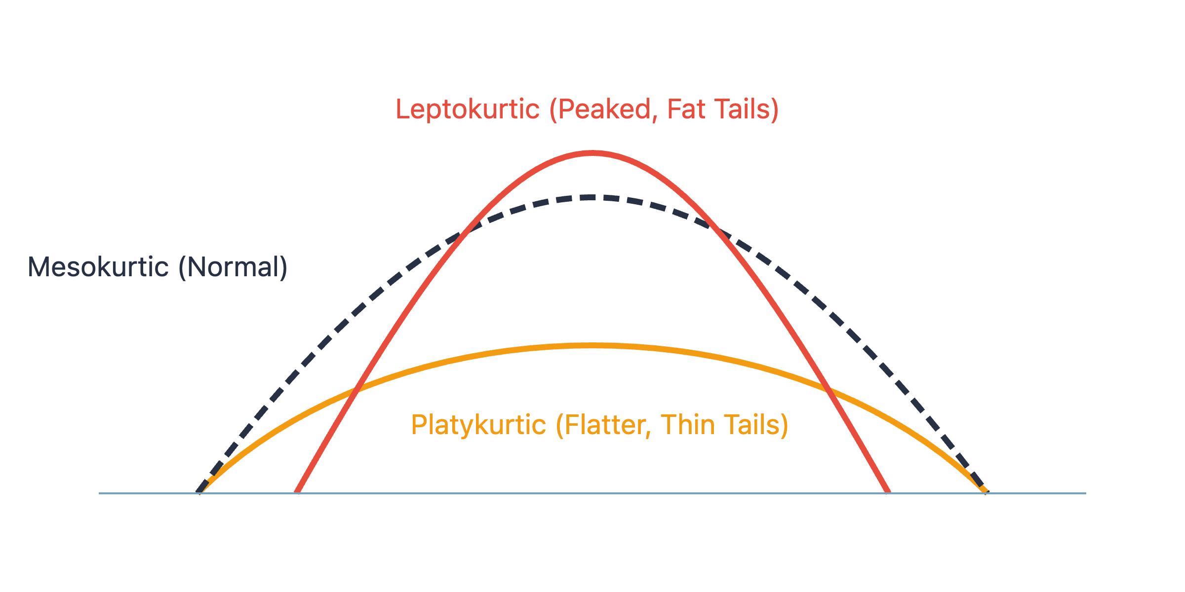
Kurtosis measures the “tailedness” of the distribution. It describes the sharpness of the peak and the weight of the tails. A high kurtosis (leptokurtic) distribution has a sharper peak and fatter tails than a normal distribution, indicating a higher presence of outliers. A low kurtosis (platykurtic) distribution has a flatter peak and thinner tails. The normal distribution has a kurtosis of 3, and often, “excess kurtosis” is reported, which is kurtosis minus 3. A positive excess kurtosis indicates a leptokurtic distribution, while a negative value indicates a platykurtic one. Analyzing kurtosis helps in understanding the outlier characteristics of a dataset.
Inferential Statistics in EDA
While descriptive statistics summarize our data, inferential statistics help us draw conclusions and make predictions based on it. In the context of EDA, we use inferential tools not for final conclusions, but to validate patterns and relationships we observe, guiding our feature engineering and modeling choices.
Correlation Analysis: Quantifying Relationships
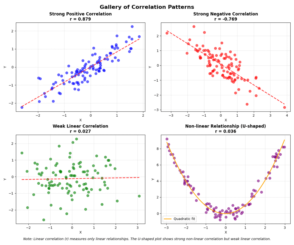
A primary goal of EDA is to understand how variables interact. Correlation is a statistical measure that expresses the extent to which two variables are linearly related, meaning they change together at a constant rate. The most common measure is the Pearson correlation coefficient (\(r\)), which measures the linear relationship between two continuous variables. Its value ranges from -1 to +1. A value of +1 indicates a perfect positive linear relationship, -1 indicates a perfect negative linear relationship, and 0 indicates no linear relationship. The formula for Pearson’s \(r\) between two variables \(X\) and \(Y\) is: \[ r = \frac{\sum_{i=1}^{n} (x_i – \bar{x})(y_i – \bar{y})}{\sqrt{\sum_{i=1}^{n} (x_i – \bar{x})^2 \sum_{i=1}^{n} (y_i – \bar{y})^2}} \]
It’s crucial to remember that Pearson’s coefficient only captures linear relationships. Two variables could have a strong non-linear relationship (e.g., a parabolic curve) and still have a correlation coefficient close to zero. Furthermore, correlation does not imply causation. This is perhaps the most critical mantra in data analysis. A strong correlation between two variables might be due to a third, confounding variable.
For non-linear relationships or for data that is not normally distributed, non-parametric correlation coefficients are more appropriate. The Spearman rank correlation coefficient assesses how well the relationship between two variables can be described using a monotonic function. It operates on the ranks of the data values rather than the values themselves, making it robust to outliers. The Kendall’s Tau is another rank-based correlation coefficient that measures the ordinal association between two measured quantities.
Hypothesis Testing in Exploration
Hypothesis testing provides a formal framework for assessing the statistical significance of an observed pattern. In EDA, we can use it to check, for example, if the difference in means between two groups is statistically significant or just due to random chance. The process involves setting up a null hypothesis (\(H_0\)), which typically represents the status quo (e.g., “there is no difference between the group means”), and an alternative hypothesis (\(H_1\)), which is what we aim to support. We then calculate a test statistic from our data and determine the p-value, which is the probability of observing our data (or something more extreme) if the null hypothesis were true. A small p-value (typically \(< 0.05\)) suggests that we can reject the null hypothesis in favor of the alternative.
Common tests used in EDA include the t-test, used to compare the means of two groups, and the Chi-squared (\(\chi^2\)) test, used to examine the relationship between two categorical variables. For example, during an EDA of customer data, we might observe that the average spending of customers from Region A seems higher than that of customers from Region B. A t-test can tell us if this observed difference is statistically significant, helping us decide if “Region” is a potentially valuable feature for a predictive model.
      graph TD
            A[Start: Formulate Question] --> B{"State Null (H₀) &<br>Alternative (H₁) Hypotheses"};
            B --> C["Choose Significance Level (α)<br><i>e.g., 0.05</i>"];
            C --> D(Collect Sample Data);
            D --> E["Calculate Test Statistic<br><i>(e.g., t-statistic, χ²)</i>"];
            E --> F{Determine p-value};
            F -- "p-value ≤ α" --> G["Reject Null Hypothesis (H₀)"];
            F -- "p-value > α" --> H["Fail to Reject Null Hypothesis (H₀)"];
            G --> I((End: Result is Statistically Significant));
            H --> J((End: Result is Not Statistically Significant));

            style A fill:#283044,stroke:#283044,stroke-width:2px,color:#ebf5ee
            style B fill:#9b59b6,stroke:#9b59b6,stroke-width:1px,color:#ebf5ee
            style C fill:#78a1bb,stroke:#78a1bb,stroke-width:1px,color:#283044
            style D fill:#78a1bb,stroke:#78a1bb,stroke-width:1px,color:#283044
            style E fill:#e74c3c,stroke:#e74c3c,stroke-width:1px,color:#ebf5ee
            style F fill:#f39c12,stroke:#f39c12,stroke-width:1px,color:#283044
            style G fill:#d63031,stroke:#d63031,stroke-width:1px,color:#ebf5ee
            style H fill:#78a1bb,stroke:#78a1bb,stroke-width:1px,color:#283044
            style I fill:#2d7a3d,stroke:#2d7a3d,stroke-width:2px,color:#ebf5ee
            style J fill:#2d7a3d,stroke:#2d7a3d,stroke-width:2px,color:#ebf5ee
Warning: During EDA, it’s easy to run hundreds of tests. This increases the chance of finding a statistically significant result purely by chance (a Type I error). This is known as the multiple comparisons problem. It’s important to treat p-values from EDA as indicators for further investigation rather than conclusive proof.
Analyzing Data Distributions and Anomalies
Understanding the distribution of each variable is a cornerstone of EDA. It tells us about the range of possible values and their frequencies. This knowledge is critical for many algorithms that make assumptions about the data’s distribution.
Common Probability Distributions
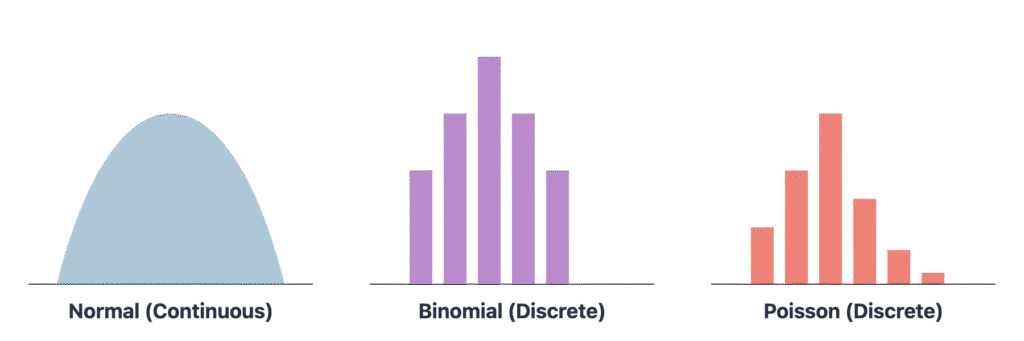
While there are many probability distributions, a few appear frequently in real-world data. The Normal (or Gaussian) Distribution is the most famous. It is a symmetric, bell-shaped curve defined by its mean (\(\mu\)) and standard deviation (\(\sigma\)). Many statistical tests and machine learning models (like Linear Regression) assume normality. The Binomial Distribution describes the number of successes in a fixed number of independent Bernoulli trials (e.g., the number of heads in 10 coin flips). The Poisson Distribution models the number of events occurring in a fixed interval of time or space, given the average rate of occurrence (e.g., the number of customers arriving at a store in an hour).
During EDA, we visually inspect distributions using histograms and density plots. We can also use statistical tests like the Shapiro-Wilk test or the Kolmogorov-Smirnov test to formally check if a sample of data was drawn from a normal distribution. If a variable that should be normal is found to be highly skewed, we might apply transformations like the logarithm, square root, or Box-Cox transformation to make it more closely approximate a normal distribution, often improving model performance.
Identifying and Handling Outliers
Outliers are data points that differ significantly from other observations. They can arise from measurement errors, data entry mistakes, or they can be legitimate but extreme values. Outliers can have a disproportionate effect on statistical measures like the mean and standard deviation and can severely impact the performance of many machine learning models.
Statistical methods are key to identifying them. The Z-score method measures how many standard deviations a data point is from the mean. A common rule of thumb is to flag any point with a Z-score greater than 3 or less than -3 as an outlier. This method, however, is not robust because the mean and standard deviation themselves are sensitive to outliers. A more robust approach is the IQR method. We calculate the Interquartile Range (IQR = Q3 – Q1) and define an outlier as any point that falls outside the range: \[ [Q1 – 1.5 \times IQR, Q3 + 1.5 \times IQR] \]
This method is visually represented by a box plot, where outliers are shown as individual points beyond the “whiskers.”
Once identified, the handling of outliers depends on their cause. If they are due to errors, they should be corrected or removed. If they are legitimate extreme values, their treatment is more nuanced. Options include removing them, transforming the data to reduce their impact (e.g., with a log transform), or using models that are inherently robust to outliers, such as tree-based models (e.g., Random Forest) or models based on the median (e.g., Quantile Regression). The decision should be documented and justified, as it can significantly influence the final model.

Practical Examples and Implementation
Theory provides the foundation, but practical implementation solidifies understanding. This section translates the statistical concepts discussed into executable Python code, demonstrating how to perform EDA on real-world data. We will use the standard AI/ML stack: pandas for data manipulation, NumPy for numerical operations, SciPy for statistical tests, and Matplotlib/Seaborn for visualization.
Mathematical Concept Implementation
Let’s start by implementing the core descriptive statistics calculations using Python. While pandas provides convenient methods for these, understanding how to compute them with NumPy reinforces the underlying mathematical formulas.
import numpy as np
from scipy import stats

# Generate some sample data
# We'll create a slightly right-skewed dataset
np.random.seed(42)
data = np.concatenate([stats.norm.rvs(loc=50, scale=10, size=100),
                       stats.norm.rvs(loc=80, scale=20, size=20)])

# --- Measures of Central Tendency ---
mean_val = np.mean(data)
median_val = np.median(data)
# SciPy's mode is more robust than pandas' for numerical data
mode_val = stats.mode(np.round(data).astype(int))

print(f"--- Central Tendency ---")
print(f"Mean: {mean_val:.2f}")
print(f"Median: {median_val:.2f}")
print(f"Mode: {mode_val.mode[0]} (Count: {mode_val.count[0]})")

# --- Measures of Dispersion ---
variance_val = np.var(data, ddof=1) # ddof=1 for sample variance
std_dev_val = np.std(data, ddof=1)  # ddof=1 for sample standard deviation
range_val = np.ptp(data) # Peak-to-peak (max - min)
q1 = np.percentile(data, 25)
q3 = np.percentile(data, 75)
iqr_val = q3 - q1

print(f"\n--- Dispersion ---")
print(f"Variance: {variance_val:.2f}")
print(f"Standard Deviation: {std_dev_val:.2f}")
print(f"Range: {range_val:.2f}")
print(f"IQR: {iqr_val:.2f}")

# --- Shape of Distribution ---
skewness_val = stats.skew(data)
kurtosis_val = stats.kurtosis(data) # Fisher's definition (normal=0)

print(f"\n--- Shape ---")
print(f"Skewness: {skewness_val:.2f}")
print(f"Kurtosis: {kurtosis_val:.2f}")

# --- Test for Normality ---
shapiro_stat, shapiro_p = stats.shapiro(data)
print(f"\n--- Normality Test ---")
print(f"Shapiro-Wilk Test Statistic: {shapiro_stat:.3f}, p-value: {shapiro_p:.3f}")
if shapiro_p > 0.05:
    print("Sample looks Gaussian (fail to reject H0)")
else:
    print("Sample does not look Gaussian (reject H0)")
Outputs:
--- Central Tendency ---
Mean: 54.28
Median: 51.04
Mode: 45 (Count: 9)

--- Dispersion ---
Variance: 278.14
Standard Deviation: 16.68
Range: 105.46
IQR: 14.62

--- Shape ---
Skewness: 1.68
Kurtosis: 4.24

--- Normality Test ---
Shapiro-Wilk Test Statistic: 0.874, p-value: 0.000
Sample does not look Gaussian (reject H0)
AI/ML Application Example: Housing Price Dataset
Let’s apply these techniques in a more realistic scenario. We’ll use the well-known California Housing dataset, available through scikit-learn. Our goal is to understand the characteristics of the data before attempting to predict MedHouseVal (Median House Value).
import pandas as pd
from sklearn.datasets import fetch_california_housing

# Load the dataset
housing = fetch_california_housing()
df = pd.DataFrame(housing.data, columns=housing.feature_names)
df['MedHouseVal'] = housing.target

# Get a quick statistical summary
print("--- DataFrame describe() ---")
print(df.describe())

# Focus on the target variable and a key feature
print("\n--- Detailed analysis of MedHouseVal and MedInc ---")
print(f"Skewness of MedHouseVal: {df['MedHouseVal'].skew():.2f}")
print(f"Skewness of MedInc: {df['MedInc'].skew():.2f}")

# Check correlation between median income and house value
correlation, p_value = stats.pearsonr(df['MedInc'], df['MedHouseVal'])
print(f"\nPearson correlation between MedInc and MedHouseVal:")
print(f"Correlation coefficient: {correlation:.3f}")
print(f"P-value: {p_value:.3e}")
The output of df.describe() provides a fantastic first look, giving us the count, mean, standard deviation, min, max, and quartile values for every numerical feature at once. The subsequent analysis shows that both MedHouseVal and MedInc are positively skewed. The strong positive correlation (around 0.689) between median income and median house value is statistically significant (very small p-value), confirming our intuition that higher income areas tend to have more expensive houses. This is a critical insight for feature selection.
--- DataFrame describe() ---
             MedInc      HouseAge      AveRooms     AveBedrms    Population      AveOccup      Latitude     Longitude   MedHouseVal
count  20640.000000  20640.000000  20640.000000  20640.000000  20640.000000  20640.000000  20640.000000  20640.000000  20640.000000
mean       3.870671     28.639486      5.429000      1.096675   1425.476744      3.070655     35.631861   -119.569704      2.068558
std        1.899822     12.585558      2.474173      0.473911   1132.462122     10.386050      2.135952      2.003532      1.153956
min        0.499900      1.000000      0.846154      0.333333      3.000000      0.692308     32.540000   -124.350000      0.149990
25%        2.563400     18.000000      4.440716      1.006079    787.000000      2.429741     33.930000   -121.800000      1.196000
50%        3.534800     29.000000      5.229129      1.048780   1166.000000      2.818116     34.260000   -118.490000      1.797000
75%        4.743250     37.000000      6.052381      1.099526   1725.000000      3.282261     37.710000   -118.010000      2.647250
max       15.000100     52.000000    141.909091     34.066667  35682.000000   1243.333333     41.950000   -114.310000      5.000010

--- Detailed analysis of MedHouseVal and MedInc ---
Skewness of MedHouseVal: 0.98
Skewness of MedInc: 1.65

Pearson correlation between MedInc and MedHouseVal:
Correlation coefficient: 0.688
P-value: 0.000e+00
Visualization and Interactive Examples
Visualizations make statistical properties immediately apparent. Seaborn, built on top of Matplotlib, provides high-level functions for creating informative statistical graphics.
import matplotlib.pyplot as plt
import seaborn as sns

# Set plot style
sns.set_style("whitegrid")

# 1. Visualize the distribution of MedHouseVal
plt.figure(figsize=(12, 5))
plt.subplot(1, 2, 1)
sns.histplot(df['MedHouseVal'], kde=True, bins=30)
plt.title('Distribution of Median House Value')
plt.xlabel('Median House Value ($100,000s)')

# 2. Use a box plot to check for outliers in MedHouseVal
plt.subplot(1, 2, 2)
sns.boxplot(x=df['MedHouseVal'])
plt.title('Box Plot of Median House Value')
plt.xlabel('Median House Value ($100,000s)')
plt.tight_layout()
plt.show()

# 3. Visualize the relationship between MedInc and MedHouseVal
plt.figure(figsize=(8, 6))
sns.scatterplot(x='MedInc', y='MedHouseVal', data=df, alpha=0.3)
plt.title('Median Income vs. Median House Value')
plt.xlabel('Median Income ($10,000s)')
plt.ylabel('Median House Value ($100,000s)')
plt.show()

# 4. Create a correlation heatmap for all features
plt.figure(figsize=(12, 10))
correlation_matrix = df.corr()
sns.heatmap(correlation_matrix, annot=True, cmap='coolwarm', fmt='.2f')
plt.title('Correlation Matrix of Housing Features')
plt.show()
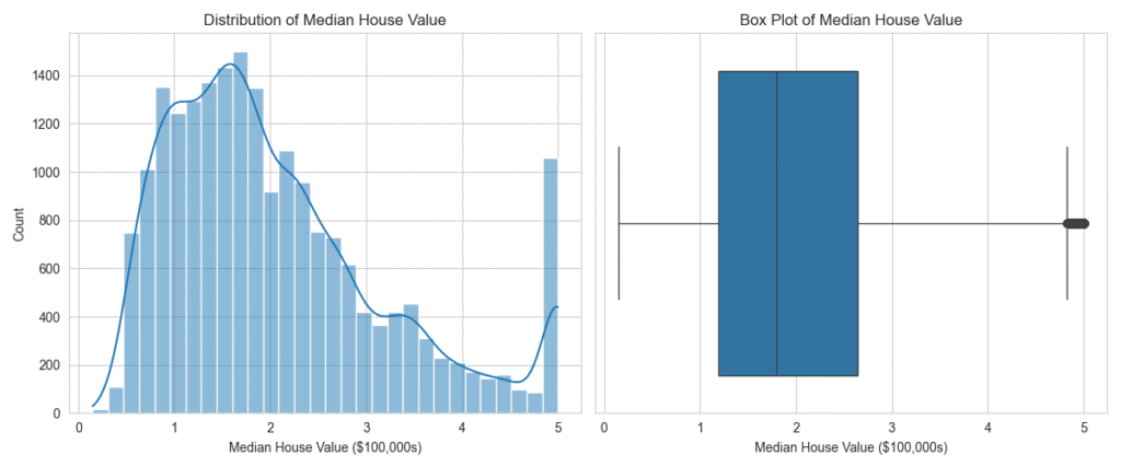
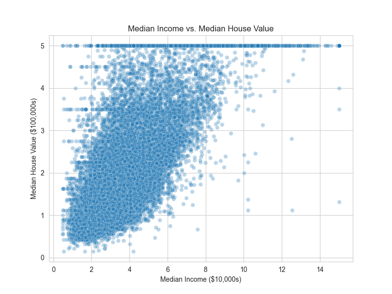
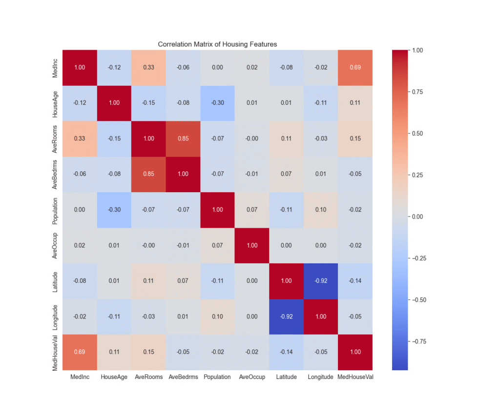
The histogram confirms the right skew in MedHouseVal. The box plot clearly shows a number of high-value properties as outliers. The scatter plot visualizes the strong positive linear relationship between income and house value. Finally, the heatmap provides a comprehensive overview of all linear relationships in the dataset, allowing us to spot potential multicollinearity (e.g., between AveRooms and AveBedrms) and identify the features most correlated with our target variable.
Real-World Problem Applications
The insights from our EDA have direct consequences for modeling:
- Feature Transformation: The positive skew in features like
MedIncandPopulationsuggests that applying a logarithmic transformation (np.log1p) could make their distributions more symmetric. This often helps linear models like Ridge or Lasso regression perform better by satisfying their assumption of normally distributed errors. - Outlier Handling: The box plot for
MedHouseValrevealed outliers. Many models cap the target variable at a certain value (e.g., 5.0 in this dataset). We need to decide if these are data artifacts or legitimate high-value homes. If we were to use a model sensitive to outliers, like standard linear regression, we might consider capping these values or using a more robust model like HuberRegressor. - Feature Selection: The correlation heatmap shows that
MedIncis the most strongly correlated feature withMedHouseVal. This makes it a prime candidate for inclusion in any model. Conversely, features with very low correlation to the target might be candidates for removal, simplifying the model without much loss in performance. - Model Selection: The clear linear relationship between
MedIncandMedHouseValsuggests that a linear model could be a good starting point. However, the scatter plot also shows heteroscedasticity (the variance of the error term appears to increase with income), which might suggest that more complex, non-linear models like Gradient Boosting or a Random Forest could capture the patterns more effectively.
Industry Applications and Case Studies
The statistical EDA techniques detailed in this chapter are not merely academic exercises; they are fundamental to solving real-world business problems across various industries.
- Financial Services: Fraud Detection: In credit card fraud detection, EDA is used to analyze transaction data. By examining the distribution of transaction amounts, analysts can identify a baseline for normal behavior. A new transaction that is, for example, five standard deviations above the average transaction amount for a particular user (a high Z-score) can be flagged as a potential outlier and subjected to further scrutiny. Correlation analysis might reveal unusual relationships, such as a high number of transactions in a short period from geographically distant locations, which is a strong indicator of fraudulent activity.
- E-commerce: Customer Segmentation: Retail companies use EDA to understand their customer base and perform market basket analysis. By analyzing the distribution of customer age, purchase frequency, and average order value, companies can identify distinct customer segments (e.g., “high-spending young adults” or “budget-conscious families”). Chi-squared tests can be used to determine if there is a statistically significant association between a customer’s demographic category and the product categories they purchase, directly informing targeted marketing campaigns and personalized recommendations.
- Manufacturing: Predictive Maintenance: In the industrial sector, EDA is applied to sensor data from machinery to predict equipment failure. Engineers analyze the time-series data from sensors measuring temperature, vibration, and pressure. They look for changes in the statistical properties of these signals over time. For instance, a sudden increase in the variance or kurtosis of vibration data might indicate that a bearing is beginning to fail. By identifying these statistical anomalies, maintenance can be scheduled proactively, preventing costly unplanned downtime.
- Healthcare: Clinical Trial Analysis: Before conducting complex modeling on clinical trial data, biostatisticians perform extensive EDA. They analyze patient demographics to ensure the trial groups are balanced. They examine the distribution of baseline health metrics (e.g., blood pressure, cholesterol) to identify outliers that might be data entry errors. Hypothesis tests, like t-tests, are used for preliminary checks to see if a new drug appears to have a different effect on a biomarker compared to a placebo, guiding the more formal analysis to come.
Best Practices and Common Pitfalls
A successful EDA requires a combination of technical skill and a disciplined, scientific mindset. Adhering to best practices while being aware of common pitfalls is crucial for deriving meaningful and reliable insights.
Best Practices:
- Document Everything: Keep a detailed log or notebook of your EDA process. Record your observations, the plots you generate, the tests you run, and the hypotheses you form. This creates a reproducible and auditable trail of your analysis, which is invaluable for team collaboration and for revisiting your work later.
- Start with Univariate Analysis: Before analyzing relationships between variables, thoroughly understand each variable on its own. Analyze its central tendency, dispersion, and shape using histograms, box plots, and descriptive statistics. This provides the necessary context for more complex bivariate and multivariate analysis.
- Combine Quantitative and Visual Methods: Don’t rely solely on statistical metrics or visualizations. Use them together. A statistical test might give you a p-value, but a visualization will give you the context. For example, a dataset can have a Pearson correlation of nearly zero, but a scatter plot could reveal a perfect non-linear relationship.
- Iterate and Ask Questions: EDA is not a linear process. An initial finding should lead to more questions. If you find a group of outliers, ask why they are there. If you see a strong correlation, question whether it’s causal or coincidental. Let your curiosity guide the investigation.
Common Pitfalls:
- Correlation vs. Causation: This is the most classic pitfall. Observing a strong correlation between two variables (e.g., ice cream sales and drowning incidents) does not mean one causes the other. Always look for potential confounding variables (e.g., hot weather, which causes both).
- Confirmation Bias: Be careful not to only look for evidence that supports your initial beliefs about the data. Actively try to disprove your own assumptions. A skeptical mindset is one of an analyst’s greatest assets.
- Over-interpreting p-values: A p-value is not the probability that the null hypothesis is true. A statistically significant result (p < 0.05) does not necessarily mean the effect is large or practically important. Always consider the effect size alongside the p-value.
- Ignoring Data Quality: No amount of sophisticated analysis can compensate for poor data quality. Always start by checking for missing values, inconsistencies, and potential measurement errors. Statistical summaries can sometimes hide these issues, so it’s important to inspect the raw data as well.
- Analysis Paralysis: With large datasets, it’s possible to explore endlessly. Define a clear scope and objectives for your EDA. While exploration should be open-ended, it should still be guided by the overall project goals. Know when to conclude the exploratory phase and move on to modeling.
Hands-on Exercises
These exercises are designed to reinforce the concepts from the chapter, progressing from basic calculations to a full exploratory analysis.
- Descriptive Statistics Fundamentals:
- Objective: Calculate and interpret core descriptive statistics manually and with code.
- Task: Given the following small dataset of exam scores:
[88, 92, 80, 75, 95, 68, 77, 85, 99, 81].- Manually calculate the mean, median, variance, and standard deviation.
- Write a Python script using NumPy to compute the same statistics and verify your manual calculations.
- Add an outlier score of
20to the list. Recalculate the mean and median. Explain in a comment which metric was more affected and why.
- Success Criteria: Your Python script produces the correct statistics, and your explanation correctly identifies the median’s robustness to outliers.
- Full EDA on a Real Dataset:
- Objective: Conduct a systematic univariate and bivariate EDA on a new dataset.
- Task: Load the “Tips” dataset, which is built into the Seaborn library (
sns.load_dataset('tips')). Perform the following analysis:- Generate a full statistical summary using
.describe(). - Create histograms for the
total_billandtipcolumns. Comment on their skewness. - Create a box plot to compare the distribution of
total_billfor smokers vs. non-smokers. - Calculate the Pearson correlation between
total_billandtip. - Generate a correlation heatmap for all numerical columns.
- Generate a full statistical summary using
- Expected Outcome: A Python script (or Jupyter Notebook) that produces the requested plots and statistics, along with markdown cells or code comments summarizing your key findings (e.g., “The tip amount is positively correlated with the total bill,” “The distribution of total bills is right-skewed”).
- Hypothesis Investigation:
- Objective: Use statistical testing to investigate a hypothesis.
- Task: Using the same “Tips” dataset, investigate the hypothesis that male and female patrons tip differently on average.
- Formulate a null hypothesis (\(H_0\)) and an alternative hypothesis (\(H_1\)).
- Separate the
tipdata into two groups: one for males and one for females. - Use a box plot to visually compare the tip distributions between the two genders.
- Perform an independent two-sample t-test (
scipy.stats.ttest_ind) to determine if there is a statistically significant difference in the mean tip amount between the groups.
- Success Criteria: You correctly state the hypotheses, generate the visualization, and interpret the p-value from the t-test to either reject or fail to reject the null hypothesis, providing a conclusion in plain English.
Tools and Technologies
The modern ecosystem for statistical EDA in Python is mature and powerful. The following tools are essential for any AI engineer.
- pandas: The cornerstone library for data manipulation and analysis in Python. Its
DataFrameobject is the de facto standard for handling tabular data. Essential functions for EDA include.describe(),.info(),.corr(),.skew(), and.value_counts(). - NumPy: The fundamental package for scientific computing in Python. It provides support for large, multi-dimensional arrays and matrices, along with a vast collection of high-level mathematical functions to operate on these arrays. It forms the computational backbone for pandas and many other libraries.
- SciPy: A library that builds on NumPy and provides a large number of functions for scientific and technical computing. Its
scipy.statsmodule is indispensable for EDA, offering functions for a wide range of statistical tests (e.g.,shapiro,ttest_ind,pearsonr), distribution analysis, and descriptive statistics. - Matplotlib: The original and most widely used plotting library in Python. It provides a huge degree of control over every aspect of a figure. While its API can be verbose, it is the foundation upon which many other visualization libraries are built.
- Seaborn: A high-level visualization library based on Matplotlib. It is specifically designed for creating attractive and informative statistical graphics. It simplifies the creation of complex plots like heatmaps, violin plots, and regression plots, making it a go-to tool for efficient EDA.
- Statsmodels: A Python module that provides classes and functions for the estimation of many different statistical models, as well as for conducting statistical tests and statistical data exploration. It offers more in-depth statistical testing capabilities than SciPy for certain applications.
Tip: For interactive visualizations, especially in web-based notebooks or dashboards, consider using libraries like Plotly or Bokeh. For datasets that are too large to fit into memory, libraries like Dask provide parallel computing capabilities that mimic the pandas API, allowing you to perform EDA on out-of-core data.
Summary
This chapter provided a comprehensive exploration of statistical methods for Exploratory Data Analysis, establishing it as a critical, foundational phase in any AI engineering project.
- Key Concepts: We defined EDA as an investigative process for summarizing, visualizing, and understanding data. We covered the mathematical foundations of descriptive statistics, including measures of central tendency (mean, median, mode), dispersion (variance, standard deviation, IQR), and shape (skewness, kurtosis).
- Relationships and Inference: We explored how to quantify relationships using correlation coefficients (Pearson, Spearman) and how to use basic hypothesis testing (t-tests, Chi-squared) to validate initial observations, while stressing the importance of avoiding the “correlation implies causation” fallacy.
- Practical Skills: You learned to implement these statistical techniques using the core Python data science stack (pandas, NumPy, SciPy). Through practical examples, you saw how to generate statistical summaries and create powerful visualizations like histograms, box plots, and heatmaps with Matplotlib and Seaborn.
- Real-World Applicability: The chapter emphasized how insights from EDA directly inform crucial decisions in the machine learning lifecycle, including feature engineering, outlier handling, and model selection. We connected these techniques to industry applications in finance, e-commerce, and manufacturing.
- Professional Practice: We outlined best practices for a systematic EDA workflow and highlighted common pitfalls to avoid, ensuring your analyses are both insightful and reliable.
By mastering statistical EDA, you have gained the ability to move beyond treating data as a black box and can now engage with it critically, uncovering the stories it holds and laying a robust foundation for building powerful AI models.
Further Reading and Resources
- Tukey, John W. (1977). Exploratory Data Analysis. The seminal book by the creator of the field. A classic that focuses on the philosophy and techniques of data exploration, many of which are still highly relevant today.
- McKinney, Wes (2022). Python for Data Analysis, 3rd Edition. Written by the creator of pandas, this is the authoritative guide to practical data manipulation and analysis with Python.
- The Seaborn Official Tutorial. (https://seaborn.pydata.org/tutorial.html) An excellent, hands-on guide to creating statistical visualizations. It provides numerous examples that are directly applicable to EDA.
- SciPy.stats Documentation. (https://docs.scipy.org/doc/scipy/reference/stats.html) The definitive reference for the statistical functions available in SciPy. An essential resource for implementing statistical tests.
- “From Exploratory Data Analysis to Data-Driven Hypotheses” – A blog post on Towards Data Science. Many articles on this platform provide practical, code-first walkthroughs of EDA on various real-world datasets, offering valuable case studies.
- Grus, Joel (2019). Data Science from Scratch, 2nd Edition. This book provides a fantastic first-principles approach, showing you how to implement many statistical concepts and algorithms from scratch before using library functions.
- The Elements of Statistical Learning by Hastie, Tibshirani, and Friedman. A more advanced, comprehensive textbook on machine learning that provides the deep statistical theory behind many of the models for which EDA is the preparatory step.
Glossary of Terms
- Central Tendency: A measure that represents the central or typical value of a dataset (e.g., mean, median, mode).
- Correlation: A statistical measure indicating the extent to which two or more variables fluctuate together. It does not imply causation.
- Dispersion: A measure of the spread or variability of data points in a dataset (e.g., standard deviation, variance, IQR).
- Exploratory Data Analysis (EDA): The process of analyzing and investigating datasets to summarize their main characteristics, often using statistical graphics and other data visualization methods.
- Hypothesis Testing: A statistical method used to make decisions or draw conclusions about a population based on a sample. It involves a null hypothesis and an alternative hypothesis.
- Interquartile Range (IQR): A measure of statistical dispersion, being equal to the difference between the 75th and 25th percentiles. It is a robust measure of spread.
- Kurtosis: A measure of the “tailedness” of a probability distribution, indicating the frequency of extreme outliers.
- Mean: The arithmetic average of a set of numbers.
- Median: The middle value in a sorted list of numbers. It is robust to outliers.
- Mode: The most frequently occurring value in a dataset.
- Outlier: A data point that differs significantly from other observations.
- p-value: In hypothesis testing, the probability of obtaining test results at least as extreme as the results actually observed, under the assumption that the null hypothesis is correct.
- Skewness: A measure of the asymmetry of the probability distribution of a real-valued random variable about its mean.
- Standard Deviation: A measure of the amount of variation or dispersion of a set of values, calculated as the square root of the variance.