Chapter 21: Matplotlib and Seaborn: Data Visualization for AI
Chapter Objectives
Upon completing this chapter, you will be able to:
- Understand the fundamental principles of data visualization and its critical role in the machine learning lifecycle, from exploratory data analysis to model interpretation and communication of results.
- Implement a wide range of static visualizations using Matplotlib, manipulating its object-oriented hierarchy of Figures, Axes, and Artists to create custom, publication-quality plots.
- Analyze complex datasets by designing and deploying statistical visualizations with Seaborn, leveraging its high-level interface to uncover relationships, distributions, and comparisons within data.
- Design effective visual narratives to communicate insights, using principles of color theory, plot composition, and annotation to guide an audience’s interpretation of AI-driven results.
- Optimize visualization workflows for efficiency and clarity, integrating Matplotlib and Seaborn with data manipulation libraries like Pandas and NumPy for seamless analysis.
- Deploy visualization techniques to interpret and diagnose machine learning models, creating plots such as confusion matrices, learning curves, and feature importance charts to evaluate performance and build trust in AI systems.
Introduction
In the landscape of artificial intelligence and machine learning, data is the foundational element, and visualization is the primary language through which we understand it. Raw data, in its tabular form of millions of rows and thousands of columns, is an impenetrable wall of numbers. It is through visualization that we transform this chaos into coherent patterns, actionable insights, and compelling stories. This chapter introduces the cornerstone libraries of Python’s data visualization ecosystem: Matplotlib and Seaborn. These tools are not merely for creating charts; they are instruments for inquiry, discovery, and communication, essential at every stage of the AI development pipeline. From the initial exploratory data analysis (EDA) that informs feature engineering, to the diagnostic plots that help us interpret and debug complex models, to the final presentation of results to stakeholders, visualization is the bridge between quantitative analysis and human understanding.
This chapter positions visualization as a core competency for the modern AI engineer. We will begin with the foundational principles of Matplotlib, exploring its powerful, albeit sometimes complex, object-oriented architecture that provides granular control over every element of a plot. We will then build upon this foundation by introducing Seaborn, a high-level library built on top of Matplotlib that simplifies the creation of sophisticated statistical graphics. By mastering both, you will gain a versatile toolkit: the precision of Matplotlib for custom designs and the efficiency of Seaborn for statistical exploration. As industry trends move towards more interpretable and explainable AI (XAI), the ability to visually represent model behavior and data characteristics is no longer a “soft skill” but a technical necessity. This chapter will equip you with the theoretical knowledge and practical skills to create visualizations that are not only aesthetically pleasing but also technically sound, insightful, and ethically responsible.
Technical Background
The Grammar of Graphics and Visualization Theory
Before diving into the syntax of specific libraries, it is crucial to understand the conceptual framework that underpins effective data visualization. The most influential of these is the “Grammar of Graphics,” a concept introduced by Leland Wilkinson. This framework decomposes any visualization into a set of independent components, much like how linguistic grammar breaks down a sentence. The core idea is that a statistical graphic is a mapping of data to the aesthetic attributes (like color, shape, and size) of geometric objects (like points, lines, and bars). This mapping is defined by a statistical transformation (such as counting, averaging, or smoothing) and is presented on a specific coordinate system.
Understanding this grammar is profoundly empowering for an AI engineer. It moves the practice of visualization from a series of ad-hoc chart-making recipes to a systematic process of design. When you create a scatter plot, you are mapping two continuous variables from your data to the x- and y-coordinates (aesthetics) of points (geometrics). When you create a histogram, you are performing a statistical transformation (binning and counting) on a single variable and mapping the resulting counts to the height (aesthetic) of bars (geometrics). This conceptual clarity allows you to invent new visualizations and to critically evaluate existing ones. It encourages you to ask fundamental questions: What is the story I am trying to tell? Which aesthetic mappings will best reveal the patterns in my data? Is my choice of coordinate system and statistical transformation appropriate for the question at hand? This theoretical foundation is the bedrock upon which the practical tools of Matplotlib and Seaborn are built. Seaborn, in particular, is designed with a high-level API that closely mirrors the components of the Grammar of Graphics, making it an intuitive tool for those who grasp these core principles.
graph TD
    subgraph The Grammar of Graphics
        direction LR
        Data[("<b>Data</b><br><i>(e.g., Pandas DataFrame)</i>")]
        style Data fill:#9b59b6,stroke:#9b59b6,stroke-width:1px,color:#ebf5ee

        Data --> Aesthetics
        Data --> Geometrics
        Data --> Transformations
        Data --> Coordinates

        Aesthetics{"<b>Aesthetics</b><br>(Mapping variables to visual properties)"}
        style Aesthetics fill:#f39c12,stroke:#f39c12,stroke-width:1px,color:#283044
        Aesthetics --> Color
        Aesthetics --> Size
        Aesthetics --> Shape

        Geometrics["<b>Geometrics</b><br>(Objects representing data)"]
        style Geometrics fill:#78a1bb,stroke:#78a1bb,stroke-width:1px,color:#283044
        Geometrics --> Points
        Geometrics --> Lines
        Geometrics --> Bars

        Transformations(("<b>Statistical Transformations</b><br>(Algorithms to process data)"))
        style Transformations fill:#e74c3c,stroke:#e74c3c,stroke-width:1px,color:#ebf5ee
        Transformations --> Binning
        Transformations --> Smoothing
        Transformations --> Counting

        Coordinates(("<b>Coordinate Systems</b><br>(The space for the geometrics)"))
        style Coordinates fill:#283044,stroke:#283044,stroke-width:2px,color:#ebf5ee
        Coordinates --> Cartesian
        Coordinates --> Polar
    end
The Matplotlib Object Hierarchy: A Controlled Approach
Matplotlib is the venerable workhorse of the Python visualization world. Its power lies in its object-oriented architecture, which provides complete control over every minute detail of a plot. To master Matplotlib, one must understand its core hierarchy of objects. At the very top is the Figure object, which can be thought of as the entire canvas or window on which everything is drawn. A Figure can contain one or more Axes objects (note the spelling: “Axes,” not “Axis”). An Axes object is the actual plotting area—the rectangular region where data is visualized with x- and y-axes (or other coordinates). This is where the vast majority of plotting commands are directed.
This distinction is crucial. Many beginners interact with Matplotlib through its pyplot interface (e.g., plt.plot()), which implicitly manages the Figure and Axes behind the scenes. While convenient for quick, interactive plots, this approach can become confusing when creating complex, multi-plot figures. The more robust and recommended approach for AI engineering is to explicitly create the Figure and Axes objects. This is typically done with the command fig, ax = plt.subplots(). From that point on, you call methods directly on the ax object (e.g., ax.plot(), ax.set_title(), ax.set_xlabel()). This object-oriented style is more verbose but vastly more powerful and clear, especially when building dashboards, comparing multiple models, or creating figures for publication. Within each Axes object, every element—the lines, points, labels, ticks, and legends—is its own programmable object, known as an Artist. This granular structure means you can, for instance, grab a specific tick label and change its font size, or add a custom annotation with an arrow pointing to a specific data point. This level of control is indispensable when you need to create a very specific, highly polished visualization to communicate a critical finding from your AI model.
graph TB
    subgraph Figure["Figure Object"]
        subgraph Axes1["Axes Object 1"]
            XAxis1["XAxis"]
            YAxis1["YAxis"]
            Title1["Title"]
            Line2D1["Line2D"]
            Text1["Text"]
            Artist1["Other Artists"]
        end

        subgraph Axes2["Axes Object 2 (Highlighted)"]
            XAxis2["XAxis"]
            YAxis2["YAxis"]
            Title2["Title"]

            subgraph Artists["Artist Objects"]
                Line2D2["Line2D"]
                Text2["Text"]
                Patch["Patch"]
                Collection["Collection"]
            end
        end

        Canvas["Canvas"]
        FigureText["Figure Text"]
    end

    %% Styling for highlighted axes
    classDef highlighted fill:#e1f5fe,stroke:#0277bd,stroke-width:3px
    classDef artists fill:#fff3e0,stroke:#f57c00,stroke-width:2px
    classDef components fill:#f3e5f5,stroke:#7b1fa2,stroke-width:1px

    class Axes2 highlighted
    class Artists,Line2D2,Text2,Patch,Collection artists
    class XAxis2,YAxis2,Title2 components
Seaborn: Statistical Visualization Made Elegant
If Matplotlib provides the fundamental building blocks, Seaborn provides the sophisticated architectural designs. Built directly on top of Matplotlib, Seaborn is a library for creating beautiful and informative statistical graphics. Its primary goal is to make visualization a central part of exploring and understanding data. It achieves this through a high-level, dataset-oriented API that abstracts away much of the complexity of Matplotlib. Where you might need a dozen lines of Matplotlib code to create a grouped bar chart with error bars and a polished aesthetic, Seaborn can often achieve the same result in a single line.
Seaborn’s power comes from its deep integration with Pandas DataFrames. Most Seaborn functions expect your data to be in a “tidy” format, where each row is an observation and each column is a variable. This structure allows you to create complex plots by simply specifying the column names for the x-axis, y-axis, hue (color), size, and style. For example, with sns.scatterplot(data=my_df, x='feature_1', y='target', hue='category'), Seaborn will automatically handle the mapping of the ‘category’ column to different colors, create a legend, and apply a visually appealing default style. This declarative approach, which aligns closely with the Grammar of Graphics, allows the AI engineer to focus on the analytical questions rather than the implementation details of the plot. Seaborn excels at visualizing distributions (histograms, kernel density estimates), relationships between variables (scatter plots, regression plots), and categorical data (box plots, violin plots, bar plots). It also provides powerful tools for creating multi-plot grids, such as FacetGrid and PairGrid, which allow you to visualize subsets of your data or pairwise relationships between many variables simultaneously—an essential task in high-dimensional feature spaces common in AI.
Key Seaborn Plot Categories
Seaborn’s plotting functions can be broadly categorized, and understanding these categories helps in selecting the right tool for the analytical task at hand.
- Relational Plots: These plots are used to understand the relationship between two or more variables. The primary functions are
scatterplot()andlineplot(). These are fundamental for tasks like visualizing the correlation between two features or plotting the performance of a model over training epochs. - Distributional Plots: Understanding the distribution of individual variables is a cornerstone of EDA. Seaborn offers a suite of functions for this purpose, including
histplot()for histograms,kdeplot()for kernel density estimates (a smoothed version of a histogram),ecdfplot()for empirical cumulative distribution functions, andrugplot()to show individual observations. These are critical for identifying skew, modality, and outliers in your data, which can heavily influence model choice and performance. - Categorical Plots: AI problems frequently involve categorical variables. Seaborn provides a rich set of plots to compare distributions across different categories. These include scatter-style plots like
stripplot()andswarmplot(), and distributional summaries likeboxplot(),violinplot(), andboxenplot(). Functions likebarplot()andcountplot()are used to show aggregate statistics or counts for each category. These plots are essential for understanding class balance, feature-target relationships, and model performance metrics broken down by category. - Regression Plots: Going beyond simple relationships, functions like
regplot()andlmplot()fit and visualize a linear regression model to your data, including confidence intervals. This is a powerful way to quickly assess linear relationships and their uncertainty. - Matrix Plots: For visualizing matrices of data, such as correlation matrices or confusion matrices, Seaborn provides
heatmap()andclustermap(). A heatmap is an indispensable tool for feature selection (by visualizing feature correlations) and model evaluation (by visualizing how a classifier is confusing different classes).
By leveraging these specialized functions, an AI engineer can rapidly conduct a thorough exploratory data analysis, asking and answering complex questions about the data’s structure, relationships, and distributions with concise and expressive code.
Key Seaborn Plot Categories
| Category | Purpose | Example Functions |
|---|---|---|
| Relational Plots | To understand the relationship between two or more variables. | scatterplot(), lineplot() |
| Distributional Plots | To understand the distribution of a single variable or compare distributions. | histplot(), kdeplot(), ecdfplot() |
| Categorical Plots | To compare distributions or aggregate statistics across different categories. | boxplot(), violinplot(), barplot(), stripplot() |
| Regression Plots | To visualize linear relationships between variables, including regression lines and confidence intervals. | regplot(), lmplot() |
| Matrix Plots | To visualize matrix data, such as correlation or confusion matrices. | heatmap(), clustermap() |
Practical Examples and Implementation
Mathematical Concept Implementation
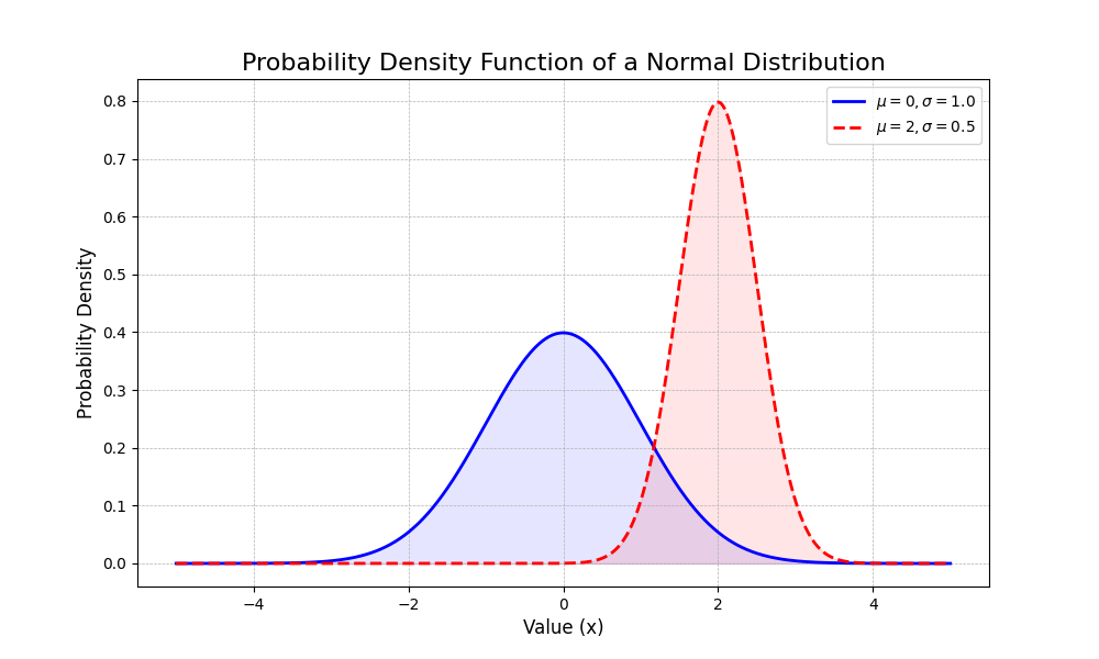
Many visualizations are direct representations of mathematical and statistical concepts. Let’s implement a few of these using Python, NumPy, and Matplotlib to bridge the gap between theory and practice. A fundamental concept in statistics is the probability density function (PDF) of a normal distribution. We can visualize this to understand how the mean (\(\mu\)) and standard deviation (\(\sigma\)) parameters affect its shape.
import numpy as np
import matplotlib.pyplot as plt
from scipy.stats import norm

# Define the parameters for two normal distributions
mu1, sigma1 = 0, 1.0  # Standard normal distribution
mu2, sigma2 = 2, 0.5  # A shifted and narrower distribution

# Generate a range of x values
x = np.linspace(-5, 5, 1000)

# Calculate the PDF for each distribution
pdf1 = norm.pdf(x, mu1, sigma1)
pdf2 = norm.pdf(x, mu2, sigma2)

# Create the plot using the object-oriented API
fig, ax = plt.subplots(figsize=(10, 6))

# Plot the PDFs
ax.plot(x, pdf1, 'b-', lw=2, label=f'$\\mu={mu1}, \\sigma={sigma1}$')
ax.plot(x, pdf2, 'r--', lw=2, label=f'$\\mu={mu2}, \\sigma={sigma2}$')

# Add titles and labels for clarity
ax.set_title('Probability Density Function of a Normal Distribution', fontsize=16)
ax.set_xlabel('Value (x)', fontsize=12)
ax.set_ylabel('Probability Density', fontsize=12)
ax.grid(True, which='both', linestyle='--', linewidth=0.5)
ax.legend(fontsize=10)

# Fill the area under the curve to represent probability
ax.fill_between(x, pdf1, color='blue', alpha=0.1)
ax.fill_between(x, pdf2, color='red', alpha=0.1)

plt.show()
This code not only plots the famous bell curve but visually demonstrates how changing \(\mu\) shifts the curve along the x-axis and how changing \(\sigma\) controls its spread.
AI/ML Application Examples
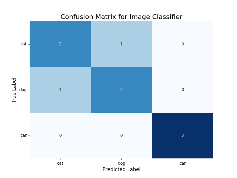
In machine learning, a common task is to evaluate the performance of a classification model. A confusion matrix is a powerful tool for this, showing the counts of true positive, true negative, false positive, and false negative predictions. Visualizing this matrix as a heatmap makes it instantly interpretable. Let’s use Seaborn to visualize a confusion matrix for a hypothetical image classifier.
import seaborn as sns
import pandas as pd
from sklearn.metrics import confusion_matrix
import matplotlib.pyplot as plt

# Ground truth labels and model predictions (hypothetical)
y_true = ['cat', 'dog', 'cat', 'car', 'dog', 'car', 'cat', 'car', 'dog']
y_pred = ['cat', 'dog', 'dog', 'car', 'cat', 'car', 'cat', 'car', 'dog']
labels = ['cat', 'dog', 'car']

# Generate the confusion matrix using scikit-learn
cm = confusion_matrix(y_true, y_pred, labels=labels)

# Convert to a pandas DataFrame for better labeling
cm_df = pd.DataFrame(cm, index=labels, columns=labels)

# Create the visualization
fig, ax = plt.subplots(figsize=(8, 6))

# Use Seaborn's heatmap
sns.heatmap(cm_df, annot=True, fmt='d', cmap='Blues', ax=ax, cbar=False)

# Add labels and title
ax.set_title('Confusion Matrix for Image Classifier', fontsize=16)
ax.set_xlabel('Predicted Label', fontsize=12)
ax.set_ylabel('True Label', fontsize=12)
ax.tick_params(axis='x', labelsize=10)
ax.tick_params(axis='y', labelsize=10, rotation=0)

plt.show()
This heatmap immediately reveals the model’s performance. The diagonal elements show correct predictions (e.g., 2 cats correctly identified as cats). The off-diagonal elements show errors. We can see that the model confused a ‘dog’ for a ‘cat’ once, and a ‘cat’ for a ‘dog’ once. This kind of visualization is far more insightful than a single accuracy score, as it tells you what kind of errors the model is making.
Visualization and Interactive Examples
Visualizing high-dimensional data is a significant challenge in AI. Techniques like Principal Component Analysis (PCA) are used to reduce dimensionality. We can visualize the results to see if the reduced dimensions can separate our data classes. Let’s use the famous Iris dataset for this.
from sklearn.decomposition import PCA
from sklearn.datasets import load_iris
import matplotlib.pyplot as plt
import numpy as np

# Load the Iris dataset
iris = load_iris()
X = iris.data
y = iris.target
target_names = iris.target_names

# Apply PCA to reduce to 2 dimensions
pca = PCA(n_components=2)
X_r = pca.fit(X).transform(X)

# Create the plot
fig, ax = plt.subplots(figsize=(10, 8))

colors = ['navy', 'turquoise', 'darkorange']
lw = 2

for color, i, target_name in zip(colors, [0, 1, 2], target_names):
    ax.scatter(X_r[y == i, 0], X_r[y == i, 1], color=color, alpha=.8, lw=lw,
                label=target_name)

ax.legend(loc='best', shadow=False, scatterpoints=1)
ax.set_title('PCA of IRIS dataset', fontsize=16)
ax.set_xlabel(f'Principal Component 1 ({pca.explained_variance_ratio_[0]:.2%})', fontsize=12)
ax.set_ylabel(f'Principal Component 2 ({pca.explained_variance_ratio_[1]:.2%})', fontsize=12)

# Add explained variance information
total_variance = np.sum(pca.explained_variance_ratio_) * 100
ax.text(0.05, 0.05, f'Total variance explained: {total_variance:.2f}%',
        transform=ax.transAxes, fontsize=12,
        verticalalignment='bottom', bbox=dict(boxstyle='round,pad=0.5', fc='wheat', alpha=0.5))

plt.show()
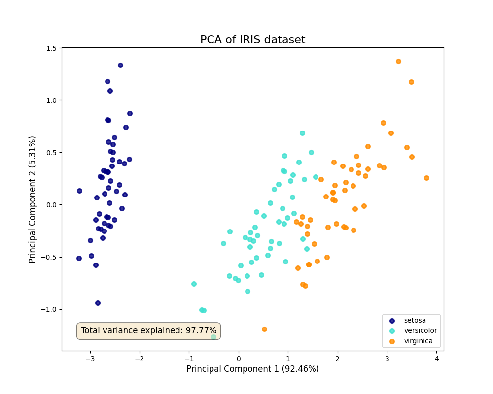
This scatter plot visualizes the dataset in the two new dimensions (principal components) that capture the most variance. We can clearly see that the three species of Iris are largely separable in this reduced 2D space. The labels also show the percentage of variance explained by each component, providing a quantitative measure of how much information was retained. This is a classic example of using visualization to validate the results of a machine learning algorithm.
Computational Exercises
Let’s reinforce our understanding with a computational exercise. A correlation matrix measures the pairwise correlation between all features in a dataset. It’s a fundamental step in EDA and feature selection.
Exercise: Given the following dataset, (1) calculate the Pearson correlation matrix using Pandas, and (2) visualize it as a heatmap using Seaborn. Manually interpret the heatmap to identify the two most positively correlated features and the two most negatively correlated features.
# Dataset for the exercise
data = {
    'Engine Size': [2.0, 3.5, 1.6, 4.0, 2.2, 1.8],
    'Horsepower': [150, 280, 110, 320, 180, 130],
    'Fuel Efficiency (MPG)': [30, 22, 35, 18, 28, 32],
    'Weight (lbs)': [2800, 3900, 2500, 4200, 3100, 2600]
}
df = pd.DataFrame(data)

# 1. Calculate the correlation matrix
corr_matrix = df.corr(method='pearson')
print("Correlation Matrix:")
print(corr_matrix)

# 2. Visualize the correlation matrix
fig, ax = plt.subplots(figsize=(10, 8))
sns.heatmap(
    corr_matrix,
    annot=True,      # Show the correlation values on the heatmap
    cmap='coolwarm', # Use a diverging colormap
    vmin=-1,         # Set the color scale limits
    vmax=1,
    linewidths=.5,
    ax=ax
)
ax.set_title('Feature Correlation Matrix', fontsize=16)
plt.show()
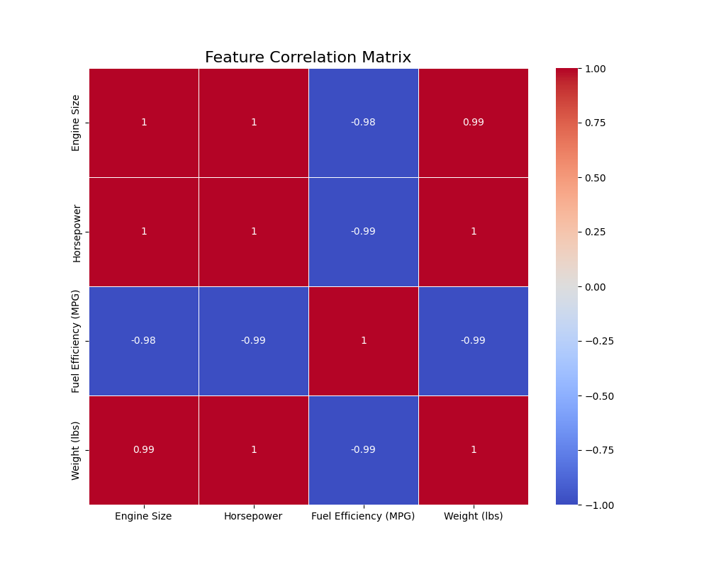
Interpretation: By examining the annotated heatmap, students should identify that Engine Size and Horsepower are the most positively correlated (a value close to +1.0). Conversely, Fuel Efficiency (MPG) and Weight (lbs) (or Horsepower) are the most negatively correlated (a value close to -1.0). This exercise connects a statistical calculation (correlation) directly to a visual representation (heatmap) and a practical interpretation (understanding feature relationships).
Real-World Problem Applications
Consider a real-world problem in finance: analyzing stock price movements. A common visualization is a candlestick chart, which displays the high, low, open, and close prices for a security over a specific period. This is often overlaid with a moving average to identify trends. While specialized libraries exist, we can create a simplified version to demonstrate the principles.
import pandas as pd
import matplotlib.pyplot as plt
import matplotlib.dates as mdates

# Create some sample time-series data
data = {
    'Date': pd.to_datetime(['2024-01-01', '2024-01-02', '2024-01-03', '2024-01-04', '2024-01-05']),
    'Open': [100, 102, 101, 104, 103],
    'High': [103, 104, 105, 106, 105],
    'Low': [99, 101, 100, 102, 102],
    'Close': [102, 101, 104, 103, 105]
}
stock_df = pd.DataFrame(data).set_index('Date')

# Calculate a simple moving average
stock_df['SMA_3'] = stock_df['Close'].rolling(window=3).mean()

# Create the plot
fig, ax = plt.subplots(figsize=(12, 7))

# Simplified "candlestick" using vertical lines and markers
ax.vlines(stock_df.index, stock_df['Low'], stock_df['High'], color='k', linewidth=1, label='_nolegend_')
ax.plot(stock_df.index, stock_df['Open'], 'o', color='blue', markersize=5, label='Open')
ax.plot(stock_df.index, stock_df['Close'], 'x', color='red', markersize=5, label='Close')

# Plot the moving average
ax.plot(stock_df.index, stock_df['SMA_3'], 'g--', label='3-Day SMA')

# Formatting the plot
ax.set_title('Stock Price Analysis', fontsize=16)
ax.set_ylabel('Price (USD)', fontsize=12)
ax.set_xlabel('Date', fontsize=12)
ax.grid(True, linestyle='--', alpha=0.6)
ax.legend()

# Format date on x-axis
ax.xaxis.set_major_formatter(mdates.DateFormatter('%Y-%m-%d'))
fig.autofmt_xdate()

plt.show()
This plot combines multiple pieces of information: the daily price range (high-low line), the open and close prices (markers), and the underlying trend (moving average). This type of multi-layered visualization is common in domain-specific AI applications and showcases how Matplotlib’s flexibility can be used to construct complex, information-rich graphics tailored to a specific problem.
Industry Applications and Case Studies
The visualization techniques covered in this chapter are not merely academic exercises; they are fundamental to creating business value across numerous industries. In e-commerce, for instance, companies like Amazon and Netflix use sophisticated visualizations to understand user behavior. Scatter plots and heatmaps of user engagement metrics against product attributes help in personalizing recommendations. A/B testing results are almost always presented using bar charts with confidence intervals to decide which website layout drives more sales, directly impacting revenue. The technical challenge here is often the sheer scale of the data; visualizations must be generated from aggregated or sampled data, and the backend systems must be robust enough to handle these queries efficiently.
In the healthcare and pharmaceutical sector, visualization is critical for both research and clinical practice. During drug discovery, researchers use clustermaps and heatmaps to analyze genomic data, identifying patterns that might indicate a compound’s efficacy. In medical imaging, AI models that detect tumors in MRI scans often output results as heatmaps overlaid on the original image, visually guiding the radiologist’s attention to suspicious areas. The performance constraints are immense, requiring low-latency rendering, and the ethical implications are profound—a misleading visualization could have life-or-death consequences, demanding extreme clarity and precision.
Finally, in the automotive industry, particularly in the development of autonomous vehicles, visualization is indispensable for diagnostics and safety validation. Engineers at companies like Tesla and Waymo use complex dashboards to visualize sensor data in real-time. A typical view might include a 3D scatter plot of LiDAR point cloud data, bounding boxes from the object detection model overlaid on camera feeds, and line plots of the vehicle’s trajectory and speed. This allows engineers to debug perception and control systems by replaying scenarios where the AI behaved unexpectedly. The business impact is direct: better visualization leads to faster debugging, more robust models, and ultimately, a safer and more reliable product.
Best Practices and Common Pitfalls
Creating effective visualizations is both an art and a science. Adhering to best practices ensures your plots are insightful and honest, while being aware of common pitfalls prevents you from misleading your audience, or worse, yourself.
A primary best practice is to choose the right plot for your data and your question. Don’t use a line chart for categorical data or a pie chart when a bar chart would be clearer for comparisons. Always start with a question (e.g., “How are these two features related?”) and select the visualization type that answers it most directly (e.g., a scatter plot). A common pitfall is misleading axes. Always start your y-axis at zero for bar charts to avoid exaggerating differences. For other plots, be deliberate about your axis limits and always label them clearly, including units.
Color is a powerful tool but also a frequent source of error. Use color purposefully, not just for decoration. For sequential data, use a gradient color map (e.g., light blue to dark blue). For categorical data, use distinct qualitative colors. Crucially, be mindful of color blindness; use palettes that are accessible to all viewers (like Matplotlib’s ‘viridis’ or Seaborn’s ‘colorblind’ palettes). A common mistake is using a rainbow colormap, which is perceptually non-uniform and can distort the interpretation of data.
Tip: Use annotations to guide your audience. A plot can show a pattern, but a well-placed arrow and a line of text can explain why that pattern is important. Use
ax.annotate()in Matplotlib to highlight key data points, trends, or outliers.
Another critical practice is simplicity and clarity. Avoid “chart junk”—unnecessary grid lines, borders, 3D effects, or background colors that distract from the data itself. Every element on your plot should serve a purpose. A common pitfall is information overload. A single plot that tries to show too many variables can become unreadable. It is often better to use a series of simpler plots or a facet grid to convey a complex story.
Finally, consider the context and audience. A visualization for a technical deep-dive with fellow engineers can be dense and complex. A visualization for a business stakeholder should be simple, with a clear title, a concise takeaway, and minimal jargon. Always ask yourself: “What is the one key message I want my audience to take away from this visual?” and design the plot to make that message as clear as possible.
graph TD
    A("<b>Start: Define a Question</b><br><i>What do I want to show?</i>") --> B{<b>Choose the Right Plot Type</b><br>Scatter for relationships?<br>Bar for comparisons?<br>Histogram for distribution?};
    B --> C[<b>Create the Plot</b><br>Use Matplotlib/Seaborn];
    C --> D{<b>Is the Message Clear?</b>};
    D -- No --> E["<b>Simplify & Clarify</b><br>- Remove chart junk<br>- Improve labels/titles<br>- Check axes (start at 0?)"]
    E --> D;
    D -- Yes --> F{<b>Is the Color Used Purposefully?</b><br>- Accessible palette?<br>- Sequential vs. Categorical?};
    F -- No --> G[<b>Adjust Color Scheme</b><br>Use colorblind-friendly palettes];
    G --> F;
    F -- Yes --> H[<b>Add Context</b><br>Use annotations to highlight<br>key insights or outliers];
    H --> I(<b>Final Review</b><br>Check against audience and context);
    I --> J[<b>Done: Share Visualization</b>];

    style A fill:#283044,stroke:#283044,stroke-width:2px,color:#ebf5ee
    style B fill:#f39c12,stroke:#f39c12,stroke-width:1px,color:#283044
    style C fill:#78a1bb,stroke:#78a1bb,stroke-width:1px,color:#283044
    style D fill:#f39c12,stroke:#f39c12,stroke-width:1px,color:#283044
    style E fill:#f1c40f,stroke:#f1c40f,stroke-width:1px,color:#283044
    style F fill:#f39c12,stroke:#f39c12,stroke-width:1px,color:#283044
    style G fill:#f1c40f,stroke:#f1c40f,stroke-width:1px,color:#283044
    style H fill:#78a1bb,stroke:#78a1bb,stroke-width:1px,color:#283044
    style I fill:#f39c12,stroke:#f39c12,stroke-width:1px,color:#283044
    style J fill:#2d7a3d,stroke:#2d7a3d,stroke-width:2px,color:#ebf5ee
Hands-on Exercises
- Basic EDA on a Real Dataset:
- Objective: Practice creating fundamental plots to understand a dataset’s characteristics.
- Task: Load the “tips” dataset included with Seaborn (
sns.load_dataset('tips')). Create three separate plots:- A
histplotto show the distribution of thetotal_bill. - A
scatterplotto explore the relationship betweentotal_billandtip. - A
boxplotto compare the distribution oftotal_billacross differentdays of the week.
- A
- Guidance: For each plot, ensure you add a descriptive title and clear axis labels. Experiment with changing the color and number of bins in the histogram.
- Success Criteria: You have successfully generated three distinct plots that correctly represent the specified data and are clearly labeled.
- Customizing a Multi-Layered Plot:
- Objective: Gain experience with Matplotlib’s object-oriented API and layering information.
- Task: Using the same “tips” dataset, create a single
Axesobject. On thisAxes, create a scatter plot oftotal_billvs.tip. Then, calculate and plot a line representing the average tip percentage. - Guidance: You will need to first calculate the average tip percentage (tip / total_bill). Then, on your scatter plot, you can use
ax.axhline()to draw a horizontal line at the level of this average percentage. Add text to the plot to label this line. - Success Criteria: The final plot contains both the scatter plot of individual tips and a clearly labeled horizontal line representing the average tip percentage.
- Advanced: Model Performance Visualization (Team Activity):
- Objective: Apply visualization techniques to the practical task of comparing ML models.
- Task: As a team, train two different classification models (e.g., Logistic Regression and a Random Forest) on the Iris dataset. For each model, generate and visualize a confusion matrix using a Seaborn heatmap. Place these two heatmaps side-by-side in a single Matplotlib
Figurefor direct comparison. - Guidance: Use
plt.subplots(1, 2, figsize=(...))to create a figure with two axes next to each other. Generate the first heatmap onax[0]and the second onax[1]. Usefig.suptitle()to give the entire figure a main title. - Success Criteria: A single figure is produced containing two clearly titled confusion matrix heatmaps, allowing for an immediate visual comparison of the two models’ error patterns.
Tools and Technologies
The primary tools for this chapter are Matplotlib, Seaborn, and their dependencies, NumPy and Pandas. These form the core of the scientific Python stack for data analysis and visualization.
- Matplotlib: The foundational plotting library.
- Installation:
pip install matplotlib - Version: This chapter assumes version 3.5+ for its examples. The object-oriented API is stable across versions, but newer versions offer improved styling defaults and features.
- Installation:
- Seaborn: The high-level statistical plotting library.
- Installation:
pip install seaborn - Version: This chapter uses Seaborn 0.12+, which introduced a new object-oriented interface, though the function-based API remains the most common.
- Installation:
- Pandas & NumPy: Essential for data manipulation.
- Installation:
pip install pandas numpy - These are typically installed as dependencies of Matplotlib and Seaborn.
- Installation:
Development Environment: These libraries can be used in any Python environment. However, for exploratory and iterative visualization work, Jupyter Notebooks or JupyterLab are highly recommended. They allow you to write code in cells and see the plot outputs inline immediately, creating a tight feedback loop that is ideal for data exploration.
Alternative Tools: While Matplotlib and Seaborn are the industry standard for static plots in Python, other tools exist for different use cases.
- Plotly: Excellent for creating interactive, web-based visualizations. If your goal is to create a dashboard where users can hover over points to see details, zoom, and pan, Plotly is a superior choice.
- Altair: A declarative statistical visualization library based on the Vega-Lite visualization grammar. Its syntax is elegant and powerful but represents a different paradigm from Matplotlib’s imperative approach.
For most AI engineering tasks involving EDA, model diagnostics, and generating figures for reports, the combination of Matplotlib and Seaborn provides a robust, flexible, and powerful workflow.
Summary
- Visualization is Core: Data visualization is not an afterthought but a critical tool for exploratory data analysis, model interpretation, and communicating results in AI engineering.
- Two-Tool Philosophy: Master the combination of Matplotlib for granular control and customization, and Seaborn for high-level, efficient statistical plotting.
- Object-Oriented is Power: For complex and reproducible plots, use Matplotlib’s explicit object-oriented interface (
fig, ax = plt.subplots()) rather than the implicitpyplotAPI. - Grammar of Graphics: Understanding this theoretical framework (mapping data to aesthetics of geometrics) allows you to move beyond canned recipes and design effective, novel visualizations.
- Seaborn & Tidy Data: Seaborn’s power is unlocked when used with “tidy” Pandas DataFrames, enabling complex statistical plots with concise, declarative code.
- Right Tool for the Job: You have learned to select the appropriate plot type for your analytical goal, whether it’s understanding distributions (
histplot,kdeplot), relationships (scatterplot), categorical data (boxplot,barplot), or matrices (heatmap). - Practical Application: The skills gained in this chapter are directly applicable to essential AI/ML tasks such as feature analysis, visualizing dimensionality reduction, and evaluating model performance with tools like confusion matrices.
Choosing the Right Chart for Your Data
| Goal | Chart Type | Description |
|---|---|---|
| Show Relationship | Scatter Plot | Displays the relationship between two continuous variables. Ideal for identifying correlations. |
| Show Distribution | Histogram / KDE Plot | Visualizes the frequency distribution of a single continuous variable. Helps find skew, gaps, and outliers. |
| Compare Categories | Bar Chart | Compares a numerical value across different discrete categories. The y-axis should always start at zero. |
| Compare Distributions by Category | Box Plot / Violin Plot | Shows the distribution of a continuous variable for several different categories. Excellent for comparison. |
| Show Change Over Time | Line Chart | Tracks the value of a variable over a continuous period. Best for time-series data. |
| Show Composition | Stacked Bar Chart / Pie Chart | Illustrates parts of a whole. Use pie charts sparingly and only for a few categories. |
Further Reading and Resources
- Official Matplotlib Documentation: (matplotlib.org) – The definitive source for all Matplotlib APIs. The gallery section is particularly useful for finding examples of specific plots.
- Official Seaborn Documentation: (seaborn.pydata.org) – An excellent resource with a detailed API reference and a user guide that provides a conceptual overview of statistical visualization.
- Wilkinson, L. (2005). The Grammar of Graphics. Springer. – The foundational academic text that introduced the theory behind modern statistical visualization libraries like Seaborn and ggplot2.
- VanderPlas, J. (2016). Python Data Science Handbook. O’Reilly Media. – Chapters on Matplotlib and visualization are considered some of the best practical introductions available. The full text is available online.
- “Calling Bullshit: Data Reasoning in a Digital World” by Carl T. Bergstrom and Jevin D. West: (callingbullshit.org) – A course and book that provide critical thinking skills for evaluating data and visualizations, essential for ethical AI practice.
- The Python Graph Gallery: (python-graph-gallery.com) – An extensive collection of graphs made with Python, providing reproducible code for Matplotlib, Seaborn, and other libraries.
- Claus O. Wilke, Fundamentals of Data Visualization (clauswilke.com/dataviz/) – An online book that provides a deep dive into the principles of creating effective and honest visualizations.
Glossary of Terms
- Axes: In Matplotlib, this is the object representing the individual plotting area within a Figure. It contains the x-axis, y-axis, title, and the plotted data itself. Not to be confused with “axis.”
- Artist: The base class for all rendered objects in a Matplotlib plot, including lines, text, rectangles, and the Figure and Axes themselves.
- Exploratory Data Analysis (EDA): The process of analyzing and visualizing datasets to summarize their main characteristics, often before formal modeling.
- FacetGrid: A Seaborn feature that allows for the creation of a grid of plots where each subplot shows a different subset of the data.
- Figure: The top-level Matplotlib object that contains all plot elements. It can be thought of as the overall window or page.
- Grammar of Graphics: A theoretical framework that describes the components of a statistical graphic, separating data, aesthetic mappings, and geometric objects.
- Heatmap: A graphical representation of data where individual values contained in a matrix are represented as colors.
- Kernel Density Estimate (KDE): A non-parametric way to estimate the probability density function of a random variable, often visualized as a smoothed curve.
- pyplot: A collection of command-style functions in Matplotlib that provide a simple interface for creating plots, implicitly managing figures and axes.
- Tidy Data: A data format where each row is an observation, each column is a variable, and each type of observational unit forms a table.